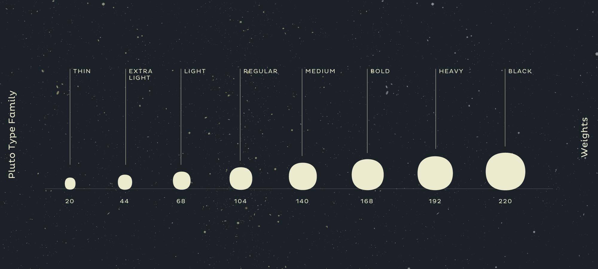
Pluto Sans is a straight forward geometric sans serif that is closely related to Pluto with its curly elements and extravagant appearance. It performs as a workhorse and is subtle when set in long text. The concept for Pluto started with the idea to keep the architecture of Pluto, but to straighten out the curls and reduce the expressive shapes. In the process it became obvious that it was not about cutting of the curly shapes, but rather about translating the idea of Pluto into a sans serif. A result of that approach was a complete new design for several letters. The result is a geometric typeface that fits perfectly with Pluto and also works like a charm, when used as the only typeface. Pluto Sans is not as loud as Pluto but still has this subtle friendly feeling shining through.
DOCUMENTED
Rocket-Powered
ARRANGEMENT
Study Disciplines
SUPPLEMENTS
Around the World
LABORATORY 4
Naming Elements
ASTROLOGICAL
Guidance System II
CALCULATIONS
Organic Chemistry
PLANETARIUM
Economic Aspects
Lorem ipsum dolor sit amet, consetetur sadipscing elitr, sed diam nonumy eirmod tempor invidunt ut labore et dolore magna aliquyam erat, sed diam voluptua. At vero eos et accusam et justo duo dolores et ea rebum. Stet clita kasd gubergren, no sea takimata sanctus est Lorem ipsum dolor sit amet. Lorem ipsum dolor sit amet, consetetur sadipscing elitr, sed diam nonumy eirmod tempor invidunt ut labore et dolore magna aliquyam erat, sed diam voluptua. At vero eos et accusam et justo duo dolores et ea rebum.
The orginial Pluto type family with its curly elements has a strong decorative appearance. We decided to create a more clean version, based on a geometric architecture with the same range of weights and styles but much more reduced. The quirky forms of the originial Pluto type family have been reduced without losing the warm soul. The result is Pluto Sans, a classic geometric Sans with open forms, easy to read and made for professional typography — it still has this touch of friendliness shining through and can be used together with Pluto or as a stand alone option.
Pluto Sans is based on the same geometric skeleton like Pluto. Where the playful Pluto has loud and extroverted letterforms, Pluto Sans can celebrate its forms in a more silent way — without geeting bored. Letters like „K“, „R“, „v“ or „w“ are designed in a more reduced way, delivering an open, clean and friendly appearance. Pluto Sans can be used in a wide scope and performs nicely in small sizes. Additionally to the normal width, Pluto Sans also contains a condensed version for a more space saving usage.
There are a lot of significant differences between the two families. While Pluto has these special terminals and letterforms that are more influenced by handwriting, Pluto Sans is more straight and has classical forms, but we kept special attention not lose its relationship to its family member.
Here is an example how different the two families feel when compared directly. You can see that they have the same dimentions, x-height and stem width but with their individual details and letterforms they have a totally different attitude. → Check out Pluto.
Pluto and Pluto Sans are two families consisting of normal and condensed width – four families in total plus matching Italics. Every family member works perfectly with the others, which results in a wide range of possibilites. Due to the same architecture and x-height but the different details and appearance you can combine the fonts and find the perfect match for your design. → Check out Pluto.
Pluto Sans is an up-to-date typeface and contains more than the alphabet and punctuation. The character set of Pluto Sans supports the most common latin based languages and on top of that it has a whole lot of OpenType features that enable excellent typography for the users in all modern layout applications. Check out what this font family has to offer under the hood.
Heavy Dancing
If you have a closer look at the stylistic sets of Pluto you can find some lovely looped alternate letters. These alternates give a unique feeling to every word.
1/6 of the size of the earth
If fractions are needed anywhere an OpenType code makes sure that if you type any numbers combined with a slash between a fraction will automatically be substituted.
1.246,79€
2.911,79€
Besides the standard lining figures, the fonts also contain a set of tabular figures. This means that all numbers have the same width, which is useful for setting up invoices, tables or every other task where the figures should have a structured appearance among themselves.
C12H22O6
A subscript is a character that is set slightly below the normal line of type. They are used in formulas, mathematical expressions, and specifications of chemical compounds and isotopes, but can have many other uses as well. These characters are not simply ordinary characters reduced in size – to keep them visually consistent with the rest of the font, they are slightly heavier than a reduced-size character would be.
x2 + a2 = n4
A superscript is a character that is set slightly above the line of type. It has the same weight and size like a subscript character. They are also used in formulas, mathematical expressions and text references, but can have many other uses as well.
Pluto Sans has an extended character set that supports more than a hundred languages. Part of the language coverage is the support for Latin and Cyrillic script.
Latin: Afar, Afrikaans, Albanian, Basque, Belarusian, Bislama, Bosnian, Breton, Catalan, Chamorro, Chichewa, Comorian, Croatian, Czech, Danish, Dutch, Esperanto, Estonian, Faroese, Fijian, Filipino/Tagalog, Finnish, Flemish, French, Gaelic, Gagauz, German, Gikuyu, Gilbertese/Kiribati, Haitian-Creole, Hawaiian, Hungarian, Icelandic, Indonesian, Irish, Italian, Javanese, Kashubian, Kinyarwanda, Kirundi, Latin, Latvian, Lithuanian, Luba/Ciluba/Kasai, Luxembourgish, Malagasy, Malay, Maltese, Maori, Marquesan, Moldovan/Romanian, Montenegrin, Nauruan, Ndebele, Norwegian, Oromo, Palauan/Belauan, Polish, Portuguese, Quechua, Romanian, Romansh, Sami, Samoan, Sango, Serbian, Sesotho, Setswana, Seychellois-Creole, Swazi, Silesian, Slovak, Slovenian, Somali, Sorbian, Sotho, Spanish, Swahili, Swedish, Tahitian, Tetum, Tok-Pisin, Tongan, Tsonga, Tswana, Turkish, Turkmen, Tuvaluan, Uzbek, Wallisian, Walloon, Welsh, Xhosa, Zulu. Cyrillic: Belarusian, Bosnian, Bulgarian, Chechen, Macedonian, Ossetic, Russian, Serbian, Ukrainian, Uzbek.
Enjoy this typeface?
Other buying Options: Fontspring.com, FontShop.com