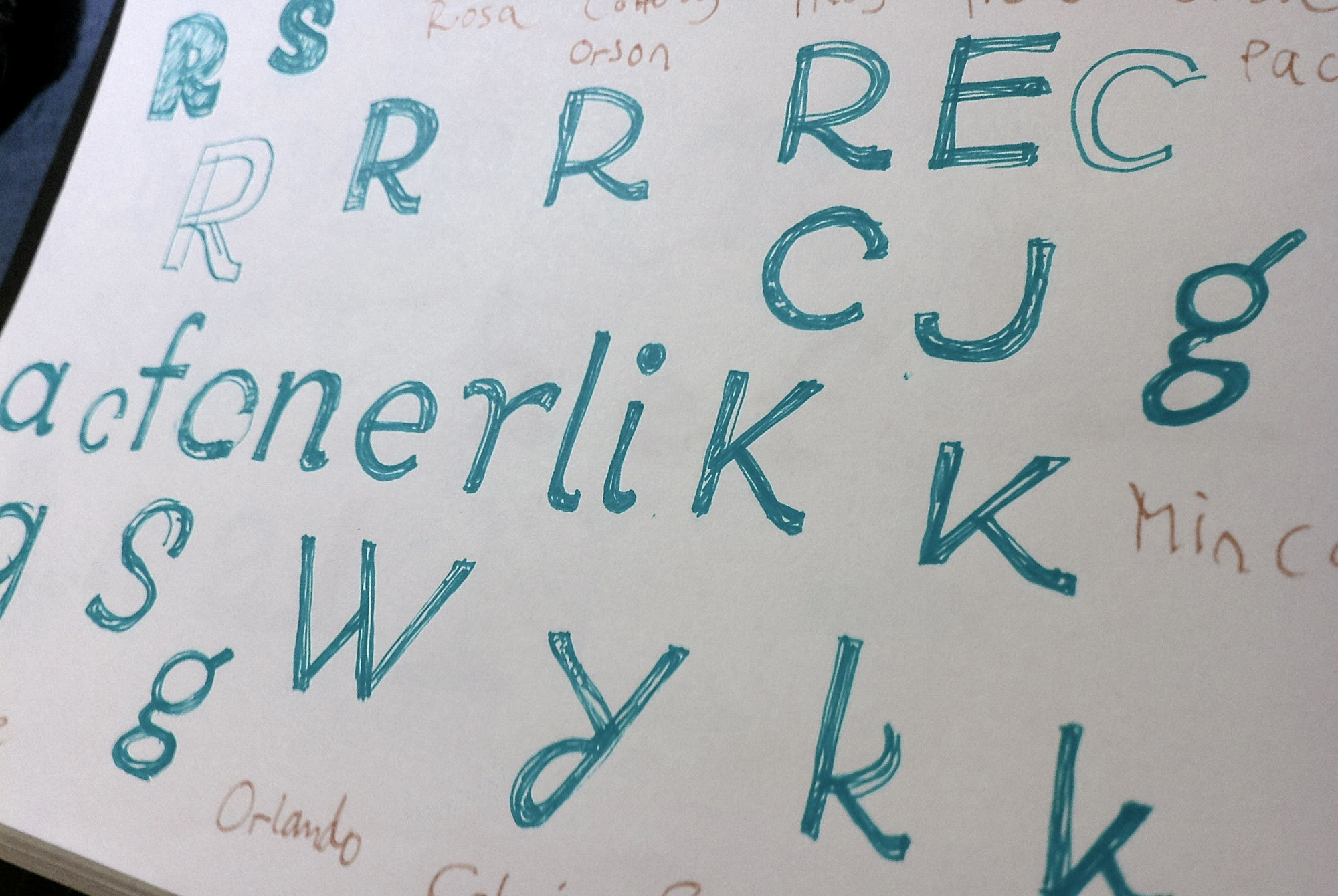
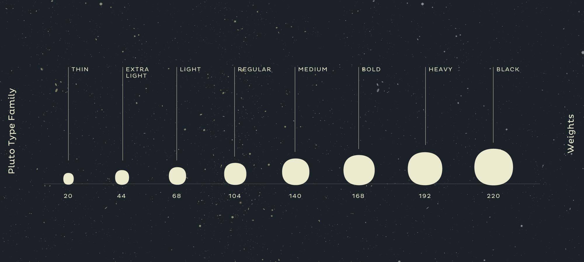
Pluto is a friendly looking type family that combines the straight architecture of sans Serif typefaces with the playfulness of script typefaces. The fonts are informal and have a cute look at first sight, which makes Pluto show its character when set in big sizes. However the clean and upright architecture make it perfect for longer copy. Because of its large x-height, Pluto even performs well in very small sizes. This contemporary type family is a great fit in retail, cosmetics, food, advertisement, games and in the service and hospitality industry.
INTERSTELLAR
Packaging Fonts
ASTRONOMER
Gravitational 12
THE MILKY WAY
Digital Projector II
TRANSPORTER
Aseptic Packages
MYSTERIOUSLY
Sternschnuppe 18
OCEAN WORLD
Food & Nutrition
GASTRONOMY
Friendly Reminder
MYTHOLOGICAL
Quality @ Control
Lorem ipsum dolor sit amet, consetetur sadipscing elitr, sed diam nonumy eirmod tempor invidunt ut labore et dolore magna aliquyam erat, sed diam voluptua. At vero eos et accusam et justo duo dolores et ea rebum. Stet clita kasd gubergren, no sea takimata sanctus est Lorem ipsum dolor sit amet. Lorem ipsum dolor sit amet, consetetur sadipscing elitr, sed diam nonumy eirmod tempor invidunt ut labore et dolore magna aliquyam erat, sed diam voluptua. At vero eos et accusam et justo duo dolores et ea rebum.
Pluto started as an experiment: Is it possible to combine the straightforwardness of a geometric sans serif family with the playful stroke endings you usually find in script typefaces? I was not sure if these two different worlds would go well together, but as I made the first sketches I started to be intrigued by the idea and expanded the sketch to a whole font family.
At first Pluto was planned without Italics, because the uprights already were really playful. I felt there was no need for a "more playful" italic companion. But as Pluto became a big success, I received a lot of requests for italics and at some point started to develop the italic counterpart for the uprights, so that Pluto now has a wider scope and you can use it for complex typographic tasks like magazines typography or corporate designs.
A special challenge were the uppercase letters. I wanted them to work not only in sentence case, but also in ALL CAPS. I noticed that people love to use ALL CAPS for poster and headlines and that designers even used ALL CAPS setting, when the capital letters were not designed for that purpose. Incorporating Pluto’s swashy and curly elements in the capital letters was not an easy task, because the letters couldn’t be too playful, when set in ALL CAPS. The capital letters had to be "straighter" than the lowercase, on the other hand the design-DNA of the typeface always needed to be present in every part of the type family. Not a single letter should stand out and the letters should not look like two typefaces combined. One of the biggest challenges in designing Pluto, was finding the perfect balance, where the typeface works in ALL CAPS and has just enough "curliness" to match the more playful lowercase. The characters "R", "C" and "K" show the idea of implementing script details in a sans serif design. The capital "S" also takes inspiration from script typefaces, in which the head is slightly bigger than the bottom. All these design features were inspired by the playful lowercase. With these small but distinct design decisions the uppercase works in both worlds — in ALL CAPS and in sentence case.
Here is an example how different the two families feel when compared directly. You can see that they have the same dimentions, x-height and stem width but with their individual details and letterforms they have a totally different attitude. → Check out Pluto Sans.
There are a lot of significant differences between the two families. While Pluto has these special terminals and letterforms that are more influenced by handwriting, Pluto Sans is more straight and has classical forms, but we kept special attention not lose its relationship to its family member. → Check out Pluto Sans.
Pluto and Pluto Sans are two families consisting of normal and condensed width – four families in total plus matching Italics. Every family member works perfectly with the others, which results in a wide range of possibilites. Due to the same architecture and x-height but the different details and appearance you can combine the fonts and find the perfect match for your design. → Check out Pluto Sans.
A font of today’s needs has to include more than just the alphabet and some punctuation. Pluto has a big character set to support the most common latin based languages and on top of that it has an whole lot of OpenType features that enable excellent typography for the users in all modern layout applications. Check out what this font family has to offer under the hood
Fruity Mango
If you have a closer look at the stylistic sets of Pluto you can find some lovely looped alternate letters. These alternates give a unique feeling to every word.
Pluto is 1/6th the size of Earth.
If fractions are needed anywhere an OpenType code makes sure that if you type any numbers combined with a slash between a fraction will automatically be substituted.
1027,86
3612,16
Besides the standard lining figures, the fonts also contain a set of tabular figures. This means that all numbers have the same width, which is useful for setting up invoices, tables or every other task where the figures should have a structured appearance among themselves.
C12H22O11
A subscript is a character that is set slightly below the normal line of type. They are used in formulas, mathematical expressions, and specifications of chemical compounds and isotopes, but can have many other uses as well. These characters are not simply ordinary characters reduced in size – to keep them visually consistent with the rest of the font, they are slightly heavier than a reduced-size character would be.
x2 + a2 = n4
A superscript is a character that is set slightly above the line of type. It has the same weight and size like a subscript character. They are also used in formulas, mathematical expressions and text references, but can have many other uses as well.
Pluto has an extended character set that supports more than a hundred languages. Part of the language coverage is the support for Latin and Cyrillic script.
Latin: Afar, Afrikaans, Albanian, Basque, Belarusian, Bislama, Bosnian, Breton, Catalan, Chamorro, Chichewa, Comorian, Croatian, Czech, Danish, Dutch, Esperanto, Estonian, Faroese, Fijian, Filipino/Tagalog, Finnish, Flemish, French, Gaelic, Gagauz, German, Gikuyu, Gilbertese/Kiribati, Haitian-Creole, Hawaiian, Hungarian, Icelandic, Indonesian, Irish, Italian, Javanese, Kashubian, Kinyarwanda, Kirundi, Latin, Latvian, Lithuanian, Luba/Ciluba/Kasai, Luxembourgish, Malagasy, Malay, Maltese, Maori, Marquesan, Moldovan/Romanian, Montenegrin, Nauruan, Ndebele, Norwegian, Oromo, Palauan/Belauan, Polish, Portuguese, Quechua, Romanian, Romansh, Sami, Samoan, Sango, Serbian, Sesotho, Setswana, Seychellois-Creole, Swazi, Silesian, Slovak, Slovenian, Somali, Sorbian, Sotho, Spanish, Swahili, Swedish, Tahitian, Tetum, Tok-Pisin, Tongan, Tsonga, Tswana, Turkish, Turkmen, Tuvaluan, Uzbek, Wallisian, Walloon, Welsh, Xhosa, Zulu. Cyrillic: Belarusian, Bosnian, Bulgarian, Chechen, Macedonian, Ossetic, Russian, Serbian, Ukrainian, Uzbek.
Enjoy this typeface?
Other buying Options: Fontspring.com, FontShop.com