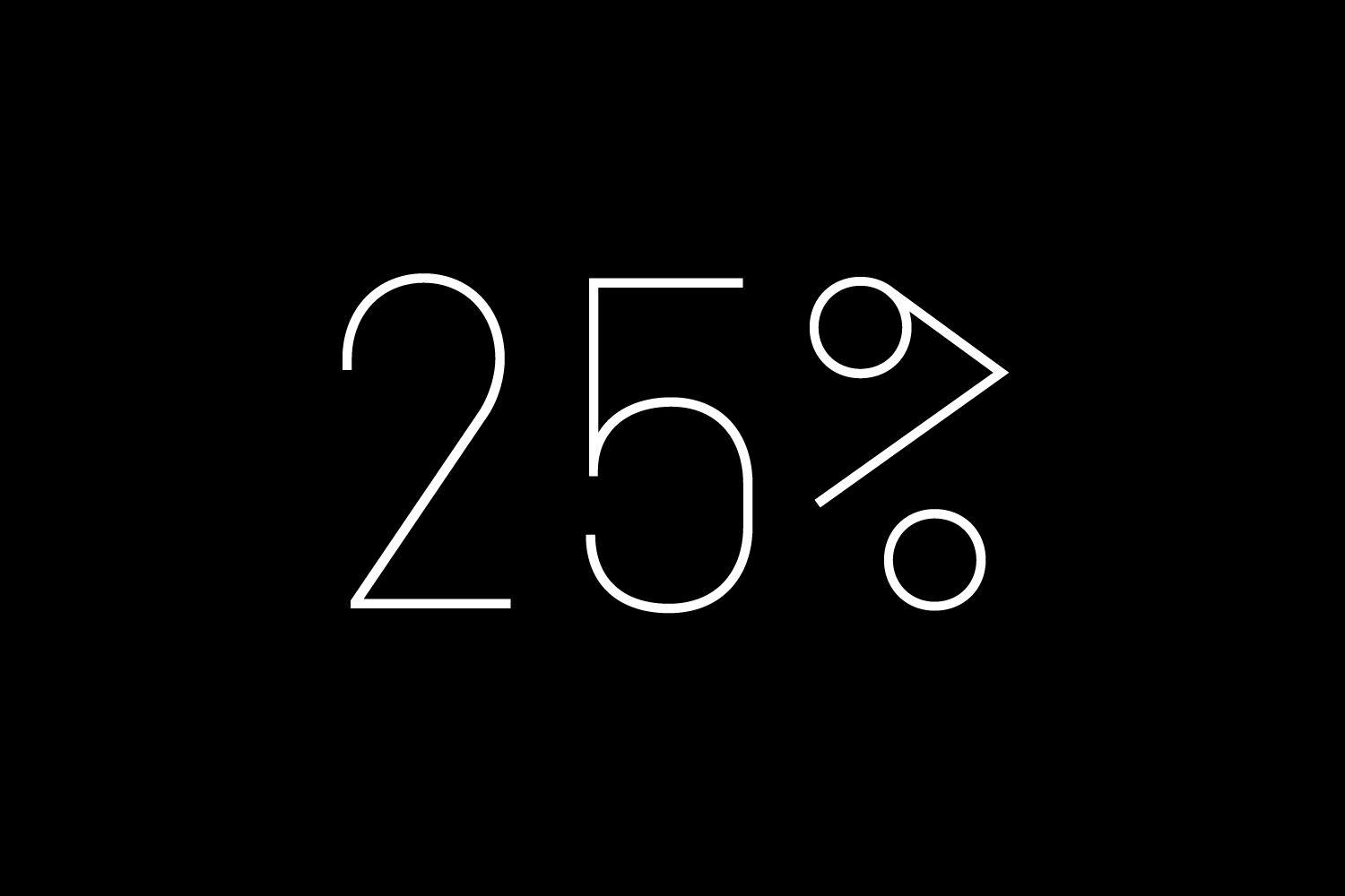
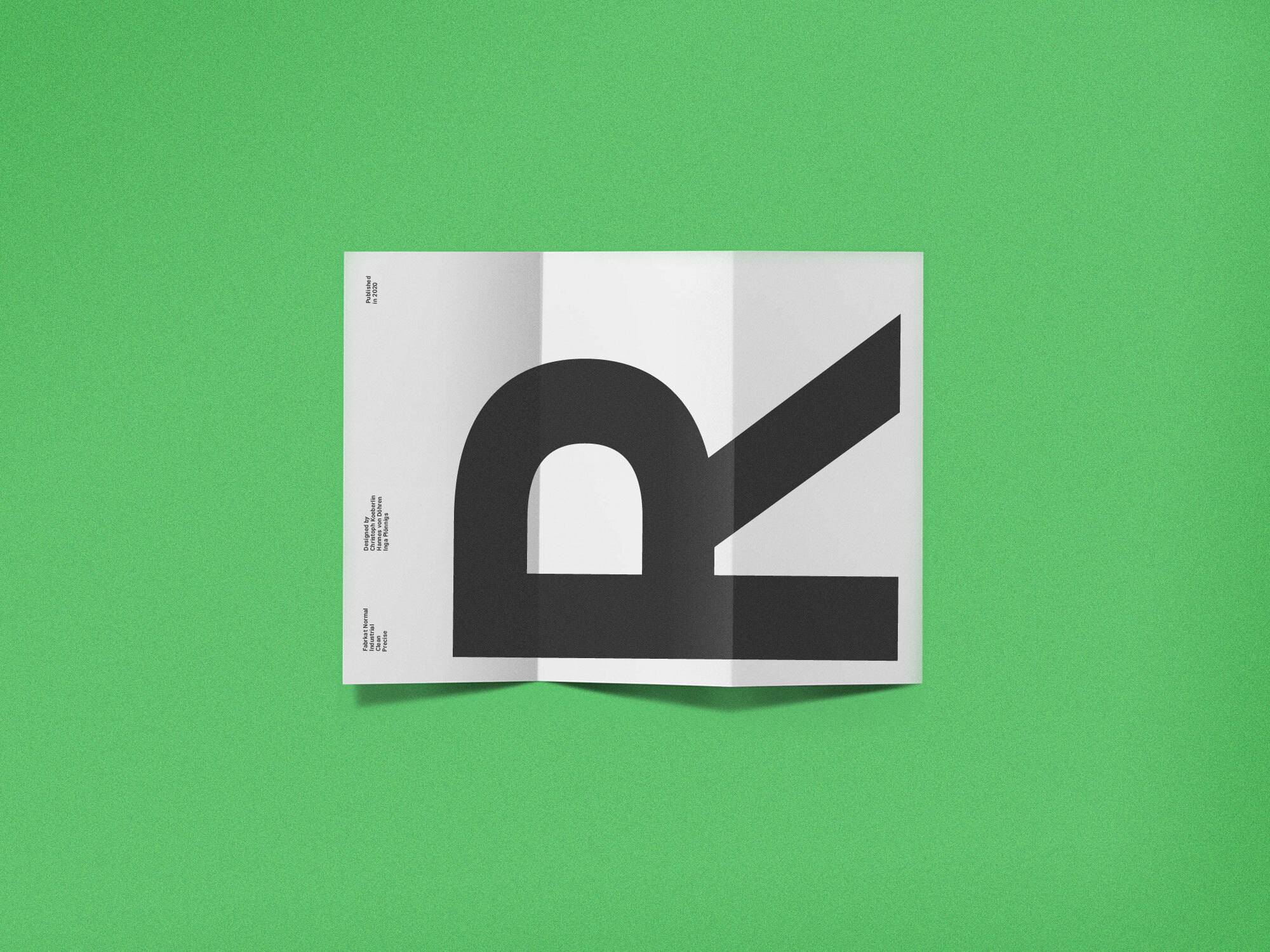
Fabrikat Mono is an addition to the popular Fabrikat type family that emphasises its engineering roots. Compared to Fabrikat, the Mono version evens out not only the characters’ variable widths but also its more subtle characteristics: Letters like B and R are counterbalanced, the height difference between caps, ascenders and even “t” are eliminated, while characters like the percent sign together with the stressed punctuation give a nod to typewriter typefaces. The type family is equipped for complex, professional typography with OpenType Features like alternate letters, arrows and an extended character set to support Central and Eastern European as well as Western European Languages.
Elliptical
Particular
Rotational
Aposematic
Collective
Workaholic
Rhythmical
Lorem ipsum dolor sit amet, consetetur sadipscing elitr, sed diam nonumy eirmod tempor invidunt ut labore et dolore magna aliquyam erat, sed diam voluptua. At vero eos et accusam et justo duo dolores et ea rebum. Stet clita kasd gubergren, no sea takimata sanctus est Lorem ipsum dolor sit amet.
When we designed the first version of Fabrikat (2016), we created an engineers typeface: Constructed, functional and geometric. Fabrikat was a success and a good choice for designers to create logos, posters and corporate designs. One year later we added Fabrikat Mono to take the approach of simplicity and reduction even further. The last additon to the Fabrikat Family was Fabrikat Normal (2020), which is optmised for reading sizes and long texts.
A font of today’s needs has to include more than just the alphabet and some punctuation. Besides a big number of accented letters, making sure that the typeface has a good language support, a font should include several features for excellent typographic work joining forces with the layout applications of the time and of course the user. Here is a selection of what this font family has to offer under the hood.
Alabama
Besides the standard letters a font sometimes contains several versions of a letter called alternates. You can exchange the alternate with the standard letter by selecting it through the Opentype feature panel and every letter of the stylistic set will be exchanged. Often this results in a totally different optical appearance of the typeface.
H6H2OH
A subscript is a character that is set slightly below the normal line of type. They are used in formulas, mathematical expressions, and specifications of chemical compounds and isotopes, but can have many other uses as well. These characters are not simply ordinary characters reduced in size – to keep them visually consistent with the rest of the font, they are slightly heavier than a reduced-size character would be.
Next!6
A superscript is a character that is set slightly above the line of type. It has the same weight and size like a subscript character. They are also used in formulas, mathematical expressions and text references, but can have many other uses as well.
As Fabrikat grew to a super family of 42 fonts in an organic way, we decided to take the chance and rename the fonts appropriately to their character: Fabrikat Kompakt (formerly known as Fabrikat), Fabrikat Mono and Fabrikat Normal were born.
Afar, Afrikaans, Albanian, Basque, Belarusian, Bislama, Bosnian, Breton, Catalan, Chamorro, Chichewa, Comorian, Croatian, Czech, Danish, Dutch, English, Esperanto, Estonian, Faroese, Fijian, Filipino/Tagalog, Finnish, Flemish, French, Gaelic, Gagauz, German, Gikuyu, Gilbertese/Kiribati, Haitian-Creole, Hawaiian, Hungarian, Icelandic, Indonesian, Irish, Italian, Javanese, Kashubian, Kinyarwanda, Kirundi, Latin, Latvian, Lithuanian, Luba/Ciluba/Kasai, Luxembourgish, Malagasy, Malay, Maltese, Maori, Marquesan, Moldovan/Romanian, Montenegrin, Nauruan, Ndebele, Norwegian, Oromo, Palauan/Belauan, Polish, Portuguese, Quechua, Romanian, Romansh, Sami, Samoan, Sango, Serbian, Sesotho, Setswana, Seychellois-Creole, Swazi, Silesian, Slovak, Slovenian, Somali, Sorbian, Sotho, Spanish, Swahili, Swedish, Tahitian, Tetum, Tok-Pisin, Tongan, Tsonga, Tswana, Turkish, Turkmen, Tuvaluan, Uzbek, Wallisian, Walloon, Welsh, Xhosa, Zulu
Enjoy this typeface?