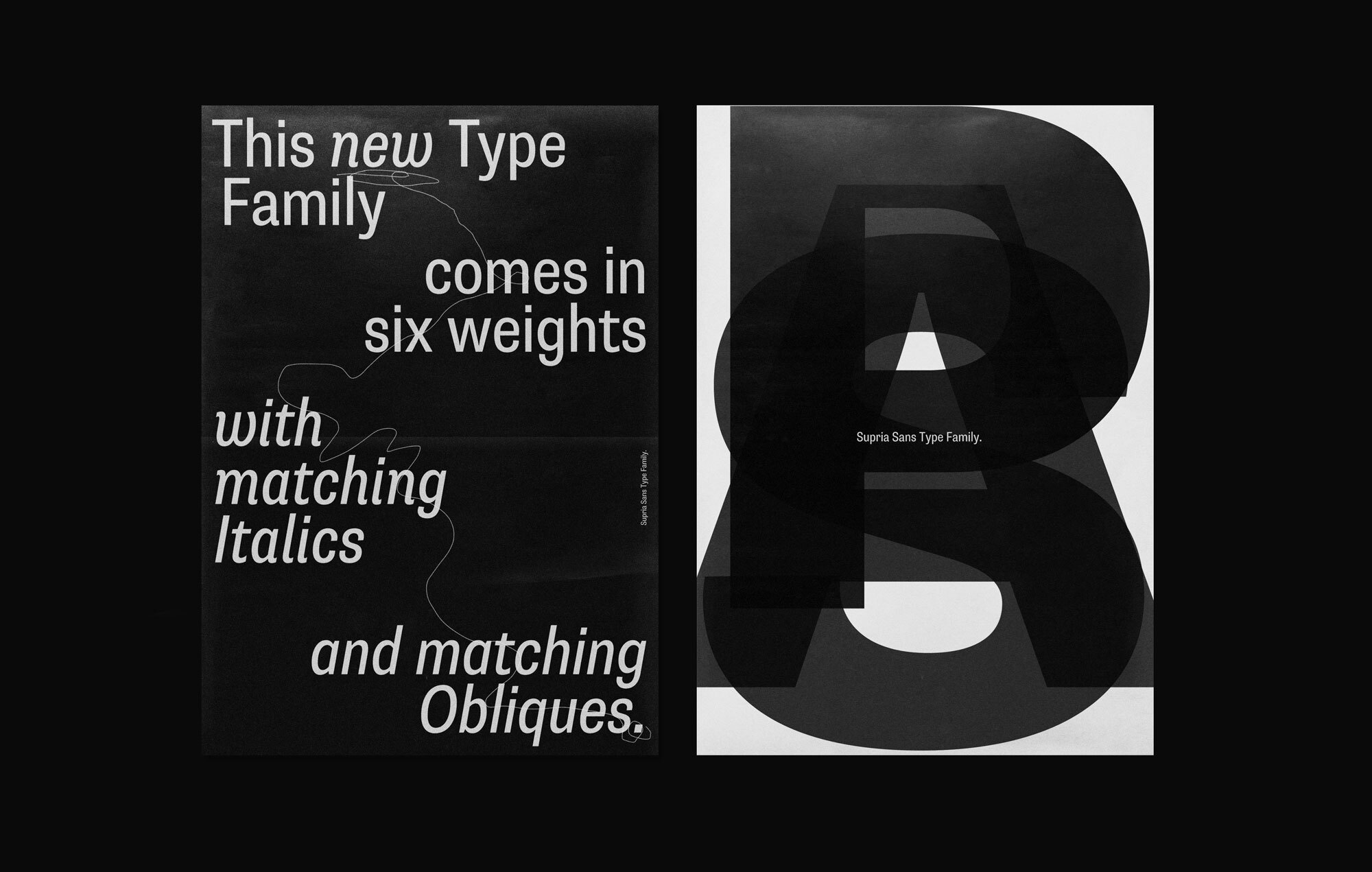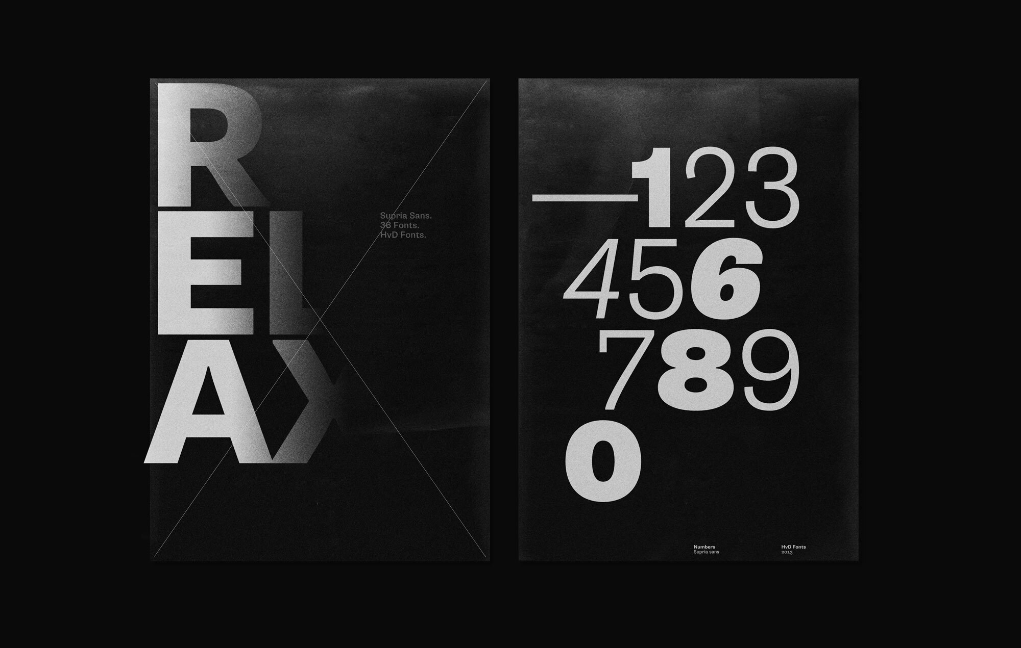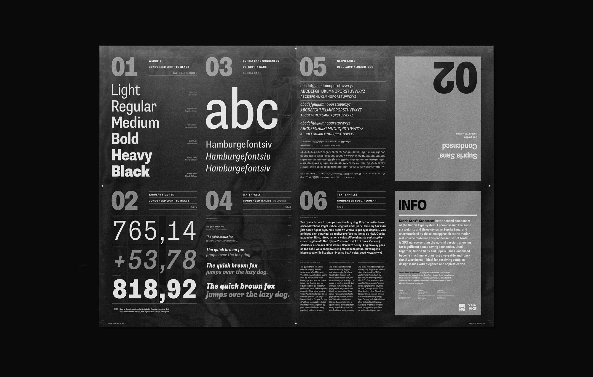
Beside Supria Sans™, the condensed version is the second component of the Supria type system. Encompassing the same six weights and three styles as Supria Sans, and characterised by the same approach to the modernist source material, this condensed set of fonts is 20% narrower than the normal version, allowing for significant space saving economies. Used together, Supria Sans and Supria Sans Condensed become much more than just a versatile and functional workhorse – ideal for resolving complex design issues with elegance and sophistication. Supria Sans Condensed™ is equipped for complex, professional typography. As an exclusively OpenType release, these fonts feature small caps, five variations of numerals, arrows and an extended character set to support Central and Eastern European as well as Western European languages.
PURELY THEORETICAL
Objects and Performances
ARTISTIC JUDGEMENT
Breathtaking Landscapes
BEST COMBINATION
Sociological Institutions
AESTHETIC STUDIES
What is called Zeitgeist
AUTONOMY OF ART
Biographical Criticism
RECENT INVENTION
Evaluations of Beauty
Lorem ipsum dolor sit amet, consetetur sadipscing elitr, sed diam nonumy eirmod tempor invidunt ut labore et dolore magna aliquyam erat, sed diam voluptua. At vero eos et accusam et justo duo dolores et ea rebum. Stet clita kasd gubergren, no sea takimata sanctus est Lorem ipsum dolor sit amet.
The design has just the right amount of character to be memorable and unique but also restrained enough to remain thoroughly useful. Bypassing the polished rationality of Neo-Grotesques, it builds upon the hearty solidity of 19th-century faces, a heritage revealed in the curled-in jaws of glyphs like the ‘C’ or the faucet-shaped ‘r’. While some details seem quite charming, the design never gets coquettish. With its blunt inktraps, tight curves, and solid weight, Supria is ready for work.
Despite this crafty atmosphere though, its rolled-up sleeves don’t get uncomfortably sweaty. Apart from older roots Supria also appears informed by recent, softer approaches to sans-serif design, and steers clear of the sharp, sometimes clumsy vintage chic recently en vogue. With its idiosyncracies tamed just enough, this design is firmly anchored in a contemporary context. There is definitely no smell of mothballs here, but rather a fresh breeze of menthol. I’ve found Supria to feel decidedly fresh, especially when set in text, and more clear and angular than its details might suggest in large display settings.
A design that harmoniously balances such diverse stylistic factors promises to be excitingly versatile. This, along with Supria’s impressive range of styles, including a Condensed variant and the all-too-rare choice of two italics (a curly Italic – likely too cute for some applications – and a more rigid Oblique), makes it an attractive candidate for more complex typographic projects too. A winner at the 2011 TDC2 competition, Supria Sans altogether strikes me as a convincingly versatile, mature, and well-conceived face.
A font of today’s needs has to include more than just the alphabet and some punctuation. Besides a big number of accented letters, making sure that the typeface has a good language support, a font should include several features for excellent typographic work joining forces with the layout applications of the time and of course the user. Here is a selection of what this font family has to offer under the hood.
Next Big Thing
Small Caps are uppercase characters set at the same height and weight as the lowercase characters or text figures. They are used in text emphasize or typographically differentiate passages beside the italics. Professional designed Small Caps are not simply scaled-down versions of the capital letters – they are designed to work with the lowercase letters and have the same stroke weight.
We are talking several languages
Besides the standard letters a font sometimes contains several versions of a letter called alternates. You can exchange the alternate with the standard letter by selecting it through the Opentype feature panel and every letter of the stylistic set will be exchanged. Often this results in a totally different optical appearance of the typeface.
1/8 less space
If fractions are needed anywhere an OpenType code makes sure that if you type any numbers combined with a slash between a fraction will automatically be substituted.
When I am 4657 miles from home
When lining figures are used in a reading text they often produce a visual stretch in the text and disturb the grey value. It has the same effect if you use ALL CAPS in a text. One solution could be to make the numbers slightly smaller and give them some more space in-between. The other, more elegant way is to use the old style figures, they have ascenders and descenders like the lower case letters and will fit seamlessly in the text.
$4.268,67
$1.211,99
In addition to the normal lining figures, the fonts contain a set of tabular figures. This means that all numbers have the same width, which is useful for setting up invoices, tables or every other task where the figures should have a structured appearance among themselves.
C2H6OH
A subscript is a character that is set slightly below the normal line of type. They are used in formulas, mathematical expressions, and specifications of chemical compounds and isotopes, but can have many other uses as well. These characters are not simply ordinary characters reduced in size – to keep them visually consistent with the rest of the font, they are slightly heavier than a reduced-size character would be.
Melbourne2
A superscript is a character that is set slightly above the line of type. It has the same weight and size like a subscript character. They are also used in formulas, mathematical expressions and text references, but can have many other uses as well.
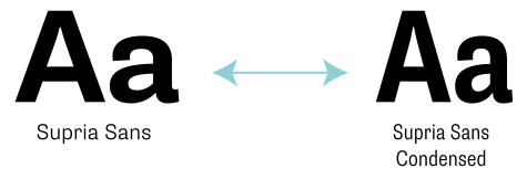
The two families, consisting of a normal and a condensed width, can be combined nicely and work together e.g. in a complex design system. Not to mention that each one has also the strength to work alone. Representing the same characteristics, the condensed version is 20% more space saving, while Supria Sans “normal” just has the self confidence to take the space it needs. → Check out Supria Sans.
Afar, Afrikaans, Albanian, Basque, Belarusian, Bislama, Bosnian, Breton, Catalan, Chamorro, Chichewa, Comorian, Croatian, Czech, Danish, Dutch, English, Esperanto, Estonian, Faroese, Fijian, Filipino/Tagalog, Finnish, Flemish, French, Gaelic, Gagauz, German, Gikuyu, Gilbertese/Kiribati, Haitian-Creole, Hawaiian, Hungarian, Icelandic, Indonesian, Irish, Italian, Javanese, Kashubian, Kinyarwanda, Kirundi, Latin, Latvian, Lithuanian, Luba/Ciluba/Kasai, Luxembourgish, Malagasy, Malay, Maltese, Maori, Marquesan, Moldovan/Romanian, Montenegrin, Nauruan, Ndebele, Norwegian, Oromo, Palauan/Belauan, Polish, Portuguese, Quechua, Romanian, Romansh, Sami, Samoan, Sango, Serbian, Sesotho, Setswana, Seychellois-Creole, Swazi, Silesian, Slovak, Slovenian, Somali, Sorbian, Sotho, Spanish, Swahili, Swedish, Tahitian, Tetum, Tok-Pisin, Tongan, Tsonga, Tswana, Turkish, Turkmen, Tuvaluan, Uzbek, Wallisian, Walloon, Welsh, Xhosa, Zulu
Enjoy this typeface?
Other buying Options: Fontspring.com, FontShop.com