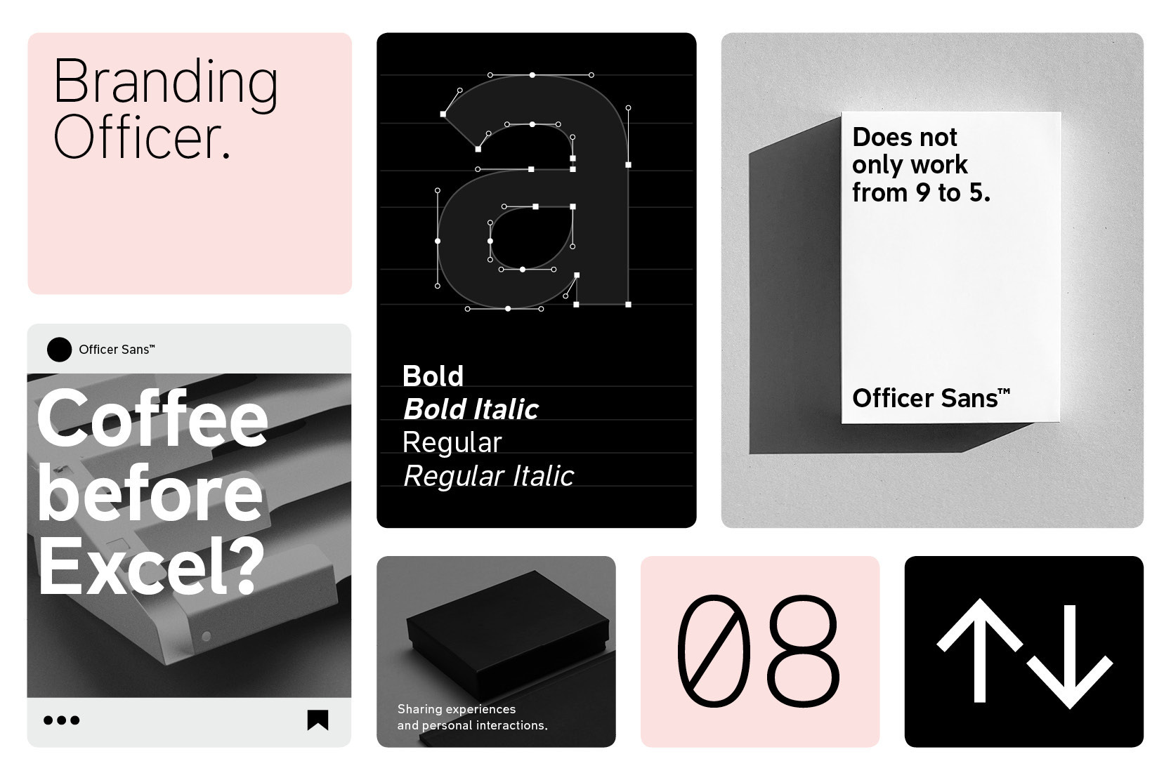
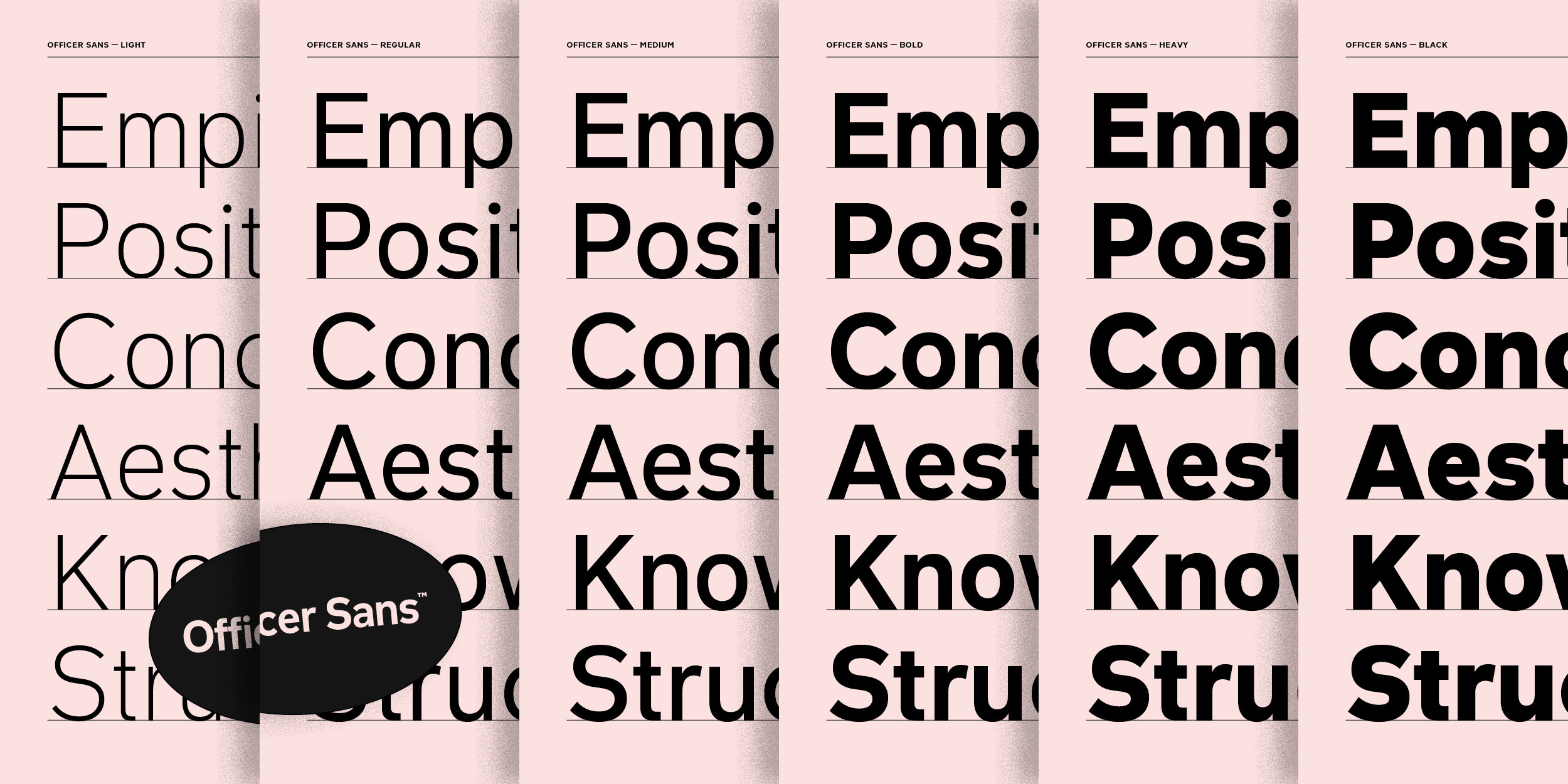
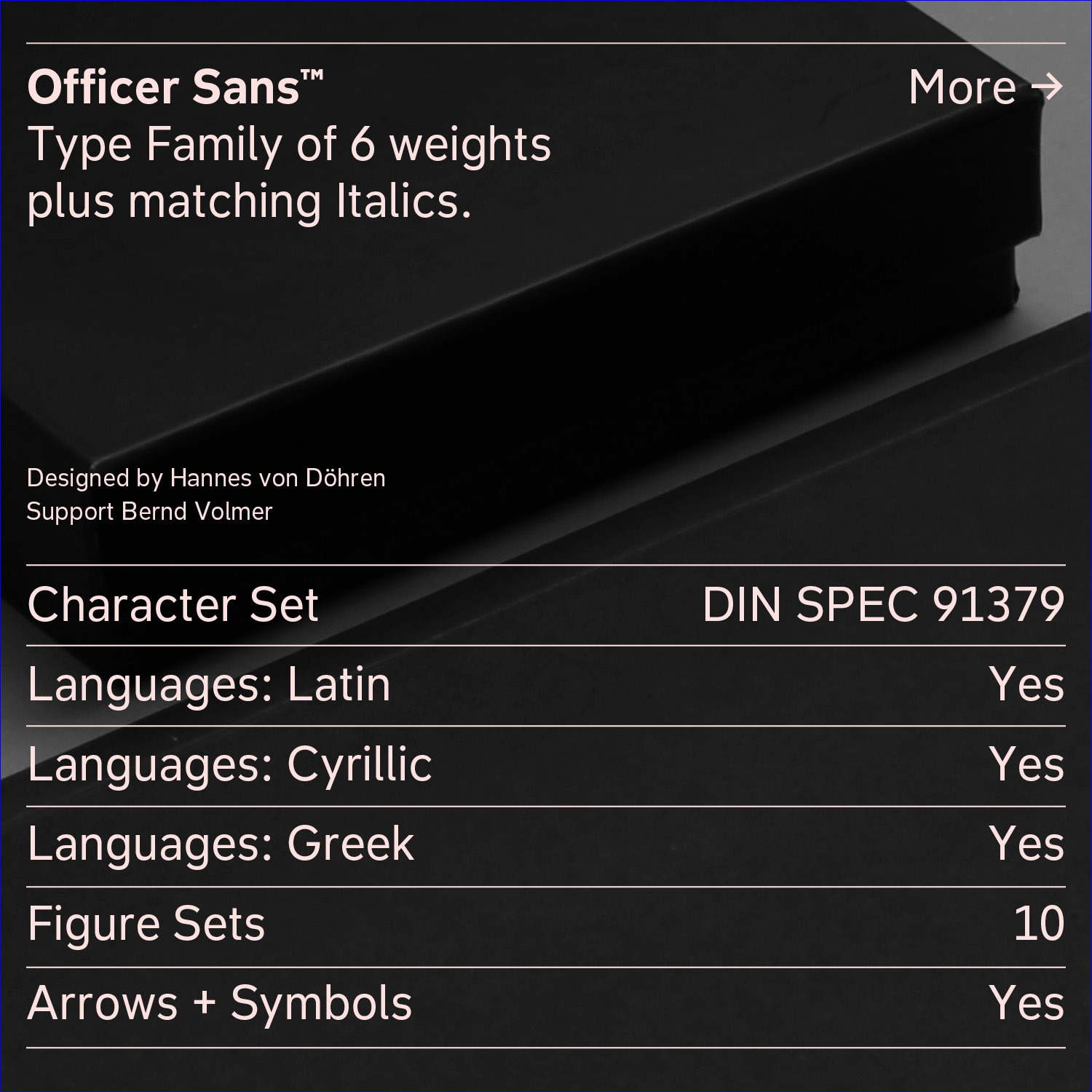
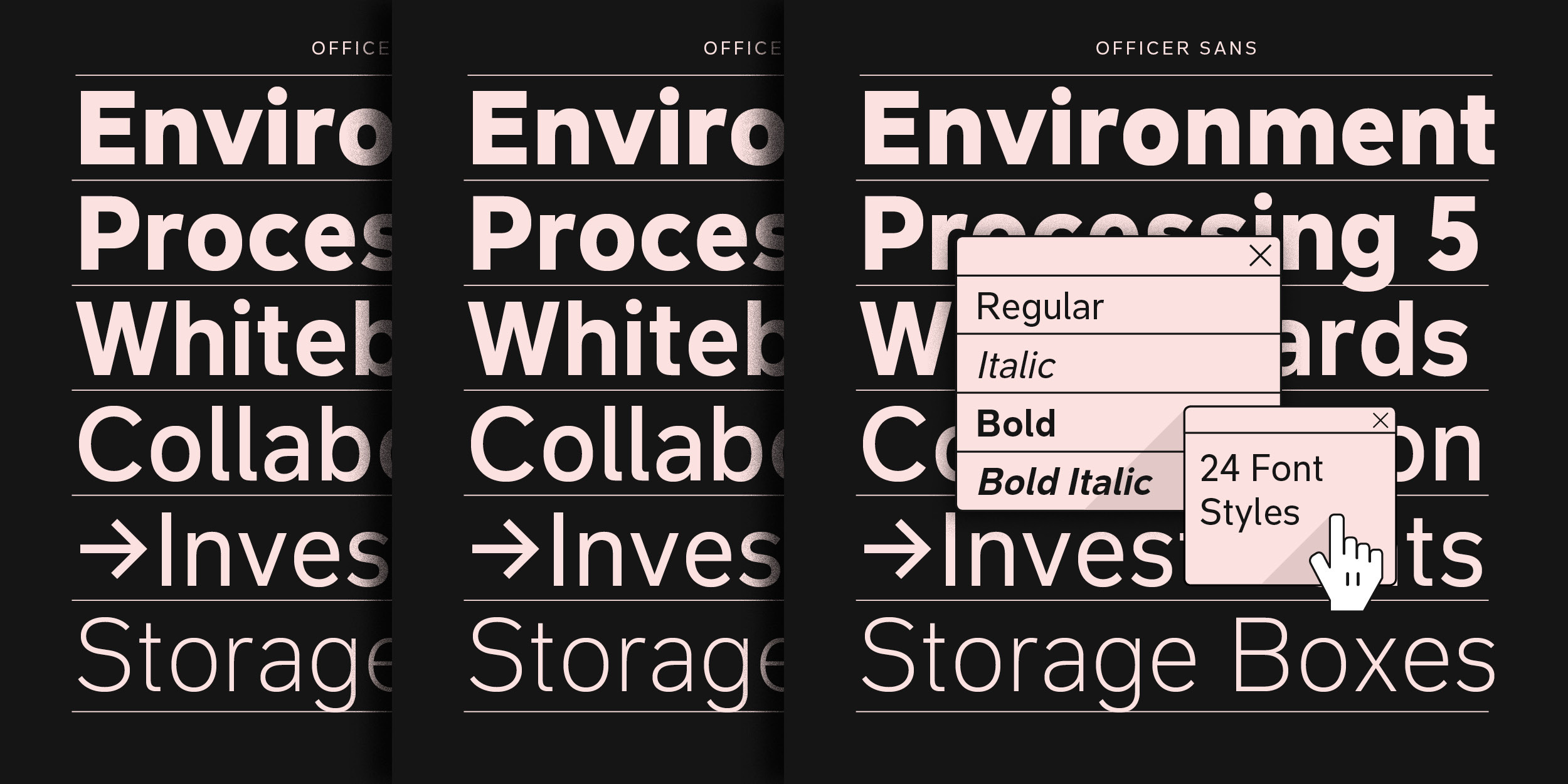
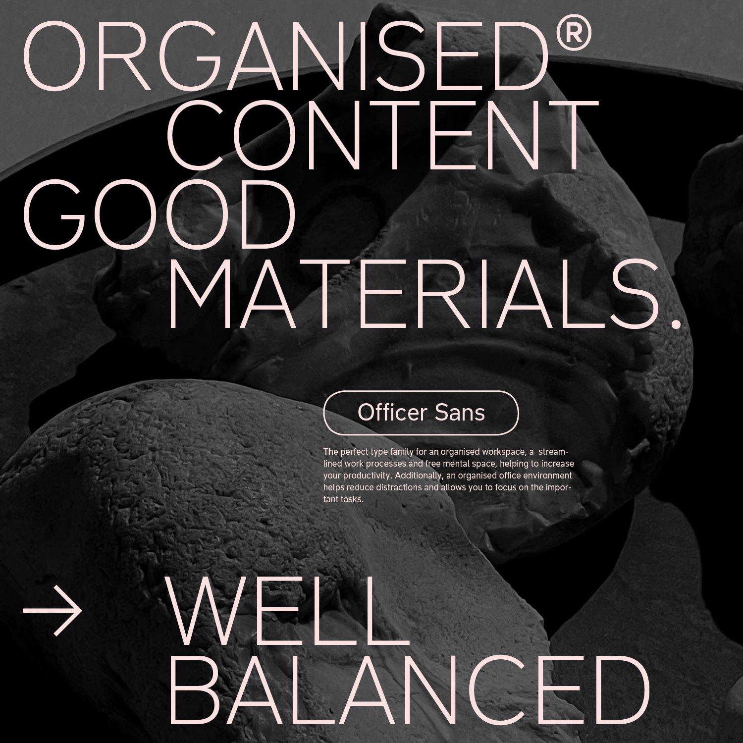
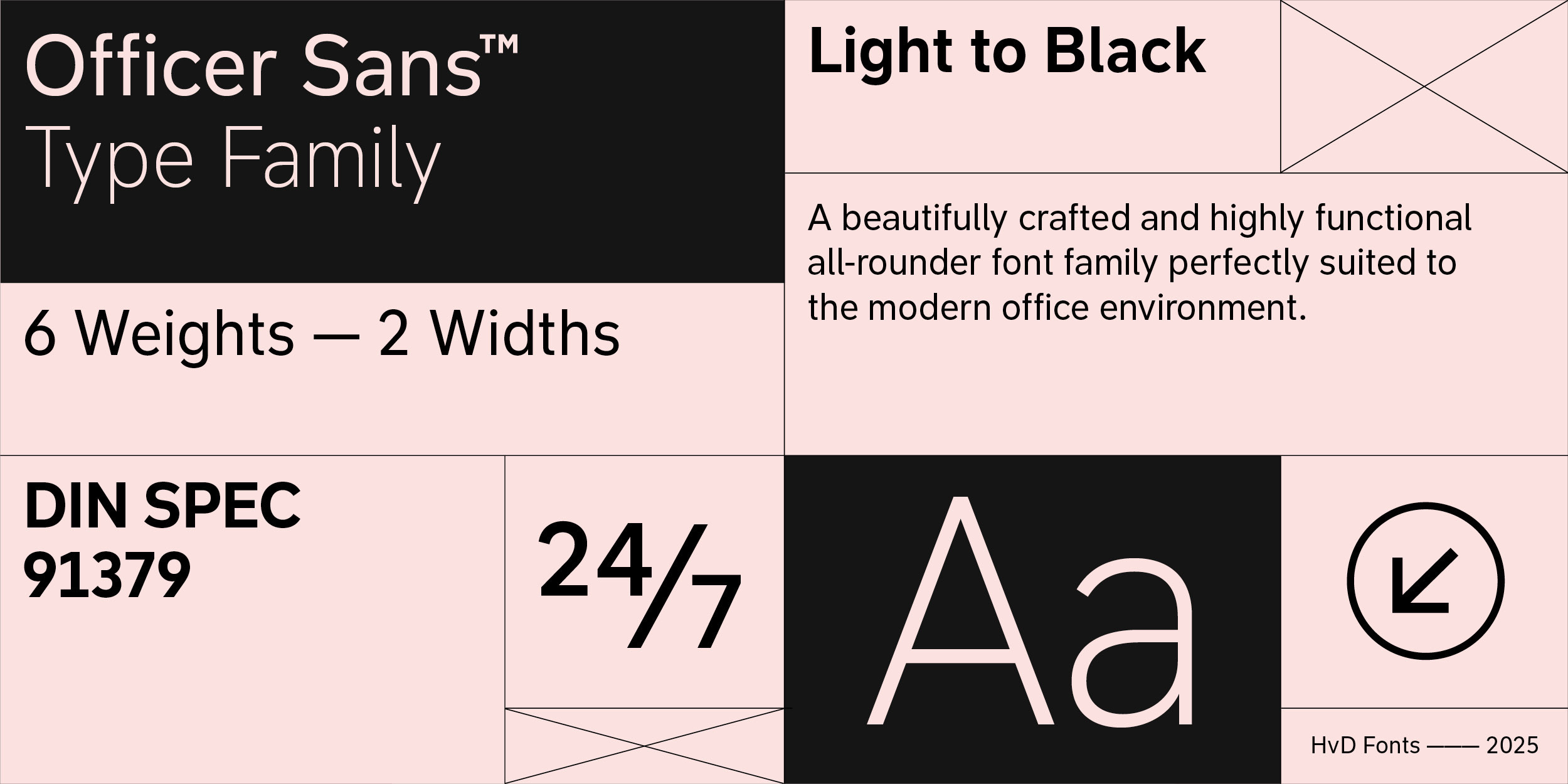
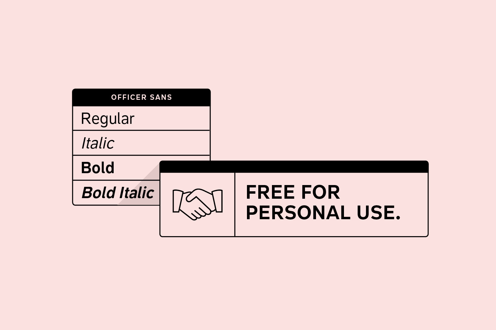
Officer Sans is the perfect typeface for your office and we decided to give the 4 basic styles for free for personal use. We want to make the search for the perfect fitting font as easy as possible. You can use the free fonts for mockups, client presentations, pitches and for personal use. For commercial use, please purchase a license here.

OPERATIONAL EFFICIENCY
Standard accounting principles 94
FINANCIAL MANAGEMENT
Provider and insurance company
ECONOMIES OF SCALE 2.0
The market value of a business
SOCIAL RESPONSIBILITIES
Assets used in futures contracts
You can use Officer Sans for your personal environment. You can use the fonts for mockups, client presentations and pitches and every other non-commercial stuff. If a project go commercial or is being produced, you will have to purchase the commercial version.

The best typefaces solve problems beautifully. Many years working across the world with large companies taught us that there is a lot of demand for a typeface solving specific challenges in the office and accounting environment. We collected all the essential and important requirements, ran the data, went back to the drawing board, and poured the results and our inspiration into a new font family that checked all the boxes — meet Officer Sans.
We designed Officer Sans to exacting standards so that the fonts work perfectly and seamlessly with modern office apps like MS Office, Excel, Pages, and Numbers. That means ensuring seamless functionality with features like Style Linking in MS Office, embedding the fonts within your documents, and optimizing or hinting all the fonts for optimal rendering on screen.
Officer Sans is remarkably versatile. Not only does it perform exceptionally in office environments, but excels at countless other typographic challenges, including remarkable performance on the web, in apps, and for server usage.
The design of Officer Sans was not driven by whims or uncompromising ideas about what might be cool, or by the latest design fads. We had high ambitions for Officer Sans: Not only did it have to look great, but more than anything it had to be about functionality. It had to be a typeface expansive and versatile enough to meet — and even exceed — all of the numerous and complex requirements demanded by the office environment. Officer Sans is a professionally crafted workhorse that excels in and out of the office — it’s just as happy in office apps as it is performing on the web or as a modern corporate typeface.
Officer Sans shares similar dimensions to the widely used Arial and Helvetica. These default or system fonts are often selected not for their performance or abilities but because they appear in the font menu pre-installed. Officer Sans is not an attempt to mimic these font families, but to make something that adds value, a font family that performs even better in today’s typographically demanding office and accounting environment.
Changing your office fonts shouldn’t be too much of a shock either for users or readers. That’s why, when designing Officer Sans, we kept an eye on the dimensions of Arial and Helvetica. By maintaining similar basic measures for cap height, x-height letter width, and thus text length, you can now switch to Officer Sans from an old default like Arial, for example, and you won’t need to rethink or redesign all of your documents and templates. The transition to Officer Sans will be smooth and painless.
Arial and Helvetica have the exact same proportions and letter widths. Their story is an interesting one but is told elsewhere. With Officer Sans, we went back to the drawing board, starting from scratch, while keeping a design corridor open to ensure that existing Arial users could upgrade to Officer Sans with ease. Arial and Helvetica have Arial and Helvetica have the exact same proportions and letter widths. Their story is an interesting one but is told elsewhere. With Officer Sans, we went back to the drawing board, starting from scratch, while keeping a design corridor open to ensure that existing Arial users could upgrade to Officer Sans with ease. Arial and Helvetica have very tight spacing, and this was the key to our solution. By making our letterforms just a little narrower, we not only maintained comparable line-length or text-flows but we introduced much-needed light and space into the design, which, as a bonus, improves legibility and overall readability.
The European Accessibility Act is designed to ensure accessibility across products and services among Member States. Designing and optimizing typefaces for accessibility means designing for a diverse audience, including individuals with visual impairments or reading disabilities, like dyslexia. Accessible typography ensures that textual information is accessible to all users, irrespective of their abilities or disabilities. [Source: GSA] Officer Sans was created with barrier-free/accessible requirements in mind.
Letters constructed with an open architecture are easier to read. When a letter like c or e, for example, is constructed too narrow, it is easily confused with a lowercase o, especially at smaller sizes. Wider openings make for better letter differentiation, less confusion, and a more comfortable reading rhythm.
Legibility in the office environment is crucial, with mistakes costly and embarrassing. Certain characters in the Latin alphabet are sometimes difficult to tell apart. The Il1 test ensures that three characters — sometimes similar or even identical in some fonts — are easily distinguishable. Officer Sans passes the test with flying colors.
Officer Sans’ generous x-height makes it legible even at very small sizes, so that even paratextual elements like footnotes, sidenotes and tiny captions can be read easily.
Besides the 4 basic styles (Regular, Italic, Bold, Bold Italic) which are free for personal use, the commercial Officer Sans family consists of 24 Styles. A large type family is able to solve all kinds of typographic challenges. From multiple widths and weights we have you covered. From a light touch to bold for emphasis or that super-heavy and hard-hitting Black weight, whatever you need, Officer Sans is prepared for every eventuality. Need more styles? Check our the commercial version.
DIN 91379 is a German standard that specifies the characters and standards for representing names and other text data in electronic systems within the EU. It is designed to promote accessibility, consistency, and compatibility while transmitting data between various systems and applications to prevent errors and misunderstandings. DIN 91379 also covers some non-European languages that use Latin script, like Vietnamese, for example. Officer Sans fonts are DIN 91379-compliant. In addition to its extended Latin character set, supporting the most common Latin-based languages, Officer Sans also comes with support for Greek and Cyrillic, helping your company on the international stage.


Rich OpenType features support ensure superb typography for users in all contemporary layout applications. So whether you’re completing a tax return, drafting a memo, or serving a blog or website, Officer Sans is there for you.
Graphic: 3 3/4 Units
Whenever fractions are required, OpenType code ensures that whenever you type numbers divided by a slash, they are automatically replaced by a proper fraction.
Tabular figures have the same width, which is useful for setting up invoices, tables or every other task where the figures should have a structured appearance among themselves. Nevertheless the proportional figures can be activated through the OpenType Proportional Figures feature.
Format2
A subscript, as its name suggests, is a character that sits just below the baseline. Subscripts are used in formulas, mathematical equations, and specifications of chemical compounds and isotopes, yet they can be used in many other areas too. These characters are not simply shrunken versions of their full-size counterparts, but have been carefully optically adjusted to ensure visual continuity and legibility.
Combining new features3
A superscript is a character that is set slightly above the line of type. It has the same weight and size like a subscript character. They are also used in formulas, mathematical expressions and text references, but can have many other uses as well.
Get this typeface for free!
Download