Officer Sans Condensed
Officer Sans Condensed DS
Explore Officer Sans Condensed – the space-saving typeface for your office.

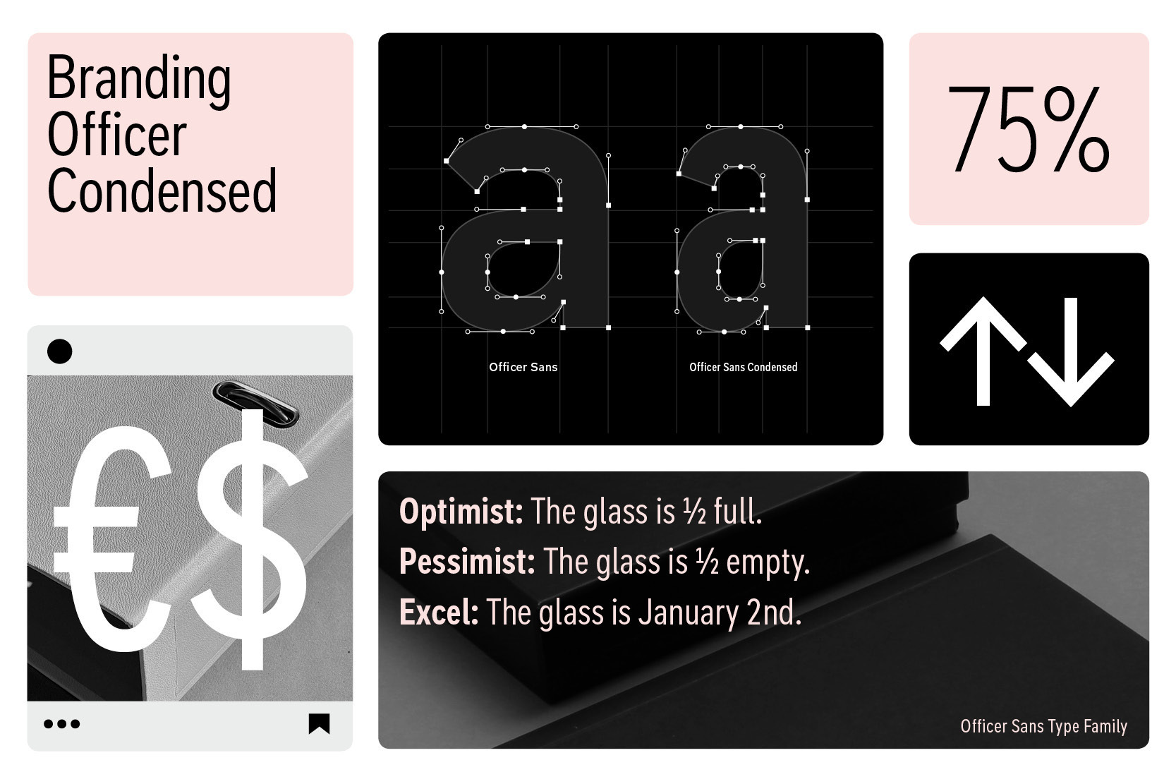
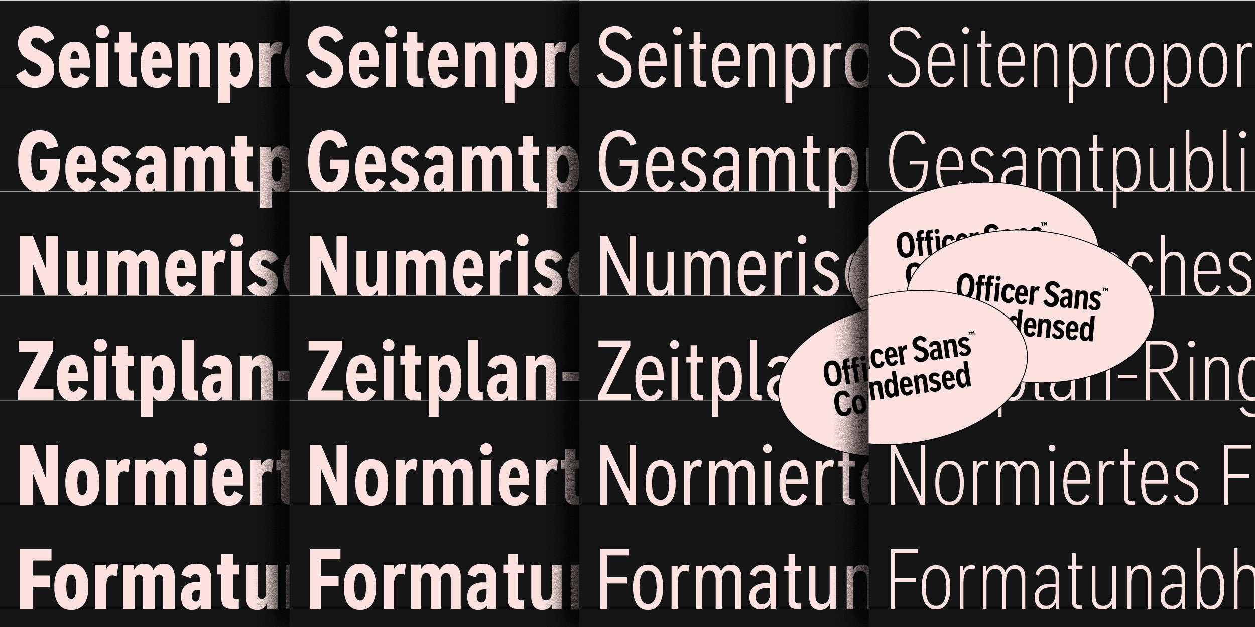
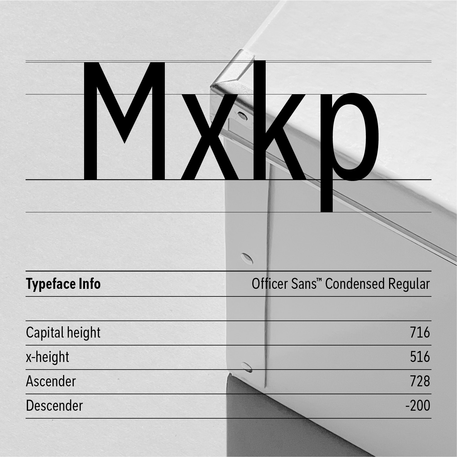
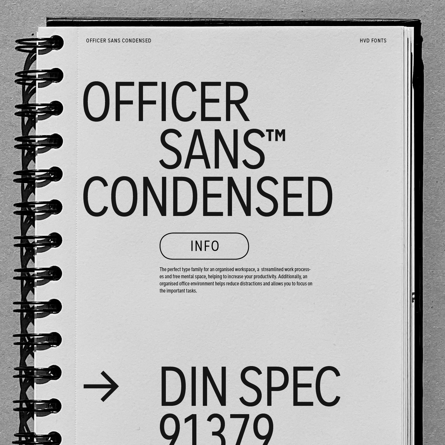
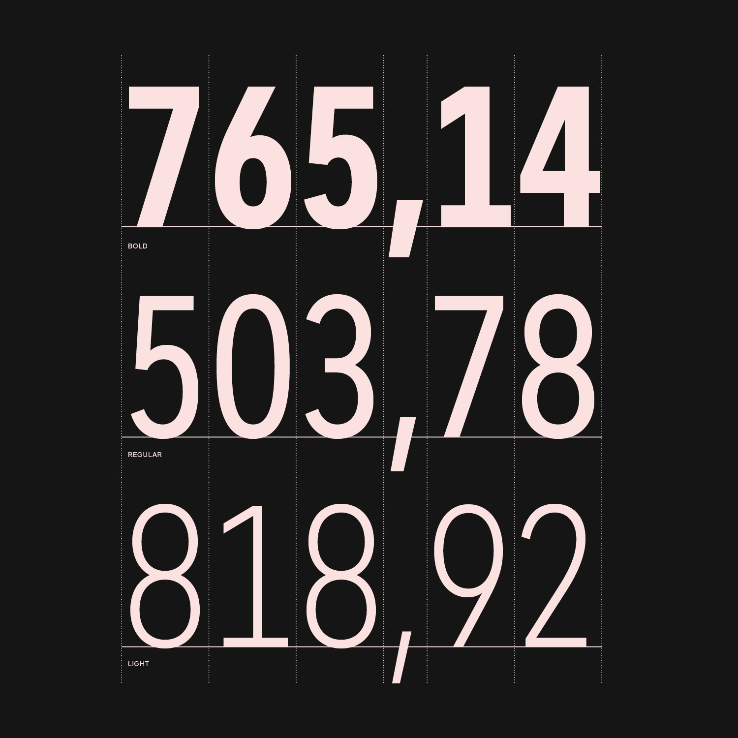
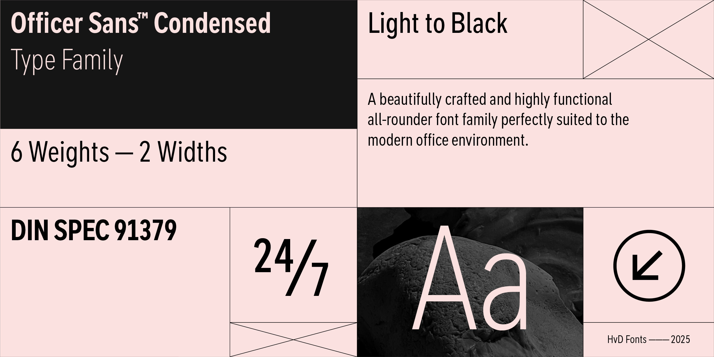
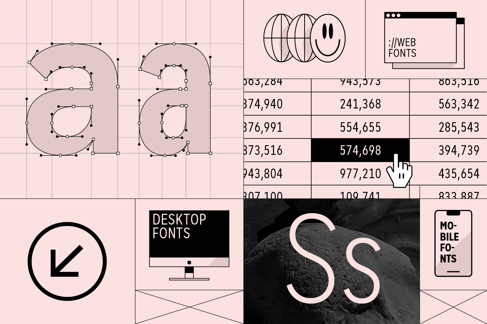
Type design is about more than crafting beautiful letters. In your day-to-day business, you don’t need flashy and fashionable — you need fonts that will always get the job done, a typographic workhorse. Officer Sans Condensed is a beautifully crafted and highly functional all-rounder font family perfectly suited to the modern office environment and designed to the most exacting typographic standards. It is the space saving companion to Officer Sans.

All 12 Styles
Aa
Light
Aa
Light Italic
Aa
Regular
Aa
Regular Italic
Aa
Medium
Aa
Medium Italic
Aa
Bold
Aa
Bold Italic
Aa
Heavy
Aa
Heavy Italic
Aa
Black
Aa
Black Italic
Buy

MATCHING PRINCIPLES
Amount of goods & services

Buy

FINANCIAL STATEMENT
Strategies and performance

Buy

MICROECONOMICS III
Measure investment trusts

Buy

WORKING CAPITAL #1
Legal company structure

Buy

SOCIAL ENTERPRISE
Future economic growth

Buy

MICROECONOMICS #2
Original creative designs

Welcome to our office
Why we made Officer Sans

The best typefaces solve problems beautifully. Many years working across the world with large companies taught us that there is a lot of demand for a typeface solving specific challenges in the office and accounting environment. We collected all the essential and important requirements, ran the data, went back to the drawing board, and poured the results and our inspiration into a new font family that checked all the boxes — meet Officer Sans.

Designed specially for the office environment

We designed Officer Sans to exacting standards so that the fonts work perfectly and seamlessly with modern office apps like MS Office, Excel, Pages, and Numbers. That means ensuring seamless functionality with features like Style Linking in MS Office, embedding the fonts within your documents, and optimizing or hinting all the fonts for optimal rendering on screen.

360º usage

Officer Sans is remarkably versatile. Not only does it perform exceptionally in office environments, but excels at countless other typographic challenges, including remarkable performance on the web, in apps, and for server usage.

Checking all the boxes

The design of Officer Sans was not driven by whims or uncompromising ideas about what might be cool, or by the latest design fads. We had high ambitions for Officer Sans: Not only did it have to look great, but more than anything it had to be about functionality. It had to be a typeface expansive and versatile enough to meet — and even exceed — all of the numerous and complex requirements demanded by the office environment. Officer Sans is a professionally crafted workhorse that excels in and out of the office — it’s just as happy in office apps as it is performing on the web or as a modern corporate typeface.

Comparing with the ”normal width“ Officer Sans
Officer Sans vs. Officer Sans Condensed

Officer Sans and Officer Sans Condensed have the same proportions, x-height and construction principle. Nevertheless we took the extra mile and drew Officer Sans Condensed from scratch to fullfill all requirements of a well drawn condensed type family. The condensed version should fit perfectly to its bigger brother, but should need 25% less space. Officer Sans Condensed can be used alone or in combination with the normal width to solve space saving challenges …or just come up with a sophisticated narrow appearance and a focus on minimalist design.

What else?!
Broad range of styles

Besides the 4 basic styles (Regular, Italic, Bold, Bold Italic) which are free for personal use, the commercial Officer Sans family consists of 24 Styles. A large type family is able to solve all kinds of typographic challenges. From multiple widths and weights we have you covered. From a light touch to bold for emphasis or that super-heavy and hard-hitting Black weight, whatever you need, Officer Sans is prepared for every eventuality.

Broad language support (DIN SPEC 91379)

DIN SPEC 91379 is a German standard that specifies the characters and standards for representing names and other text data in electronic systems within the EU. It is designed to promote accessibility, consistency and compatibility while transmitting data between various systems and applications to prevent errors and misunderstandings. DIN SPEC 91379 also covers some non-European languages that use Latin script, like Vietnamese, for example. Officer Sans fonts are DIN SPEC 91379-compliant. In addition to its extended Latin character set, supporting the most common Latin-based languages, Officer Sans also comes with support for Greek and Cyrillic, helping your company on the international stage.


Putting a typeface to use brings it to life
Officer Sans Cond GIF Web
Officer Sans Cond1500x1500
Officer Sans Cond1500x15003
Officer Sans Cond1500x15002

OpenType features — beyond the tax return

Rich OpenType features support ensure superb typography for users in all contemporary layout applications. So whether you’re completing a tax return, drafting a memo, or serving a blog or website, Officer Sans is there for you.

Graphic: 3 3/4 Units

Fractions

Whenever fractions are required, OpenType code ensures that whenever you type numbers divided by a slash, they are automatically replaced by a proper fraction.

Default Tabular Figures

Tabular figures have the same width, which is useful for setting up invoices, tables or every other task where the figures should have a structured appearance among themselves. Nevertheless the proportional figures can be activated through the OpenType Proportional Figures feature.

Format2

Subscript

A subscript, as its name suggests, is a character that sits just below the baseline. Subscripts are used in formulas, mathematical equations, and specifications of chemical compounds and isotopes, yet they can be used in many other areas too. These characters are not simply shrunken versions of their full-size counterparts, but have been carefully optically adjusted to ensure visual continuity and legibility.

Combining new features3

Superscript

A superscript is a character that is set slightly above the line of type. It has the same weight and size like a subscript character. They are also used in formulas, mathematical expressions and text references, but can have many other uses as well.


Enjoy this typeface?

Buy