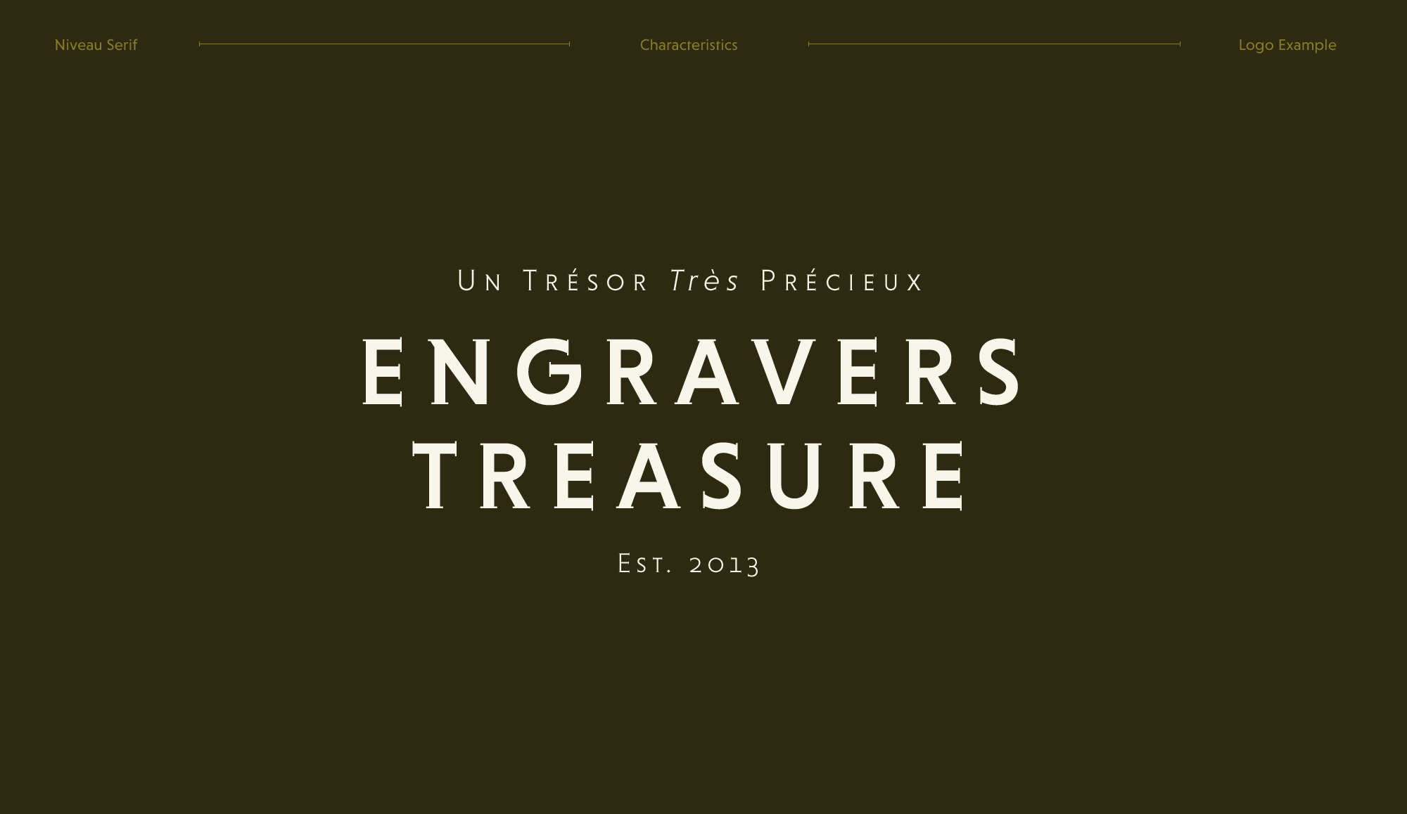
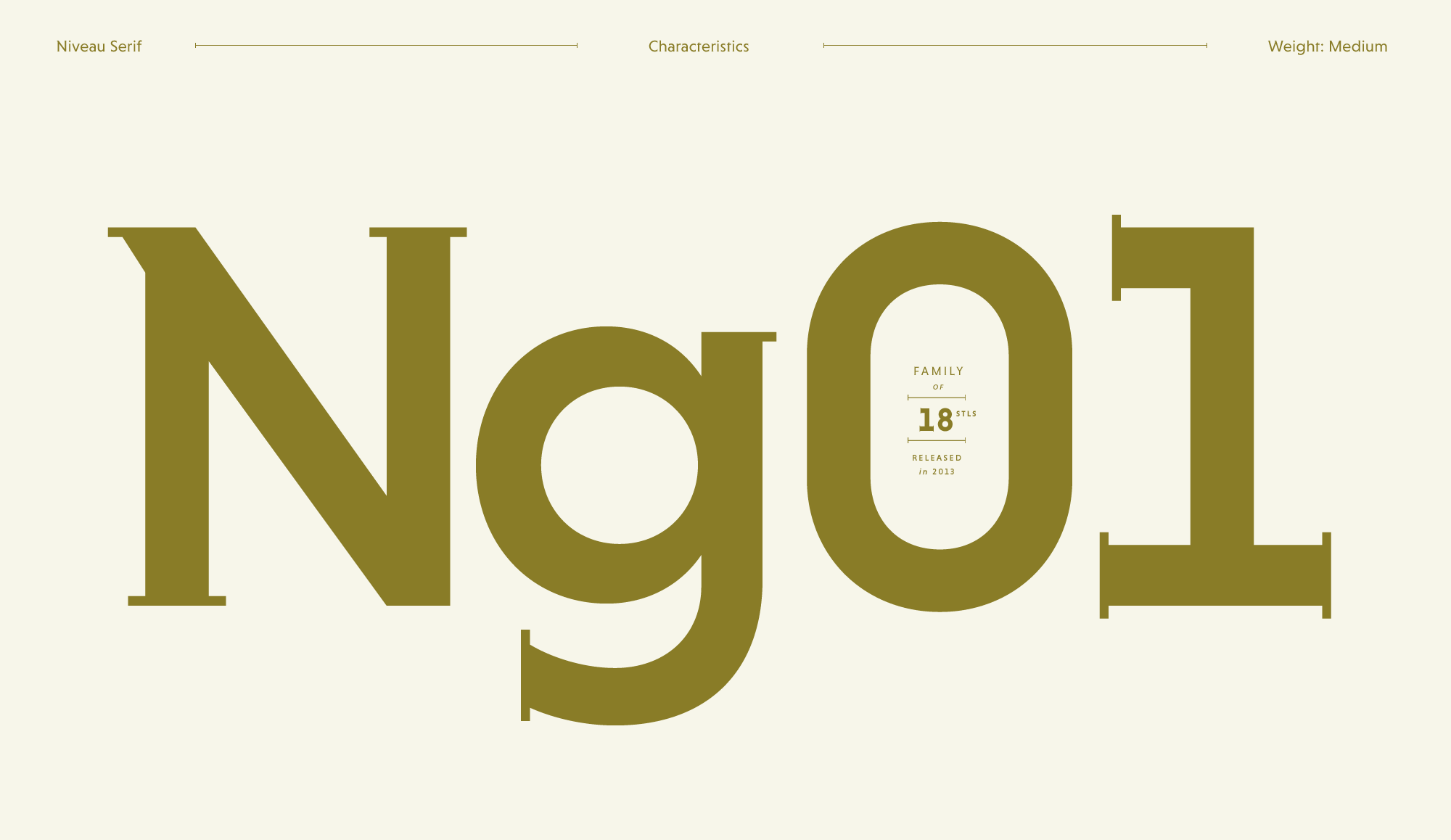
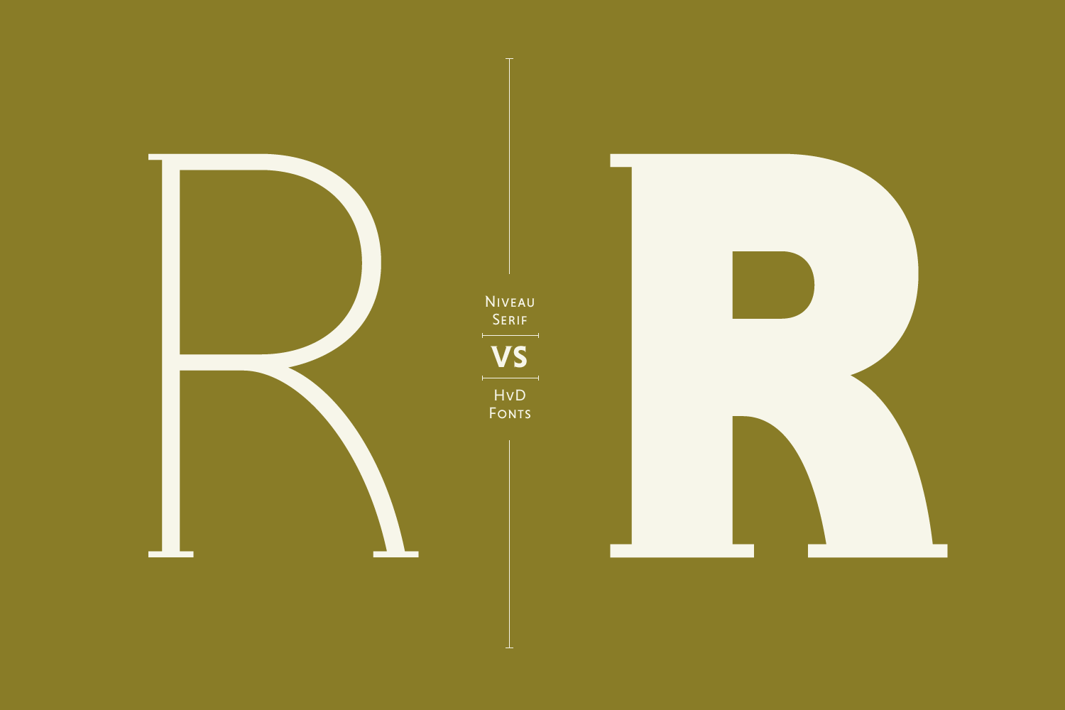
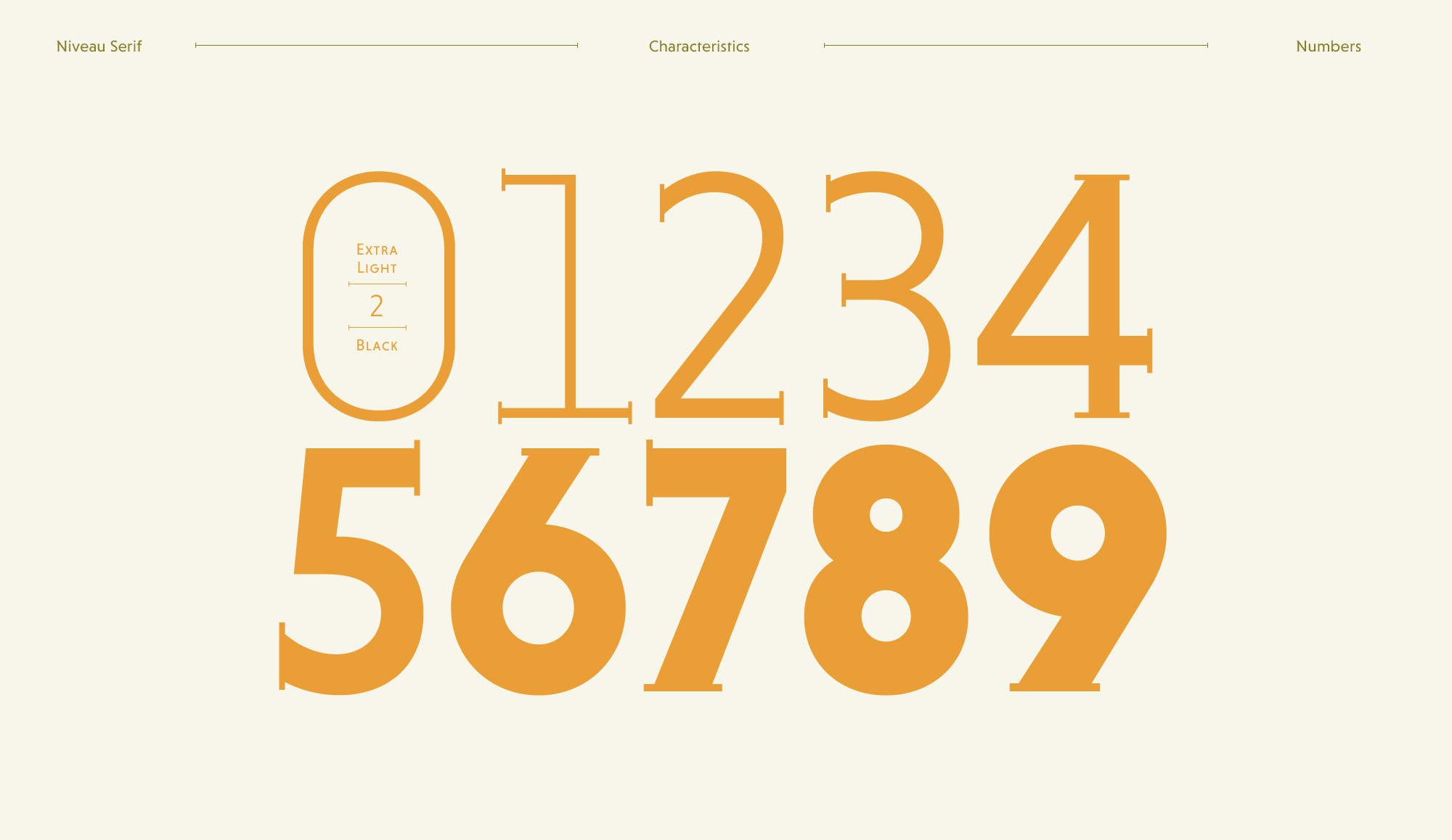
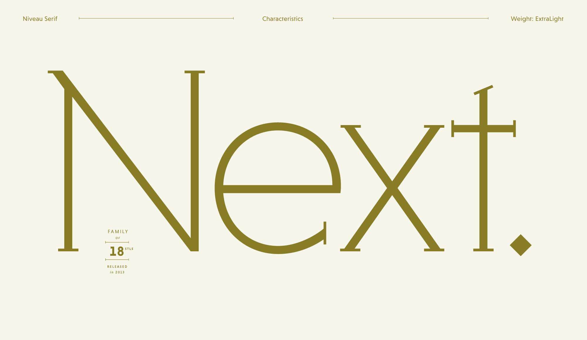
Niveau Serif is a geometric type family of six weights plus matching italics & small caps. Equipped with tiny serifs pointing outwards, Niveau Serif can be seen as an homage to the classical nineteenth century engravers faces, like Copperplate by Frederic W. Goudy. This kind of typeface was popular in the 1950’s and 1960’s for banks, doctors or lawyers. Today, these engravers typefaces often feel outdated and there is nearly no contemporary approach on the market. Niveau Serif combines the architecture of a contemporary typeface with the flair and elegance from these days and it comes with a sans serif companion called Niveau Grotesk.
INDIVIDUAL IDEAS
Gemological technique
PRINCIPAL BUSINESS
Aesthetic consideration
PREHISTORIC ART
Branch of philosophy II
INTERPRETATIONS
Biggest Grand Canyon
STRONG EMOTIONS
Experienced audience
DISTINGUISHABLE
Domain of knowledge
Lorem ipsum dolor sit amet, consetetur sadipscing elitr, sed diam nonumy eirmod tempor invidunt ut labore et dolore magna aliquyam erat, sed diam voluptua. At vero eos et accusam et justo duo dolores et ea rebum. Stet clita kasd gubergren, no sea takimata sanctus est Lorem ipsum dolor sit amet. Lorem ipsum dolor sit amet, consetetur sadipscing elitr, sed diam nonumy eirmod tempor invidunt ut labore et dolore magna aliquyam erat, sed diam voluptua. At vero eos et accusam et justo duo dolores et ea rebum.
A font of today’s needs has to include more than just the alphabet and some punctuation. Besides a big number of accented letters, making sure that the typeface has a good language support, a font should include several features for excellent typographic work joining forces with the layout applications of the time and of course the user. Here is a selection of what this font family has to offer under the hood.
Avalanche
Besides the standard letters a font sometimes contains several versions of a letter called alternates. You can exchange the alternate with the standard letter by selecting it through the Opentype feature panel and every letter of the stylistic set will be exchanged. Often this results in a totally different optical appearance of the typeface.
4/5 of my thoughts are about gold
If fractions are needed anywhere an OpenType code makes sure that if you type any numbers combined with a slash between a fraction will automatically be substituted.
Falling into 50123 pieces
When lining figures are used in a reading text they often produce a visual stretch in the text and disturb the grey value. It has the same effect if you use ALL CAPS in a text. One solution could be to make the numbers slightly smaller and give them some more space in-between. The other, more elegant way is to use the old style figures, they have ascenders and descenders like the lower case letters and will fit seamlessly in the text.
H2C6O8
A subscript is a character that is set slightly below the normal line of type. They are used in formulas, mathematical expressions, and specifications of chemical compounds and isotopes, but can have many other uses as well. These characters are not simply ordinary characters reduced in size – to keep them visually consistent with the rest of the font, they are slightly heavier than a reduced-size character would be.
Millionaire2
A superscript is a character that is set slightly above the line of type. It has the same weight and size like a subscript character. They are also used in formulas, mathematical expressions and text references, but can have many other uses as well.
The idea behind the Niveau families was to create a super family consisting of a clean and precise sans family which is combinable with a more extroverted serif family. The two genres have the same skeleton but details and several letters are totally different. So each family work on its own and doesn't need its related counterpart – but they are also made to work together to unfold a unique strength. → Check out Niveau Grotesk.
Afar, Afrikaans, Albanian, Basque, Belarusian, Bislama, Bosnian, Breton, Catalan, Chamorro, Chichewa, Comorian, Croatian, Czech, Danish, Dutch, English, Esperanto, Estonian, Faroese, Fijian, Filipino/Tagalog, Finnish, Flemish, French, Gaelic, Gagauz, German, Gikuyu, Gilbertese/Kiribati, Haitian-Creole, Hawaiian, Hungarian, Icelandic, Indonesian, Irish, Italian, Javanese, Kashubian, Kinyarwanda, Kirundi, Latin, Latvian, Lithuanian, Luba/Ciluba/Kasai, Luxembourgish, Malagasy, Malay, Maltese, Maori, Marquesan, Moldovan/Romanian, Montenegrin, Nauruan, Ndebele, Norwegian, Oromo, Palauan/Belauan, Polish, Portuguese, Quechua, Romanian, Romansh, Sami, Samoan, Sango, Serbian, Sesotho, Setswana, Seychellois-Creole, Swazi, Silesian, Slovak, Slovenian, Somali, Sorbian, Sotho, Spanish, Swahili, Swedish, Tahitian, Tetum, Tok-Pisin, Tongan, Tsonga, Tswana, Turkish, Turkmen, Tuvaluan, Uzbek, Wallisian, Walloon, Welsh, Xhosa, Zulu
Enjoy this typeface?
Other buying Options: Fontspring.com, FontShop.com