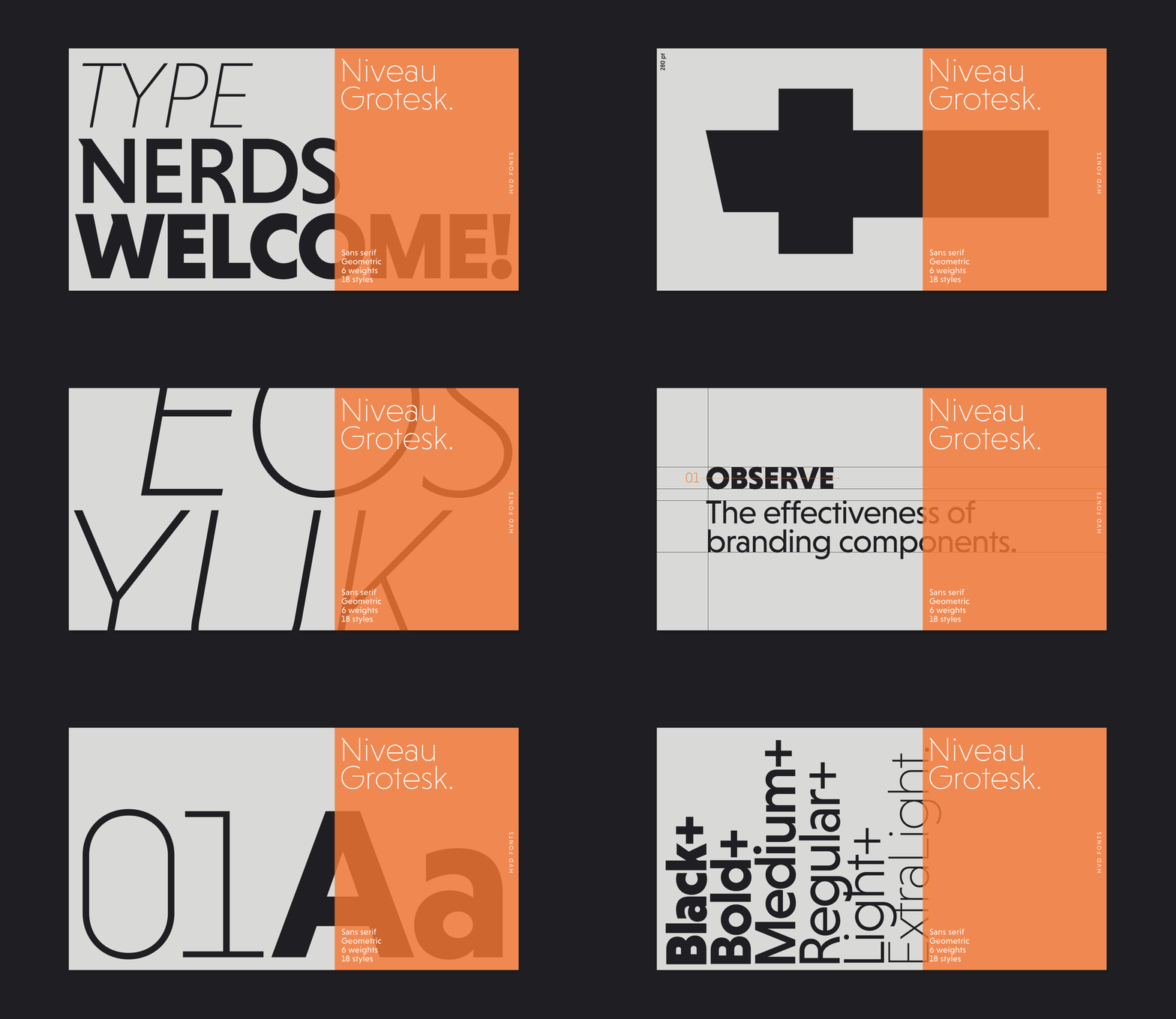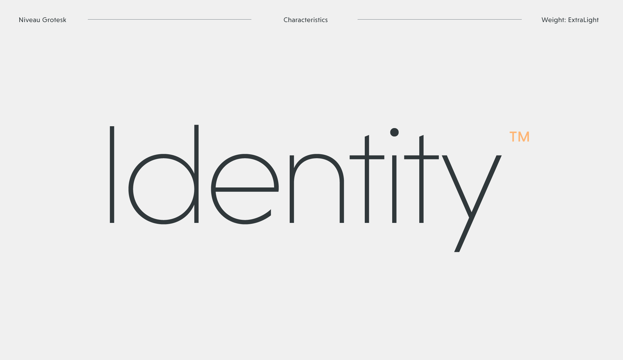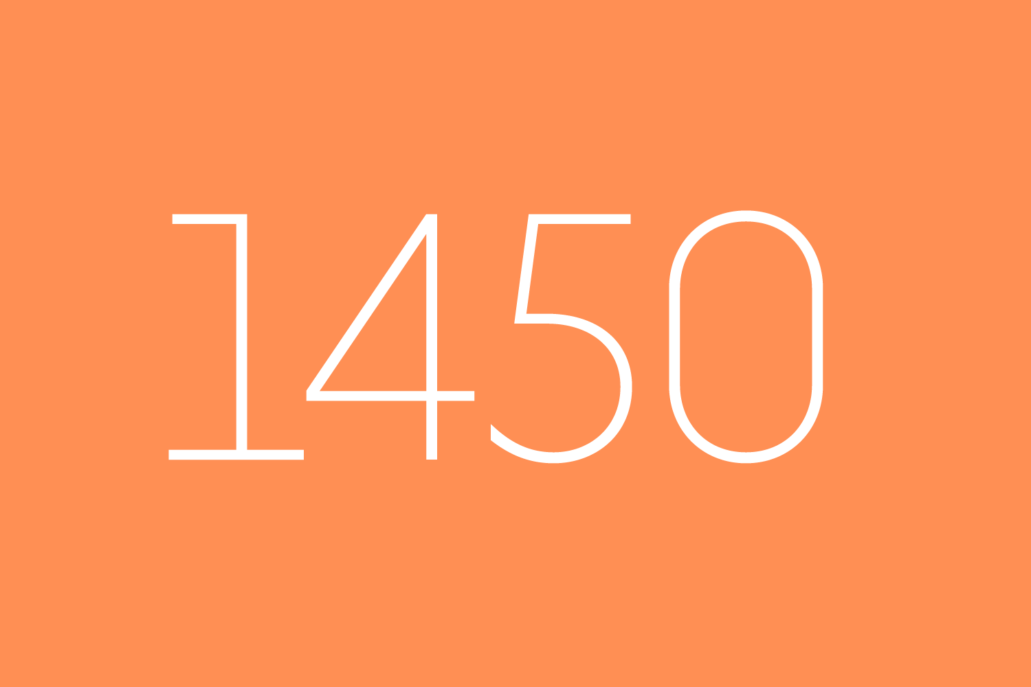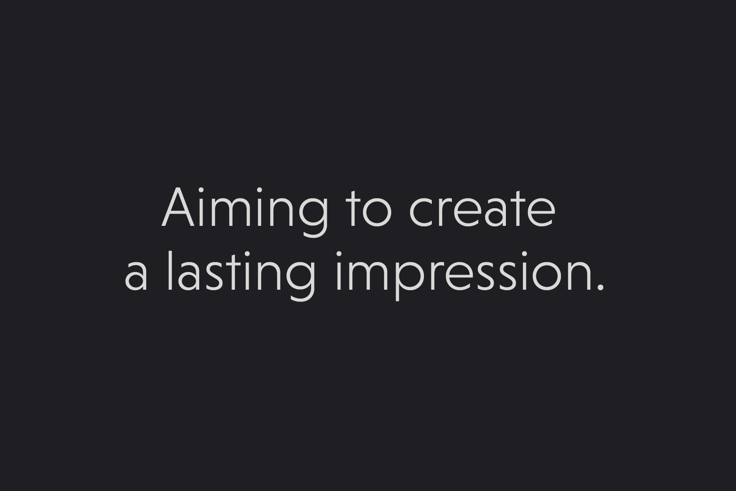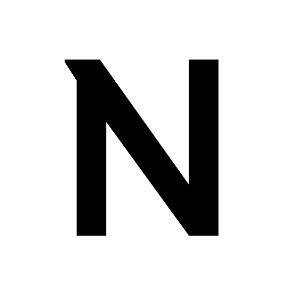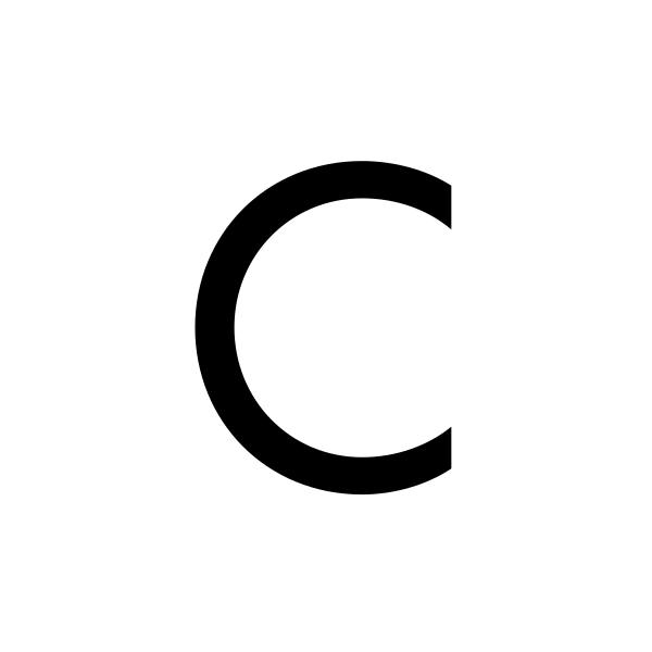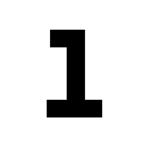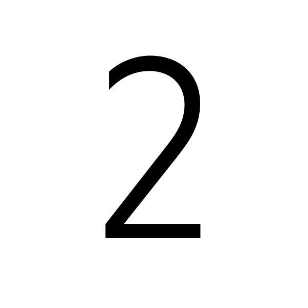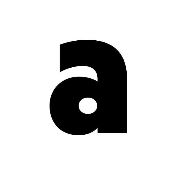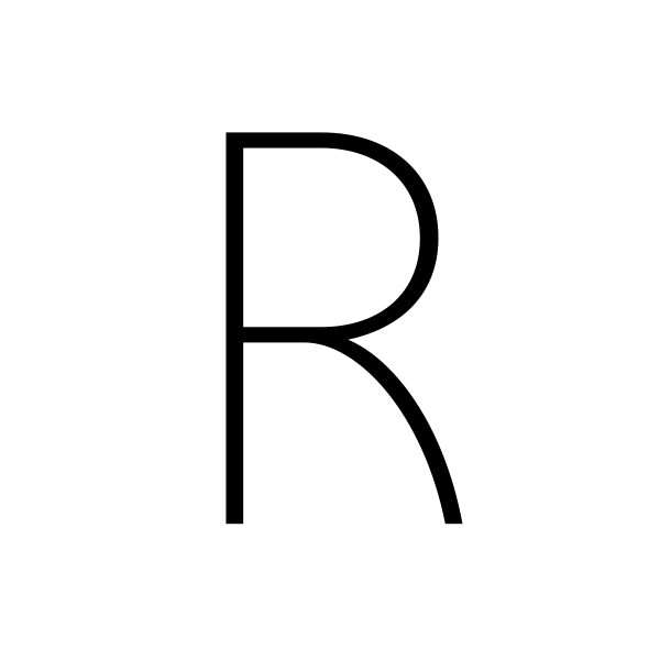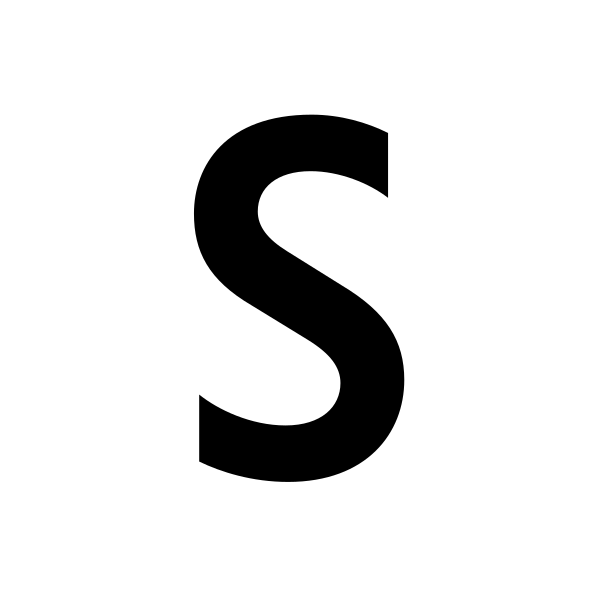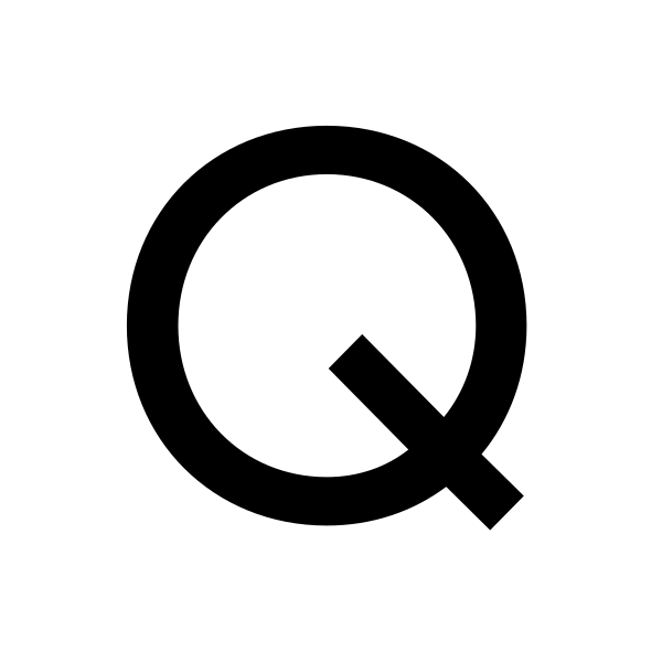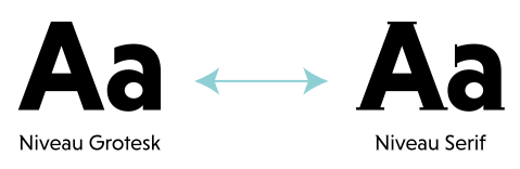
Niveau Grotesk is influenced by classical nineteenth-century faces, the fonts are based on geometric forms. Because of its straight architecture, it punches in big sizes but is very legible in smaller sizes and longer texts — in print or on screen. The Fonts is equipped for complex, professional typography with alternate letters, arrows, fractions and an extended character set to support Central and Eastern European as well as Western European Languages.
HIGHWAY PATROL
Speed 67 Automobile
MANUFACTURED
Components & Engines
DEVELOPMENTS
New Flagship Model
COMPONENT 24
Architecture of Luxury
AERODYNAMICS
All-time high Record
Carburetor 5
Lorem ipsum dolor sit amet, consetetur sadipscing elitr, sed diam nonumy eirmod tempor invidunt ut labore et dolore magna aliquyam erat, sed diam voluptua. At vero eos et accusam et justo duo dolores et ea rebum. Stet clita kasd gubergren, no sea takimata sanctus est Lorem ipsum dolor sit amet. Lorem ipsum dolor sit amet, consetetur sadipscing elitr, sed diam nonumy eirmod tempor invidunt ut labore et dolore magna aliquyam erat, sed diam voluptua. At vero eos et accusam et justo duo dolores et ea rebum.
When I started to design Niveau Grotesk I had several ideas on this geometric sans. I always admired the creativity and ideas of ITC Serif Gothic (Herb Lubalin, Antonio DiSpigna, 1974) and ITC Kabel (Rudolf Koch, Victor Caruso, 1927/1976). To my eyes these type families are super creative but from todays point of view they felt a bit clunky and antiquated. I also loved the Avant Garde type family (Herb Lubalin, 1968) with its geometric skeleton and extravagant letterforms. All these type faces are not very useful for reading sizes and longer texts. Influenced by these great, classic forms I was motivated to create a totally new typeface – smoother, timeless and good for reading sizes.
Niveau Grotesk should feel reduced but it also should have the attitude to be extravagant. Niveau Grotesk inspires the viewer with its self confidence, but it can also handle the hard work: longer texts and reading sizes. For those who still want to get one step further I created an additional family based on Niveau Grotesk with tiny serifs quoting the typefaces of the engraving era: Niveau Serif.
A font of today’s needs has to include more than just the alphabet and some punctuation. Besides a big number of accented letters, making sure that the typeface has a good language support, a font should include several features for excellent typographic work joining forces with the layout applications of the time and of course the user. Here is a selection of what this font family has to offer under the hood.
Material
Besides the standard letters a font sometimes contains several versions of a letter called alternates. You can exchange the alternate with the standard letter by selecting it through the Opentype feature panel and every letter of the stylistic set will be exchanged. Often this results in a totally different optical appearance of the typeface.
2/3 of my thoughts are about fashion
If fractions are needed anywhere an OpenType code makes sure that if you type any numbers combined with a slash between a fraction will automatically be substituted.
I am falling into 34810 pieces
When lining figures are used in a reading text they often produce a visual stretch in the text and disturb the grey value. It has the same effect if you use ALL CAPS in a text. One solution could be to make the numbers slightly smaller and give them some more space in-between. The other, more elegant way is to use the old style figures, they have ascenders and descenders like the lower case letters and will fit seamlessly in the text.
H2O6CH
A subscript is a character that is set slightly below the normal line of type. They are used in formulas, mathematical expressions, and specifications of chemical compounds and isotopes, but can have many other uses as well. These characters are not simply ordinary characters reduced in size – to keep them visually consistent with the rest of the font, they are slightly heavier than a reduced-size character would be.
High Class3
A superscript is a character that is set slightly above the line of type. It has the same weight and size like a subscript character. They are also used in formulas, mathematical expressions and text references, but can have many other uses as well.
The idea behind Niveau was to create a super family consisting of a clean and precise sans family which is combinable with a more extroverted serif family. The two genres have the same skeleton but details and several letters are totally different. So each family work on its own and doesn't need its related counterpart – but they are also made to work together to unfold a unique strength. → Check out Niveau Serif.
Afar, Afrikaans, Albanian, Basque, Belarusian, Bislama, Bosnian, Breton, Catalan, Chamorro, Chichewa, Comorian, Croatian, Czech, Danish, Dutch, English, Esperanto, Estonian, Faroese, Fijian, Filipino/Tagalog, Finnish, Flemish, French, Gaelic, Gagauz, German, Gikuyu, Gilbertese/Kiribati, Haitian-Creole, Hawaiian, Hungarian, Icelandic, Indonesian, Irish, Italian, Javanese, Kashubian, Kinyarwanda, Kirundi, Latin, Latvian, Lithuanian, Luba/Ciluba/Kasai, Luxembourgish, Malagasy, Malay, Maltese, Maori, Marquesan, Moldovan/Romanian, Montenegrin, Nauruan, Ndebele, Norwegian, Oromo, Palauan/Belauan, Polish, Portuguese, Quechua, Romanian, Romansh, Sami, Samoan, Sango, Serbian, Sesotho, Setswana, Seychellois-Creole, Swazi, Silesian, Slovak, Slovenian, Somali, Sorbian, Sotho, Spanish, Swahili, Swedish, Tahitian, Tetum, Tok-Pisin, Tongan, Tsonga, Tswana, Turkish, Turkmen, Tuvaluan, Uzbek, Wallisian, Walloon, Welsh, Xhosa, Zulu
Enjoy this typeface?
Other buying Options: Fontspring.com, FontShop.com