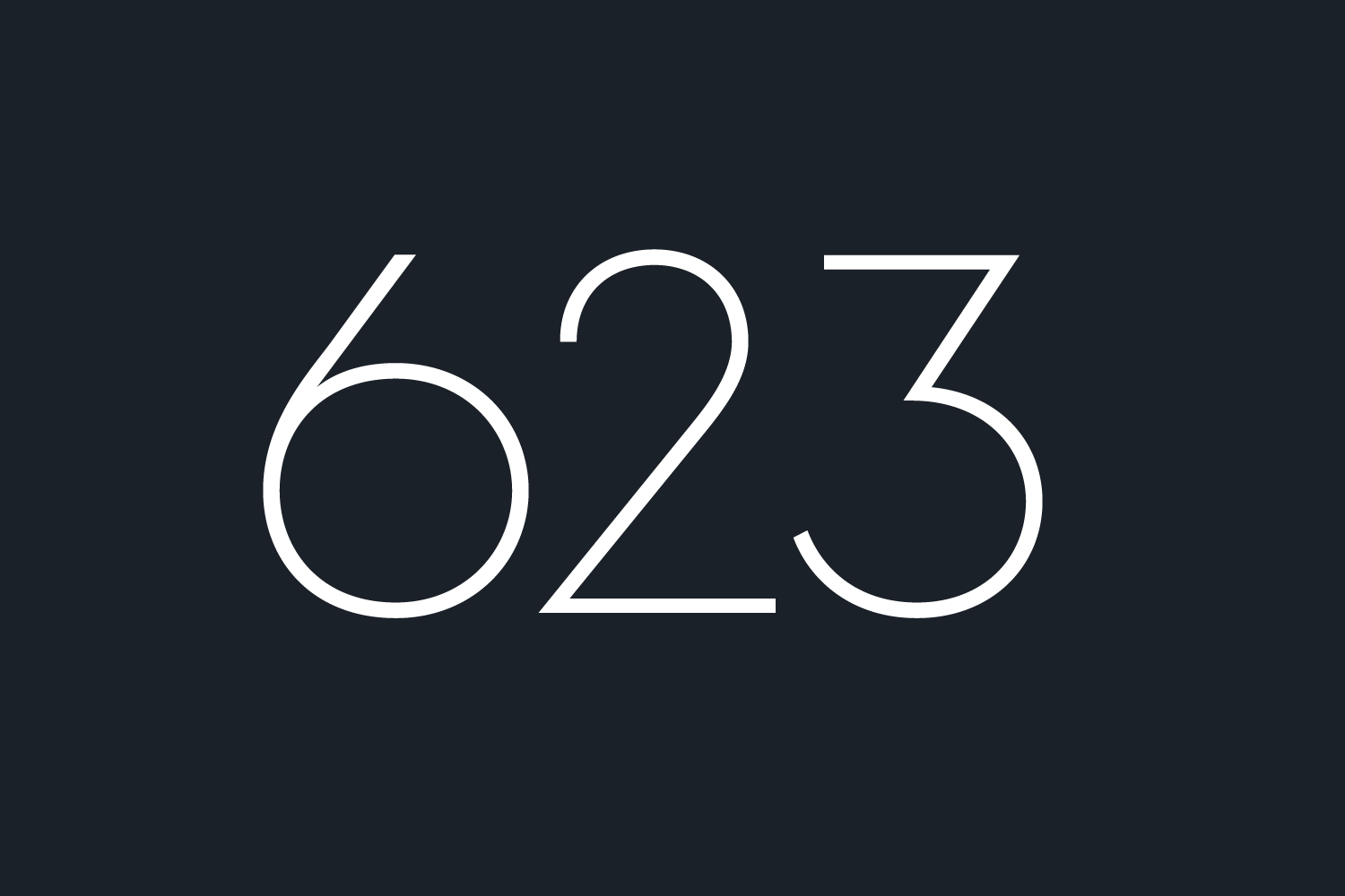
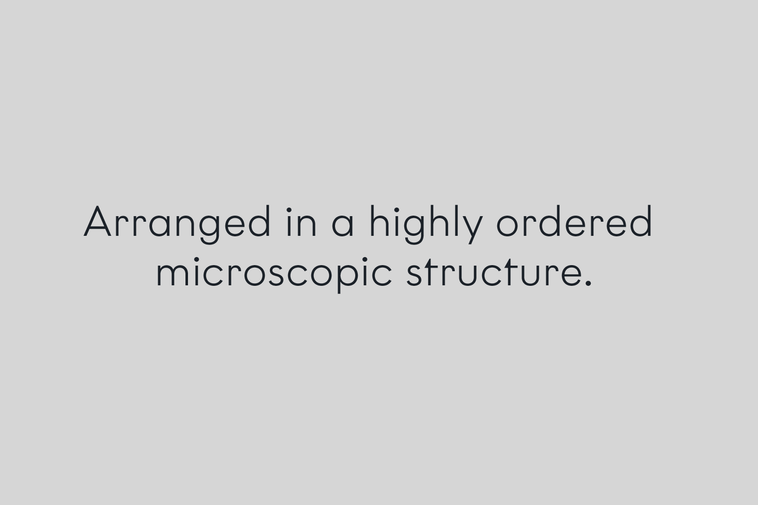
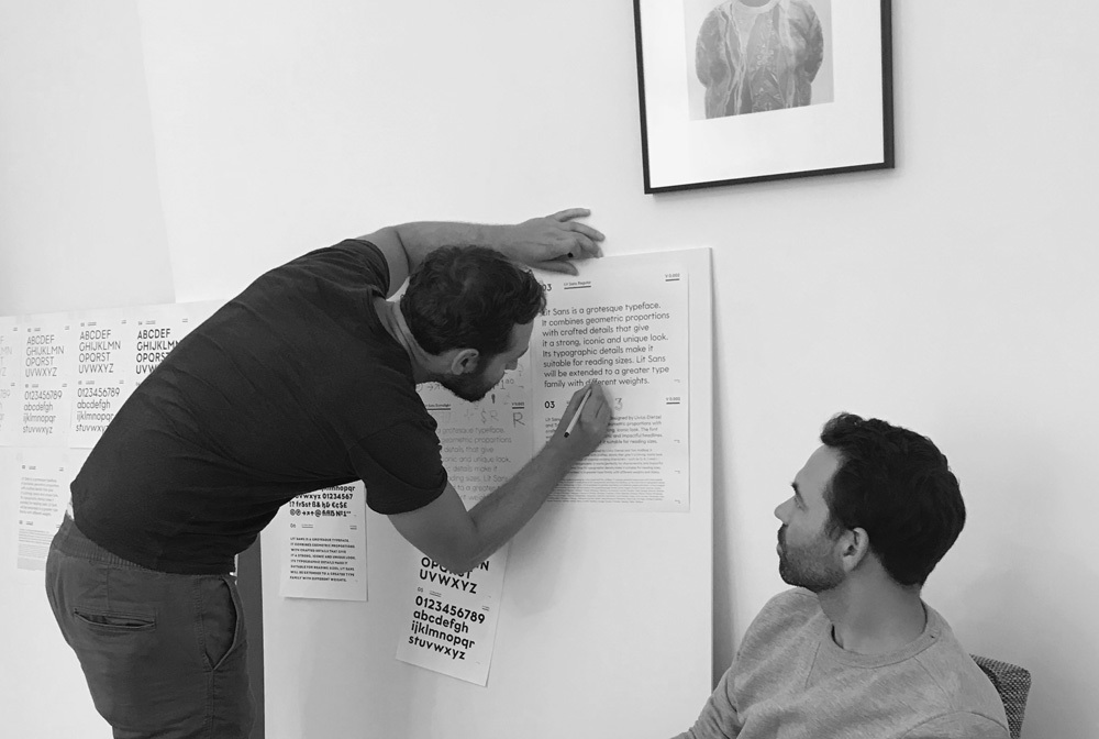
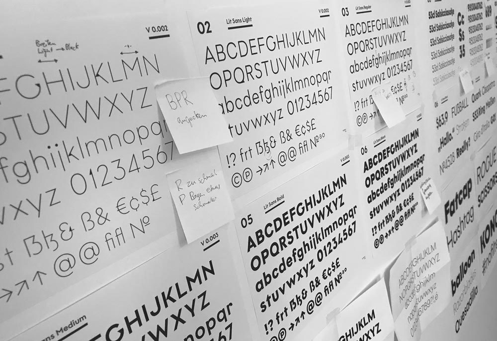
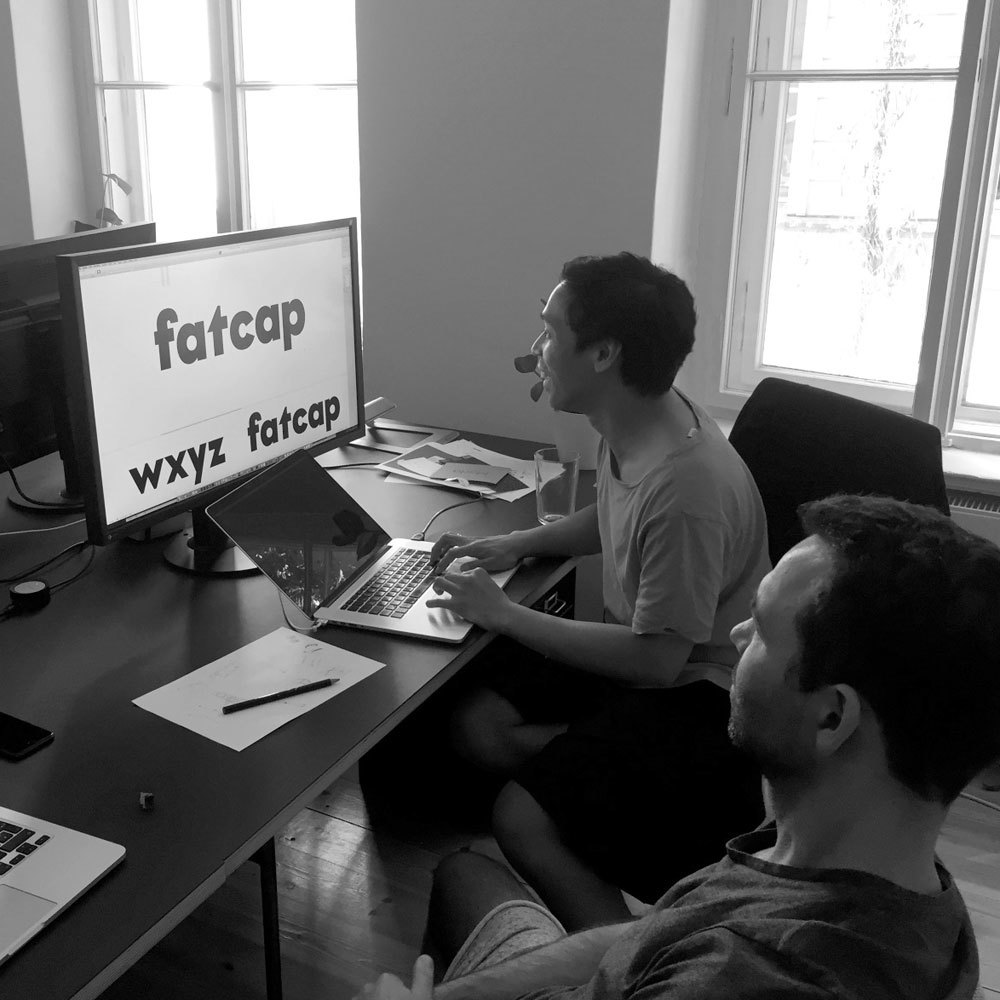
Graphit is a typeface designed by Lit Design Studio, curated by HvD Fonts. Livius Dietzel and Tom Hoßfeld are combining clear, geometric shapes with edgy, crafted details. Following the essence of geometry — featuring a selection of typographic elements that are shaped out of the triangle.
THUNDERBOLT 3
Blinded by an Arrow
GEOGRAPHER 12
From early traditions
METAMORPHIC
Earth’s land surface
TRANSFØRMING
Continental Collision
HYPOTHESIS 54
Rising Temperature
SUBSTANCES 92
Mineral Composition
Lorem ipsum dolor sit amet, consetetur sadipscing elitr, sed diam nonumy eirmod tempor invidunt ut labore et dolore magna aliquyam erat, sed diam voluptua. At vero eos et accusam et justo duo dolores et ea rebum. Stet clita kasd gubergren, no sea takimata sanctus est Lorem ipsum dolor sit amet. Lorem ipsum dolor sit amet, consetetur sadipscing elitr, sed diam nonumy eirmod tempor invidunt ut labore et dolore magna aliquyam erat, sed diam voluptua. At vero eos et accusam et justo duo dolores et ea rebum.
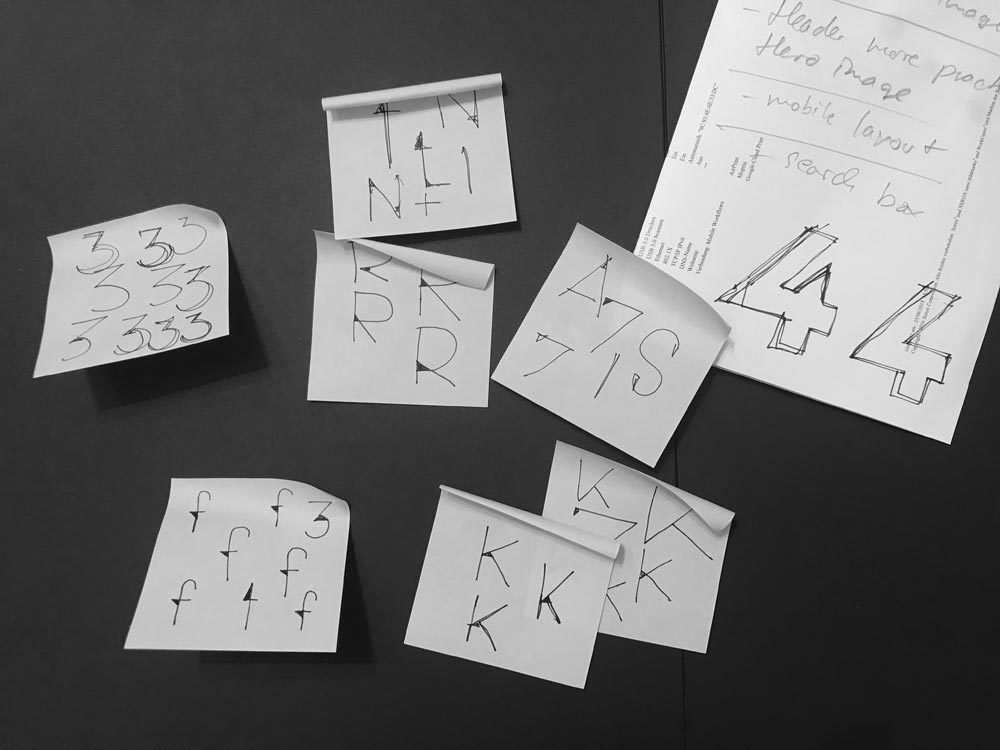
With the design of the Graphit typeface, we started a journey through the world of reduced forms, straight lines, round circles and pointy elements. Our aim was to create an inspiring and professional type family — rooted the in the idea of constructed typefaces with one distinctive difference: the triangle. So the question we kept asking ourselves was: Can we create a type family with a strict set of rules for how to construct each letter, while maintaining a homogenous character at the same time?
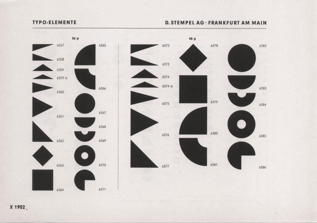
A triangle is one of the basic shapes in geometry. In the specimen displayed — a section of Futura Schmuck from the 1920s — the triangle plays a central role. In this case, the triangles are only used as decoration and graphic elements – being separated from the actual alphabet of the geometric Futura. Graphit gives the same importance to geometric elements and incorporates the triangle-shape into one of the striking main characteristics of the typeface.
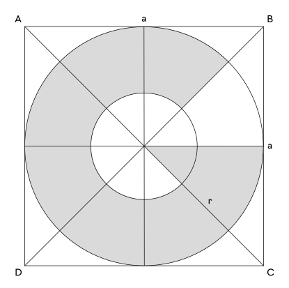
The basic idea of this type family was to create a working geometric sans out of these three geometric basic shapes: circle, square and triangle in a well balanced proportion. Similar to Futura or Erbar when it comes to geometry, but to take it even further – the extra focus on the use of the triangle. The result is an additonal flavour, delivering a suprisingly unique appearance without losing the idea of staying on the very basic geometric route.
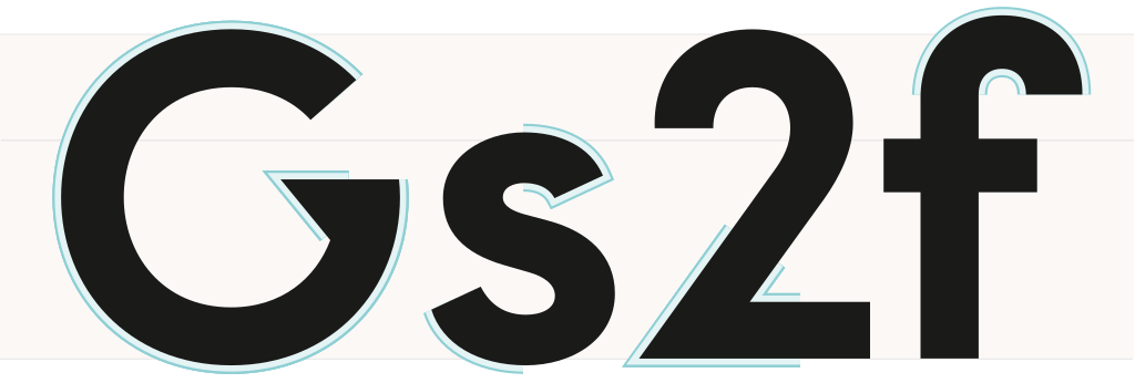
Graphit features six low-contrast weights ranging from thin to black. Every single letter has been individually crafted to make it feel distinctive and vivid. In the thin and light weights the triangle is more prominent and becomes a distinctive display element. The Medium and Regular weights are optimized for usage in copy texts. For smaller sizes and longer texts, the alternate character set features a double-storey “a” and a simplifed “f” and “r” for improved legibility. The Bold and Black weights can be set tightly for strong and bold statements.
Lit Design Studio created a wonderful website to show the Graphit type family: www.graphit-type.com
Graphit not only has an extended character set to support the most common latin based languages, but also a rich OpenType feature support. The OpenType features enable excellent typography for the users in all modern layout applications.
Offizier
If two letters have the nature to collide when used in combination a ligature is needed to solve this unwanted event. Ligatures are especially designed solutions for such letter combinations. This font contains a set of ligatures which are automatically substituted as soon as these letter combinations are typed in
Party & Animals
Besides the standard letters a font sometimes contains several versions of a letter called alternates. You can exchange the alternate with the standard letter by selecting it through the Opentype feature panel and every letter of the stylistic set will be exchanged. Often this results in a totally different optical appearance of the typeface.
I still have a 3/8 piece of Tanzanite.
If fractions are needed anywhere an OpenType code makes sure that if you type any numbers combined with a slash between a fraction will automatically be substituted.
H2O7N8
A subscript is a character that is set slightly below the normal line of type. They are used in formulas, mathematical expressions, and specifications of chemical compounds and isotopes, but can have many other uses as well. These characters are not simply ordinary characters reduced in size – to keep them visually consistent with the rest of the font, they are slightly heavier than a reduced-size character would be
CM2
A superscript is a character that is set slightly above the line of type. It has the same weight and size like a subscript character. They are also used in formulas, mathematical expressions and text references, but can have many other uses as well.
Afar, Afrikaans, Albanian, Basque, Belarusian, Bislama, Bosnian, Breton, Catalan, Chamorro, Chichewa, Comorian, Croatian, Czech, Danish, Dutch, Esperanto, Estonian, Faroese, Fijian, Filipino/Tagalog, Finnish, Flemish, French, Gaelic, Gagauz, German, Gikuyu, Gilbertese/Kiribati, Haitian-Creole, Hawaiian, Hungarian, Icelandic, Indonesian, Irish, Italian, Javanese, Kashubian, Kinyarwanda, Kirundi, Latin, Latvian, Lithuanian, Luba/Ciluba/Kasai, Luxembourgish, Malagasy, Malay, Maltese, Maori, Marquesan, Moldovan/Romanian, Montenegrin, Nauruan, Ndebele, Norwegian, Oromo, Palauan/Belauan, Polish, Portuguese, Quechua, Romanian, Romansh, Sami, Samoan, Sango, Serbian, Sesotho, Setswana, Seychellois-Creole, Swazi, Silesian, Slovak, Slovenian, Somali, Sorbian, Sotho, Spanish, Swahili, Swedish, Tahitian, Tetum, Tok-Pisin, Tongan, Tsonga, Tswana, Turkish, Turkmen, Tuvaluan, Uzbek, Wallisian, Walloon, Welsh, Xhosa, Zulu
Enjoy this typeface?
Other buying Options: Fontspring.com