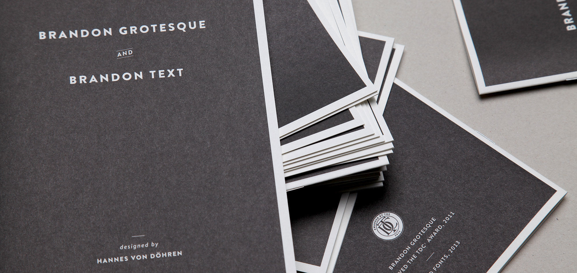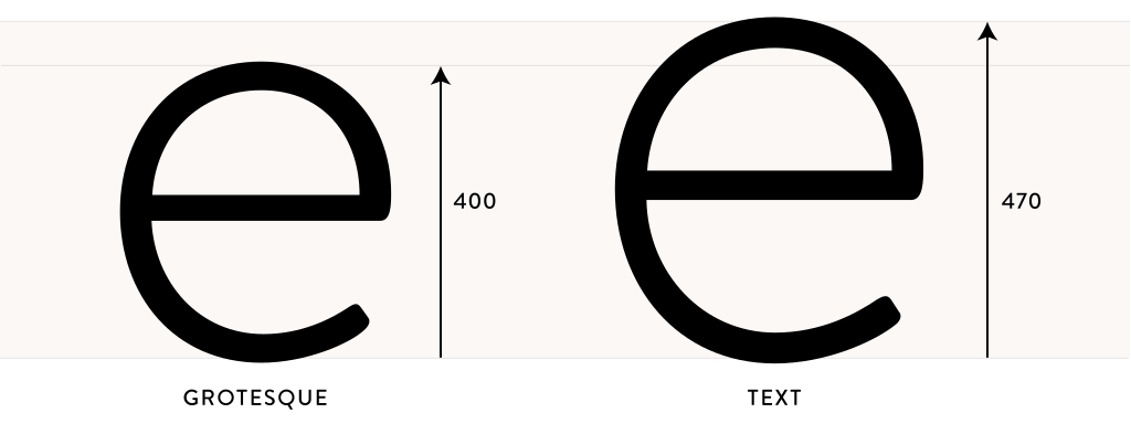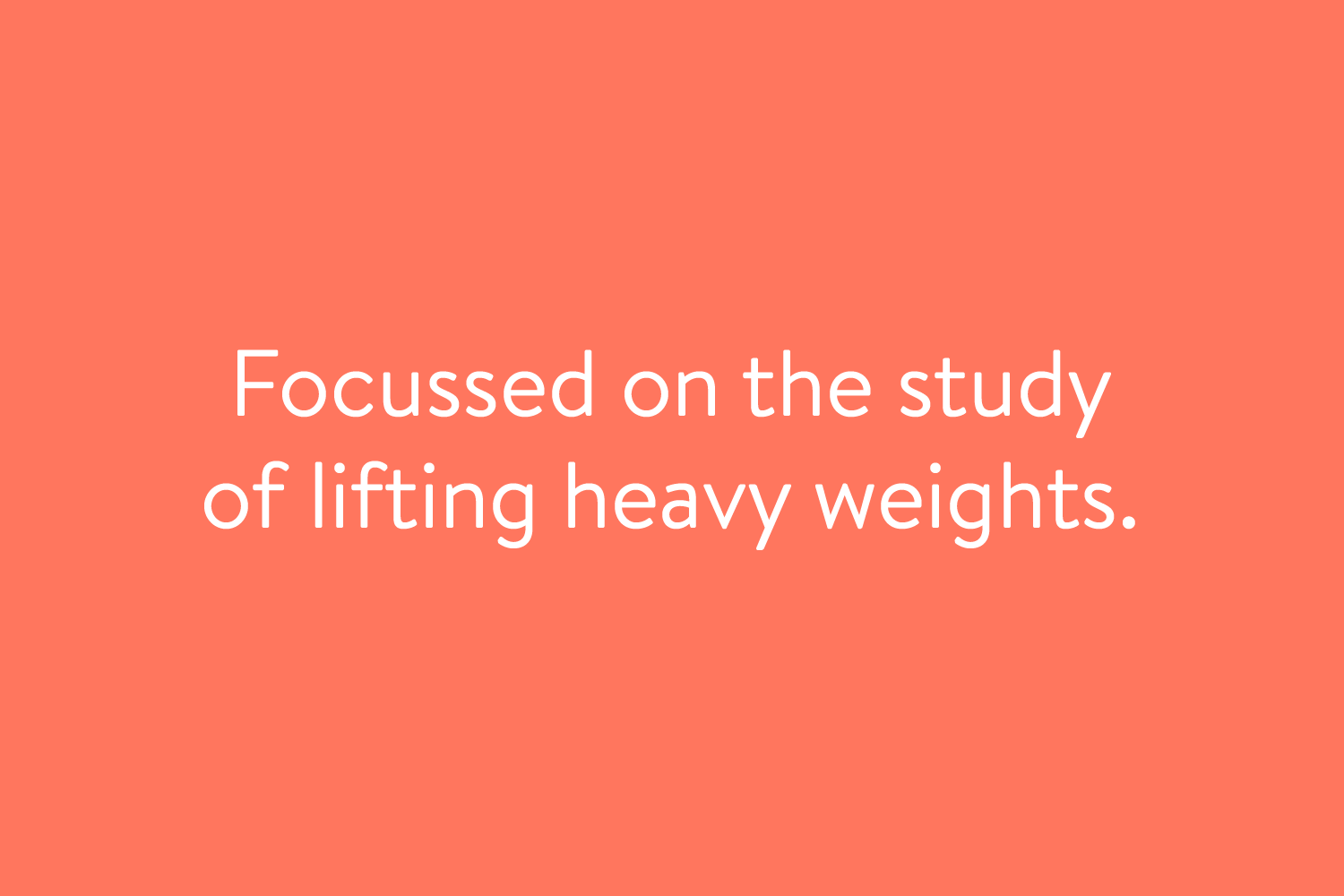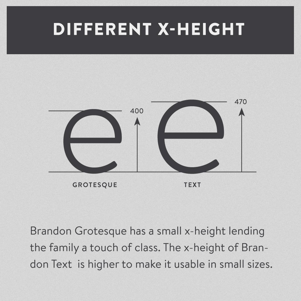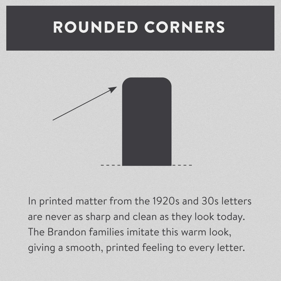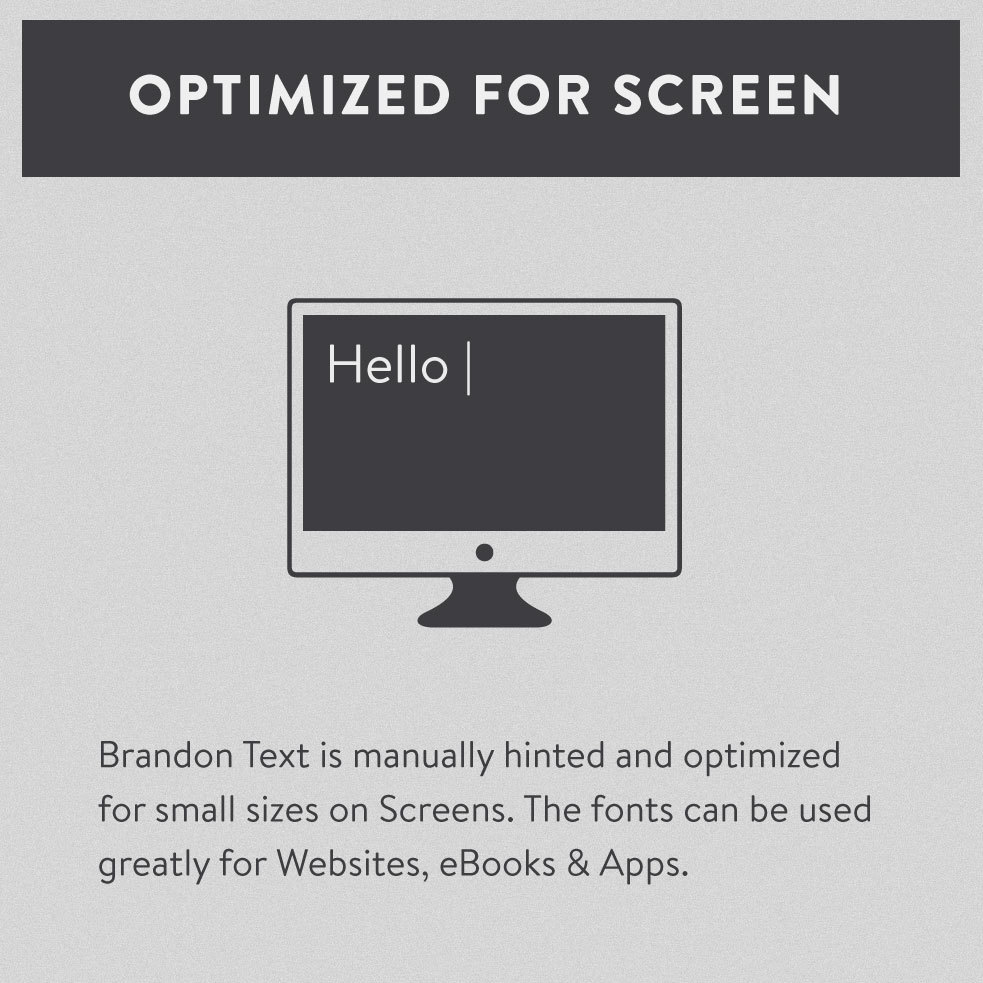
Brandon Text is the companion of the famous Brandon Grotesque type family. It has a higher x-height than the Grotesque version and is optimized for long texts, small sizes and screens. Influenced by the geometric-style sans serif faces that were popular during the 1920s and 30s, the fonts are based on geometric forms that have been optically corrected for better legibility. Brandon Text has a functional look with a warm touch and works perfectly together with Brandon Grotesque. It is manually hinted and optimized for screens, so it will be a good choice for Websites, eBooks or Apps.
MECHANISIERUNG
System & Konstruktion
HANDWERKLICH
Richtige Sortierung #1
POLYURETHAN
Relational Database
IMPROVEMENTS
Buchblockbearbeitung
TRANSACTIONS
Indexing Algorithm 3
ZEITSCHRIFTEN
Representing Values
Lorem ipsum dolor sit amet, consetetur sadipscing elitr, sed diam nonumy eirmod tempor invidunt ut labore et dolore magna aliquyam erat, sed diam voluptua. At vero eos et accusam et justo duo dolores et ea rebum. Stet clita kasd gubergren, no sea takimata sanctus est Lorem ipsum dolor sit amet. Lorem ipsum dolor sit amet, consetetur sadipscing elitr, sed diam nonumy eirmod tempor invidunt ut labore et dolore magna aliquyam erat, sed diam voluptua. At vero eos et accusam et justo duo dolores et ea rebum.
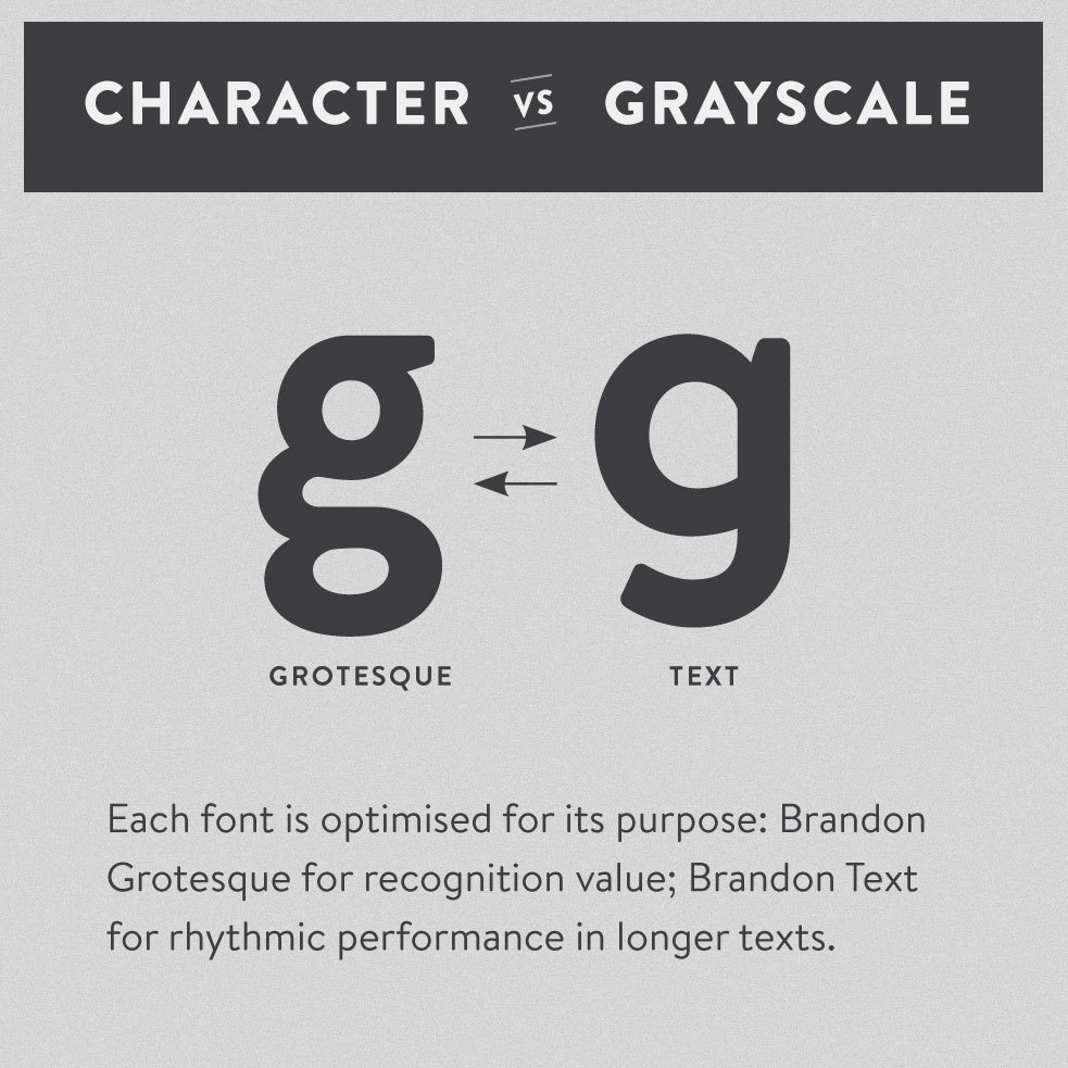
When Brandon Grotesque became a big success, people loved use it everywhere — also in their books, info letters or manuals. Although Brandon Grotesque is not the worst choice for texts, it was initially made for medium or bigger usage. There are several characteristics unfolding its strength in bigger sizes that could be made differently for small reading sizes and text blocks. We decided to create a specialist for this and offer a solution for those who appreciate the details of typography. Due to its higher x-height, new proportions and some settled down characters like the “g” or “j” Brandon Text delivers a homogenous grey value and it is the ideal choice for small sizes and long text passages.
A font of today’s needs has to include more than just the alphabet and some punctuation. Besides a big number of accented letters, making sure that the typeface has a good language support, a font should include several features for excellent typographic work joining forces with the layout applications of the time and of course the user. Here is a selection of what this font family has to offer under the hood.
We are taking 1/2 cup of Sugar
A special OpenType conding makes sure that if you type any numbers combined with a slash between a fraction will automatically be substituted.
10.987,62 €
90.811,26 €
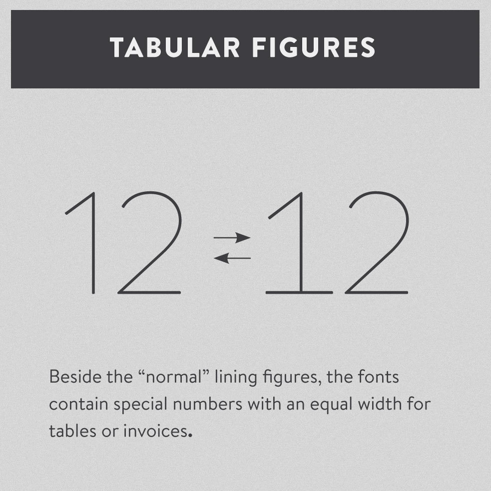
Besides the standard lining figures, the fonts also contain a set of tabular figures. This means that all numbers have the same width – useful if you want to set up invoices, tables or every other task where the figures should have a structured appearance between themselves.
Keeping paragraphs together
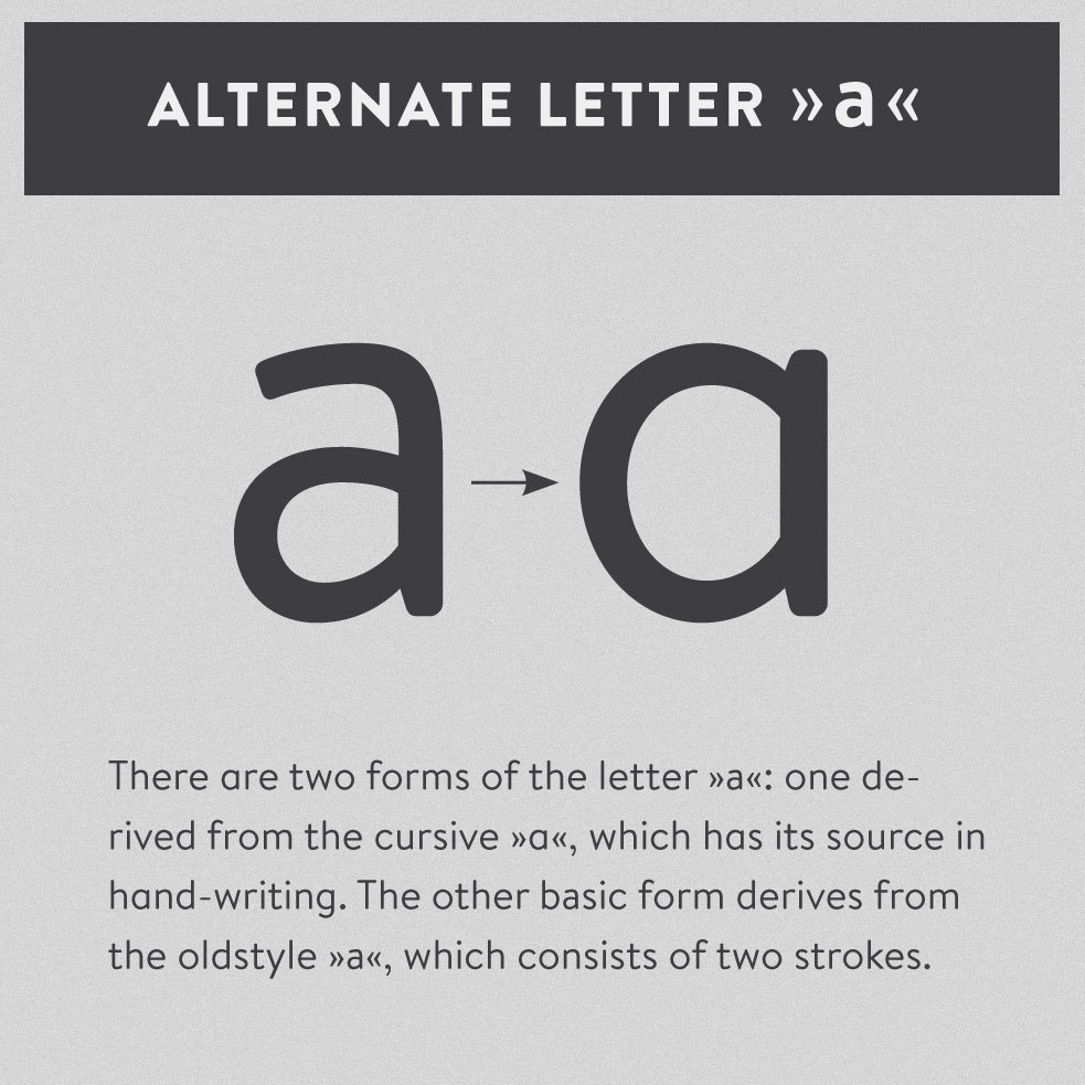
There are two forms of the letter »a«: one de-rived from the cursive »a«, which has its source in hand-writing. The other basic form derives from the oldstyle »a«, which consists of two strokes. Also the »g« is available in two forms: the simple »g« which is good for small sizes and a consistent gray value inside the text blocks and the more characterful »g« which makes a text or logo distinctive
Office Applications
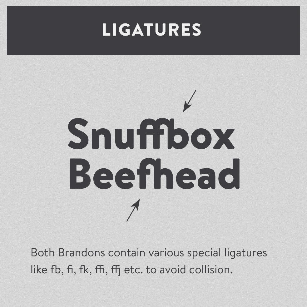
To avoid collisions of certain letters the fonts contain several nice ligatures which are automatically exchanged when these combinations occur in a word or sentence.
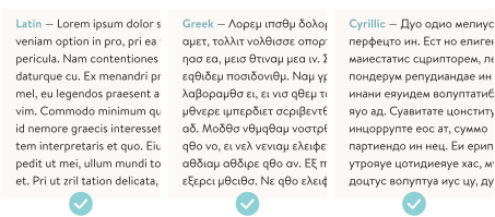
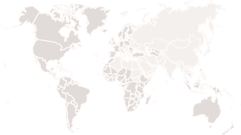
Brandon Texte has an extended character set that supports more than a hundred languages. Part of the language coverage is the support for Latin, Greek and Cyrillic script.
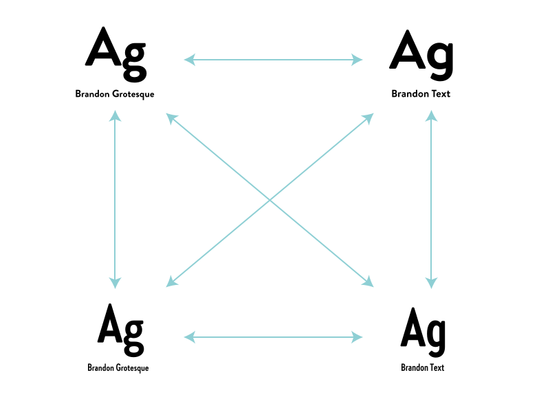
Every family member works perfectly with the others, which results in a wide range of possibilites. Due to the same architecture but the different details every family can be seen as an separate problem solver. You can combine the fonts and find the perfect match for your design. → Check out Brandon Grotesque or Brandon Text Condensed.
Latin: Afar, Afrikaans, Albanian, Basque, Belarusian, Bislama, Bosnian, Breton, Catalan, Chamorro, Chichewa, Comorian, Croatian, Czech, Danish, Dutch, Esperanto, Estonian, Faroese, Fijian, Filipino/Tagalog, Finnish, Flemish, French, Gaelic, Gagauz, German, Gikuyu, Gilbertese/Kiribati, Haitian-Creole, Hawaiian, Hungarian, Icelandic, Indonesian, Irish, Italian, Javanese, Kashubian, Kinyarwanda, Kirundi, Latin, Latvian, Lithuanian, Luba/Ciluba/Kasai, Luxembourgish, Malagasy, Malay, Maltese, Maori, Marquesan, Moldovan/Romanian, Montenegrin, Nauruan, Ndebele, Norwegian, Oromo, Palauan/Belauan, Polish, Portuguese, Quechua, Romanian, Romansh, Sami, Samoan, Sango, Serbian, Sesotho, Setswana, Seychellois-Creole, Swazi, Silesian, Slovak, Slovenian, Somali, Sorbian, Sotho, Spanish, Swahili, Swedish, Tahitian, Tetum, Tok-Pisin, Tongan, Tsonga, Tswana, Turkish, Turkmen, Tuvaluan, Uzbek, Wallisian, Walloon, Welsh, Xhosa, Zulu. Cyrillic: Belarusian, Bosnian, Bulgarian, Chechen, Macedonian, Ossetic, Russian, Serbian, Ukrainian, Uzbek. Greek: Greek.
Enjoy this typeface?
Other buying Options: Fontspring.com