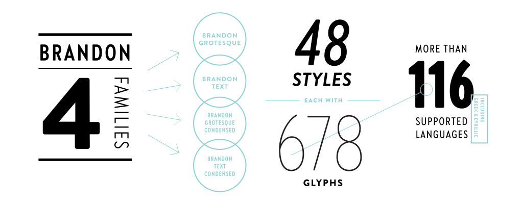
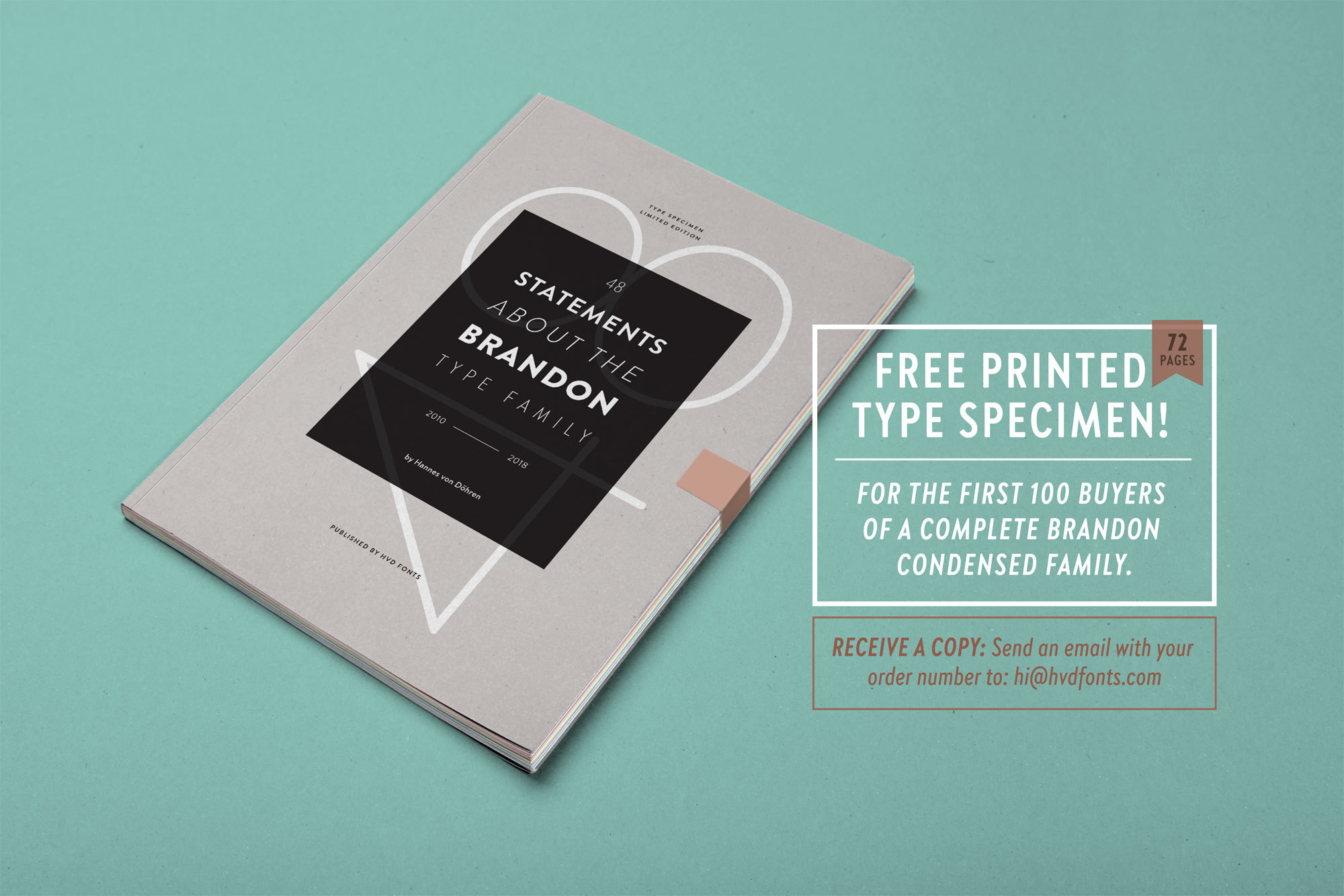
Eight years after the initial release of Brandon Grotesque (2010), the typeface has grown into a font family of 48 styles, including a version for small sizes and the newly released condensed version. Today, Brandon Grotesque supports at least 116 languages, from Latin based languages to Greek and Cyrillic.
THE SCIENTIFIC PRINCIPLE
Preparing an innovative edition
OUTSTANDING EXAMPLE
The arts of the ancient world
CONTEMPORARY WORKS
Industrially manufactured 78
INDUSTRIAL DESIGNERS
German Data Protection Laws 8
EFFECTIVE GENERATION 7
Strategic and tactical activities
A TIMELESS AESTHETIC
Brainstorming possible ideas
Lorem ipsum dolor sit amet, consetetur sadipscing elitr, sed diam nonumy eirmod tempor invidunt ut labore et dolore magna aliquyam erat, sed diam voluptua. At vero eos et accusam et justo duo dolores et ea rebum. Stet clita kasd gubergren, no sea takimata sanctus est Lorem ipsum dolor sit amet. Lorem ipsum dolor sit amet, consetetur sadipscing elitr, sed diam nonumy eirmod tempor invidunt ut labore et dolore magna aliquyam erat, sed diam voluptua. At vero eos et accusam et justo duo dolores et ea rebum.
Creating the condensed version for the Brandon Text was the missing project to complete the Brandon series. Brandon Text was made as a companion to Grotesque in 2012. Brandon Grotesque and Brandon Text are a perfect team when it comes to professional typography. When we started to designed Brandon Grotesque Condensed we felt that there should also a condensed counterpart for small sizes; so we made Brandon Text Condensed. While a condensed typeface is not just a squeezed original, we took the Grotesque Condensed as a starting point for the Text Condensed version simultaneously we also kept an eye on Brandon Text to find the perfect missing variables.
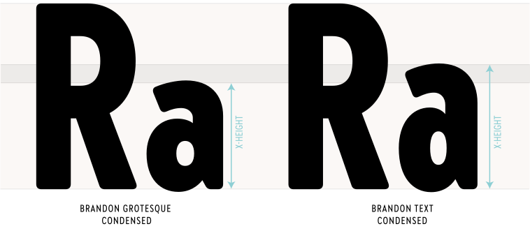
The main difference compared to the Grotesque Condensed version is the higher x-height of Brandon Text Condensed, which makes it a good choice for texts in small sizes. We took care that Brandon Text and its condensed companion are working together perfectly.
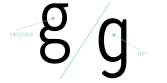
Another difference is some simplified forms which helps to achieve a homogeneous grey value in text blocks. We added a new simplified ‘g’ and also a new ‘j’. For all lovers of the double storey ‘g’ we kept this version which is accessible through the OpenType features. All Brandon fonts can be seen as a system which deliver a solution for different challenges.
Brandon Text Condensed is optimized to work in small sizes. Similar to Brandon Text is has a nice reading rhythm and should be used if there is much information and little space. The Bolder weights have its own aestetics and work nicely in headlines, giving a unique touch – without losing the Brandon DNA.
A font of today’s needs has to include more than just the alphabet and some punctuation. Besides a big number of accented letters, making sure that the typeface has a good language support, a font should include several features for excellent typographic work joining forces with the layout applications of the time and of course the user. Here is a selection of what this font family has to offer under the hood.
Take your leaflets and let them fly.
If two letters have the nature to collide when used in combination a ligature is needed to solve this unwanted event. Ligatures are especially designed solutions for such letter combinations. This font contains a set of ligatures which are automatically substituted as soon as these letter combinations are typed in.
The base of an ice sheet is generally warmer.
Besides the standard letters a font sometimes contains several versions of a letter called alternates. You can exchange the alternate with the standard letter by selecting it through the Opentype feature panel and every letter of the stylistic set will be exchanged. Often this results in a totally different optical appearance of the typeface.
1.401,39€
3.547,21€
In addition to the standard lining figures, the fonts contain a set of tabular figures. This means that all numbers have the same width, which is useful for setting up invoices, tables or every other task where the figures should have a structured appearance among themselves.
I would like to buy 5 2/3 pieces of chocolate.
If fractions are needed anywhere an OpenType code makes sure that if you type any numbers combined with a slash between a fraction will automatically be substituted.
C2H5O12
A subscript is a character that is set slightly below the normal line of type. They are used in formulas, mathematical expressions, and specifications of chemical compounds and isotopes, but can have many other uses as well. These characters are not simply ordinary characters reduced in size – to keep them visually consistent with the rest of the font, they are slightly heavier than a reduced-size character would be.
You just have to read the small text.3
A superscript is a character that is set slightly above the line of type. It has the same weight and size like a subscript character. They are also used in formulas, mathematical expressions and text references, but can have many other uses as well.
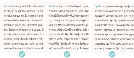
Brandon Text Condensed has an extended character set that supports more than a hundred languages. Part of the language coverage is the support for Latin, Greek and Cyrillic script.
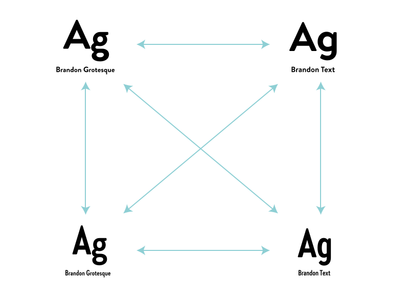
Every family member works perfectly with the others, which results in a wide range of possibilites. Due to the same architecture but the different details every family can be seen as an separate problem solver. You can combine the fonts and find the perfect match for your design. → Check out Brandon Grotesque or Brandon Text.
While Brandon Grotesque can be used to give character to the brand, Brandon Text has a higher x-heigt and is the perfect choice for longer text blocks in reading sizes. Both now have a condensed counterpart which can be used for space saving tasks, but also work individually with its own aestetics.
Latin: Afar, Afrikaans, Albanian, Basque, Belarusian, Bislama, Bosnian, Breton, Catalan, Chamorro, Chichewa, Comorian, Croatian, Czech, Danish, Dutch, Esperanto, Estonian, Faroese, Fijian, Filipino/Tagalog, Finnish, Flemish, French, Gaelic, Gagauz, German, Gikuyu, Gilbertese/Kiribati, Haitian-Creole, Hawaiian, Hungarian, Icelandic, Indonesian, Irish, Italian, Javanese, Kashubian, Kinyarwanda, Kirundi, Latin, Latvian, Lithuanian, Luba/Ciluba/Kasai, Luxembourgish, Malagasy, Malay, Maltese, Maori, Marquesan, Moldovan/Romanian, Montenegrin, Nauruan, Ndebele, Norwegian, Oromo, Palauan/Belauan, Polish, Portuguese, Quechua, Romanian, Romansh, Sami, Samoan, Sango, Serbian, Sesotho, Setswana, Seychellois-Creole, Swazi, Silesian, Slovak, Slovenian, Somali, Sorbian, Sotho, Spanish, Swahili, Swedish, Tahitian, Tetum, Tok-Pisin, Tongan, Tsonga, Tswana, Turkish, Turkmen, Tuvaluan, Uzbek, Wallisian, Walloon, Welsh, Xhosa, Zulu. Cyrillic: Belarusian, Bosnian, Bulgarian, Chechen, Macedonian, Ossetic, Russian, Serbian, Ukrainian, Uzbek. Greek: Greek.
Enjoy this typeface?