Wüstenrot
Wuestenrot Intro3
What should we take care of when we come from a Logo to a complete typeface?

When we received the request to create a typeface for the insurance company Wüstenrot & Württembergische out of the existing letters from their logo, the first thing we had to do is to research if someone else (e.g. the creator) has specific rights on the logo – in this case we would not have been allowed to do this job. Secondly we had to see if this wordmark maybe is set in a existing font and the client may not know about. After some detailed research we found out that both points do not apply, so we where free to accept this job.

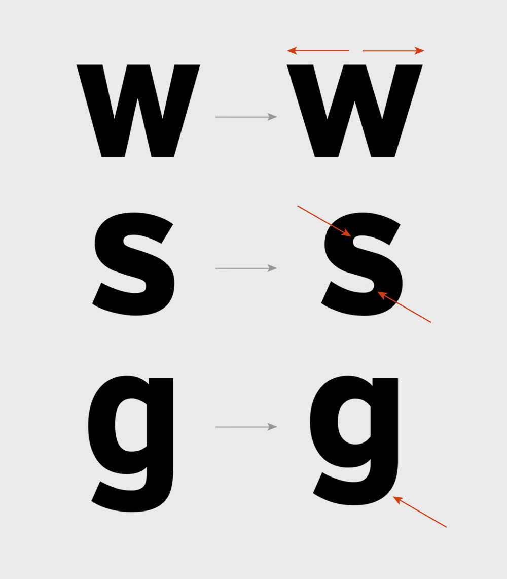
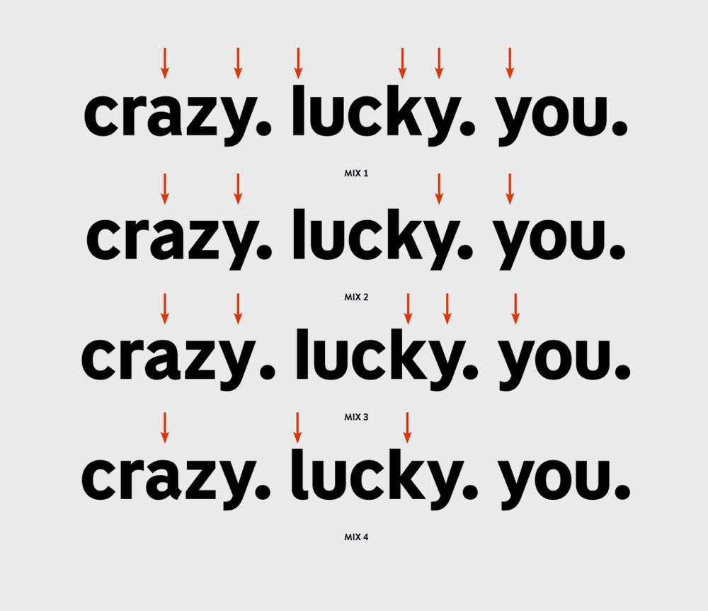
The status quo was that they had these letters of the logo somebody drew but they used a different sans serif typeface which didn‘t really match to the Logo-Sans. A totally logic decision is to unify this and use just one typeface for everyhing. The good thing: We could try to implement the companies core values into the rest of the letters.

The typeface and the logo of a company should work together perfectly.
The goal was to harmonize the visual language. There was a logo but no fitting typeface, so we created a full typeface on the base of the existing letters.
Wüstenrot & Württembergische
Developing a typeface

In the beginning we had these 14 letters so 471 where missing for this weight. In additon to the Bold weight, we should also draw a regular weight which should be optimized for text setting. But we started with the Bold which is easier to define the character of a typeface. So we also took a closer look at the company Wüstenrot & Württembergische to feel in which design direction the missing characters should be developed.


We first analyzed every given form and detail of the logo to get a feeling how the rest could look like.
Wüstenrot & Württembergische
What we had: The existing letters

We decided that we would like to do some small but for a good typeface necessary tweaks to the existing letters. So that the typeface doesn‘t really look different but works as a system inside a font. Beside the form of a single letter, it is also important how combinations of different letters work together and how the rhythm of a text is.

Wüstenrot & Württembergische
Refined forms of the original Logo

Before designing the missing letters we tweaked the existing ones to have a good basis for the whole typeface. The „w“ was very narrow which would result in some black spots inside a text, we optimized the curves of the s and several other letters and we also shortened the g to work better in texts and define a descender length.

Researching the right choice of letterforms
Wüstenrot & Württembergische
Several different ways to the vision

Together with the designers of the agency we explored several varaints of character givinig letters finding the typeface which fits perfectly to the company. It is really impressive how the whole feeling of the typeface changes if you just change one or two letters. So this is a very important phase of the process which is ideally done together with the agency brand experts and in the best case also with the client. After some back and forth we found the forms and characteristics.

Characteristics of the typeface
1
2
3
4
1 — Distinctive Details
The G has a very decided spur to act as one of the strong character giving letters. This results in a stable and self confident appearance: it would be not that easy to push this over
Wüstenrot & Württembergische
Print and appearance

The fonts are used in logos, on flyers and every other visual areas. They need to work as the carrier of information as well as the visual recognizability for the brand in every situation.

One of the most important aspect was that the fonts should also have the quality of a workhorse that can be used for brochures, mailings, forms and lists and tables representing payment- and order numbers.

Wüstenrot & Württembergische
Digital Use

A manual screen optimization (hinting) for the fonts makes sure that a clean and sharp rendering is guaranteed in the digital world.


Feel that tingling in your fingertips? That’s the magnetic urge to contact us:

[email protected]