RIMOWA
Rimowa00
A journey through the details of typography.

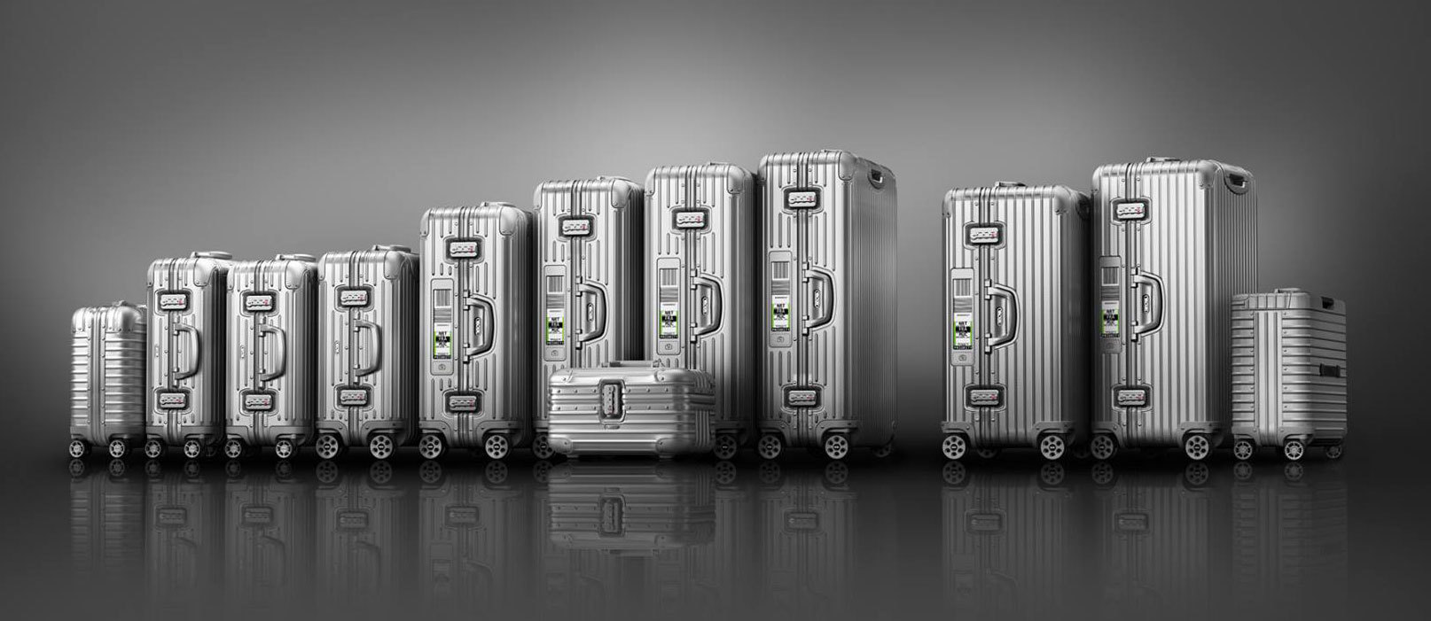
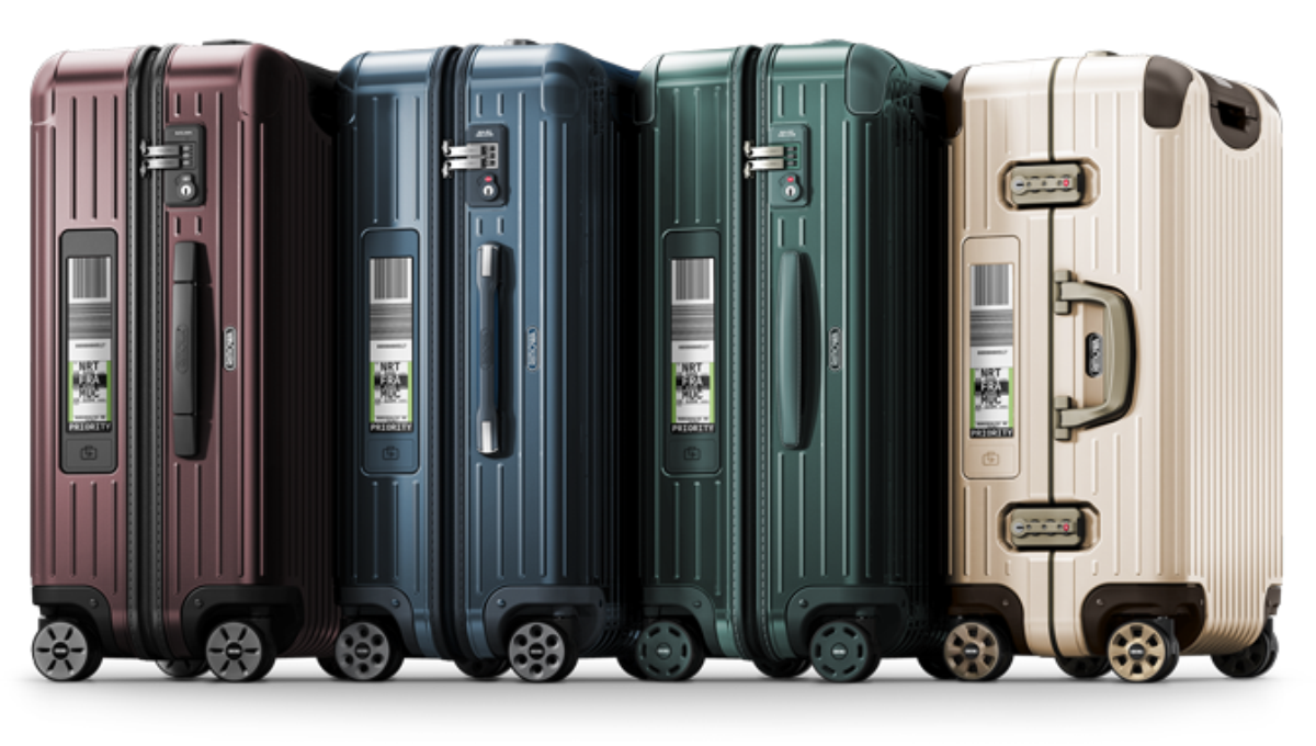
Whether traditional aluminium cases or light luggage made of the high-tech material polycarbonate, the RIMOWA design is unmistakable due to the groove structure of its case shells. RIMOWA is one of Europe‘s leading luggage manufacturers

The designers came with the vision that the typeface should match the design of the luggage on the one hand and let the long history and pioneer work of the company shine through on the other hand. As a starting point they choose Brandon Grotesque but we decided to carve out this special unique connection to the RIMOWA world. So we created custom version of strong character giving letters especially for RIMOWA and their wonderful cases.

This typeface lets us feel the history of the company but also the quality of their future-oriented ideas in the luggage segment.
It‘s a match! From the first moment on we found that Brandon Grotesque and the visual language of the products where made for each other – Now if was time to make it perfect.
Rimowa Type
Where it all begann…

We used Brandon Grotesque as a starting point. The qualities and characteristics of Brandon were a good basis and covered already a big field of the brand character. Nevertheless we wanted to customize things to fit perfectly to the RIMOWA brand.

Rimowa Type
Bigger head

The bowls of letters like “P” and “R” were made bigger. This refers to the golden ages of the 1920sDuring the 1920s and 1930s great progress was made in the field of aviation, including the first transatlantic flight of Alcock and Brown in 1919, Charles Lindbergh's solo transatlantic flight in 1927, and Charles Kingsford Smith's transpacific flight the following year.

Rimowa Type
More Deco

We pushed the “W” more to the Art Deco direction which was very popular in the first quarter of the 20th century. It represented luxury, glamour, exuberance, and faith in social and technological progress.

Rimowa Type
Optimizing for all caps use

The designers planned to use the Rimowa fonts in headlines in ALL CAPS combined with an underline, so we created a special version of the “Q” that has no descender and avoids collison with the underline.

Several voices for the RIMOWA brand
Rimowa Type
Weights & Styles

We created three weighst for the headline version and every headline version has a companion with a pre defined underline which works perfectly with the stem width of the font weight. We also added four text weights based on Brandon Text which takes on the task for reading sizes and long texts. With this package RIMOWA has a complete type system fitting perfectly to their appearance and vision and working for all fields of the brand.

Rimowa Type
In Store Use

In the stores and the typeface is implemented in the interior design and beside the cases. It is important that the visual appearance of all elements feels completely homogeneous. The typeface fits in perfectly besides forms and materials. And tells the same story like RIMOWA.

Rimowa Type
Giving a distinctive look to the brand

The fonts are also used in logos and on signage systems. They need to work as the carrier of information as well as the visual recognizability for the brand in every situation.

Rimowa Type
Digital Use

A manual screen optimization (hinting) for the fonts makes sure that a clean and sharp rendering is guaranteed in the digital world.

Rimowa Type
Catalogues and printed matter

One of the most important aspect was that the fonts should also have the quality of a workhorse that can be used for long catalogues, magazines and technical information like lists and tables representing payment- and order numbers.


Feel that tingling in your fingertips? That’s the magnetic urge to contact us:

[email protected]