Walmart
Walmart Intro wide
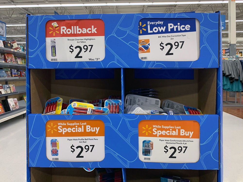
Consistency across all customer touchpoints.

Walmart’s visual branding has five key design elements: logo, color palette, imagery, graphics and typography. Our role was to create a custom typeface that defines the identity and ensures that messaging, typographic appearance and branding are consistently applied across all communication channels. Walmart chose Brandon Text as a starting point for the development. The idea was to integrate existing key elements of Walmart’s logotype and the “Spark” (the six-pointed star) into the new typeface.

Walton & Bogle…
© Photo: Walmart
Walmart Sans vs. Bogle
…or how to name a typeface.

The history of Walmart began in 1950 when Sam Walton opened a store called Walton’s 5-10. At some point in the 1960’s, he decided to achieve higher sales volumes by keeping sales prices lower than his competitors and reducing his profit margin. Inspired by the successes of other discount department store chains, Walton opened a second store in Harrison, Arkansas. Walton’s assistant Bob Bogle, who was responsible for the purchase and maintenance of signage, came up with the name “Wal-Mart” for the new chain. As a gesture of appreciation to the inventor of the name Wal-Mart, the Walmart company decided to call their typeface Bogle.


The Process
Walmart
Fundamental elements

The “Spark” and the logotype “Walmart” are the basic elements of the corporate design. The yellow spark appears most often as part of the lockup for the Walmart logo, however it is also used alone on certain occasions. The rounded details of the logotype have become key features of the typeface’s DNA.

Brandon Text and Bogle

Brandon’s soft corners and geometric architecture corresponded to what Walmart had wanted for their new custom font, so Brandon Text supplied the perfect basis for Bogle. We made design changes to Brandon Text and fine-tuned it to complement the existing Walmart design and logotype.

Unique elements

Taking cues from the original Walmart logotype, we added the distinctive quarter circles to Bogle. The result is a unique typeface that ensures a seamless and homogenous appearance throughout the brand.

Walmart spark
Walmart Price Tags
Walmart
Sparkling elements

We also implemented elements of the “Spark” in several characters. Price tags are everywhere in department stores, hence we paid extra attention to the design of the $-sign. It is important that the typeface works as a whole, and to prevent a visual overkill, the sparkling elements have deliberately been added to only a few but substantial characters.

↑ Above: Basic characters of the Bogle type family (Bold).
↓ Below: All 12 styles of Bogle offer a wide scope of uses in company communication.

The Bogle fonts in use

The face of Walmart — You can find the new Bogle font in every single Walmart product box, price tag, aisle sign, advertising and marketing material, even the webshop and online campaign.

© Photo: Harry Keller
Walmart store1
Walmart store1
Walmart store2
Walmart store2
Walmart website1
Walmart website1
Walmart store3
Walmart store3

Feel that tingling in your fingertips? That’s the magnetic urge to contact us:

[email protected]