Together with MetaDesign, we were asked to develop a new global typeface for Volkswagen. We created a flexible type system, lending the Volkswagen brand a new iconic face and matching it to the new product design at the same time. It also ought to cover the different needs and expressions of a global brand. In other words: more dynamic, more sympathetic and customer-centric.
The task was to create a new type system that is strong enough to lend the Volkswagen brand a face and that is sufficiently flexible and robust to work in every area of the company. Volkswagen ought to receive an integral 360-degree customer journey from first contact with the brand through advertising and editorial design on the website and store design to the decisive move of buying a car, defined by consistency throughout automobile manuals and car interiors, such as on speedometers and board computers.
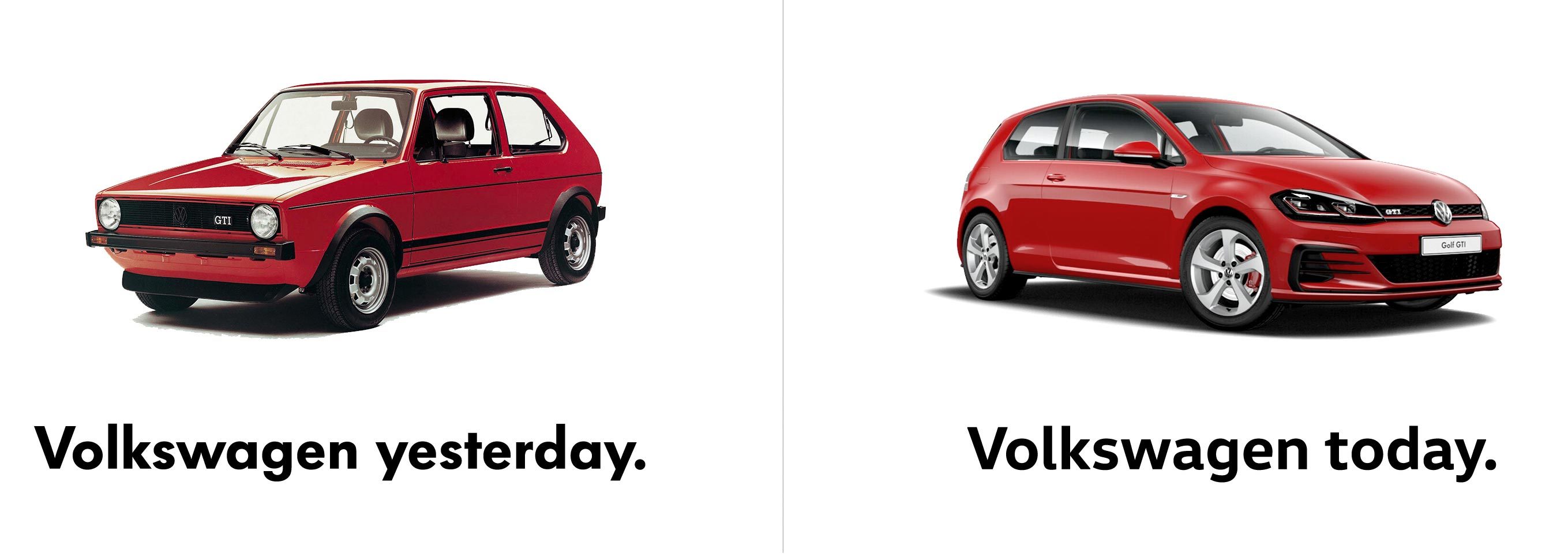
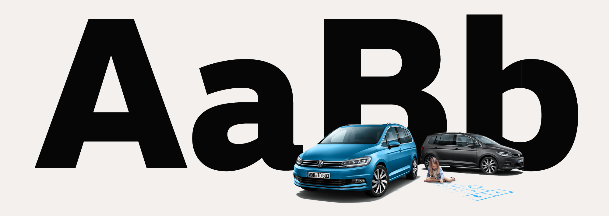
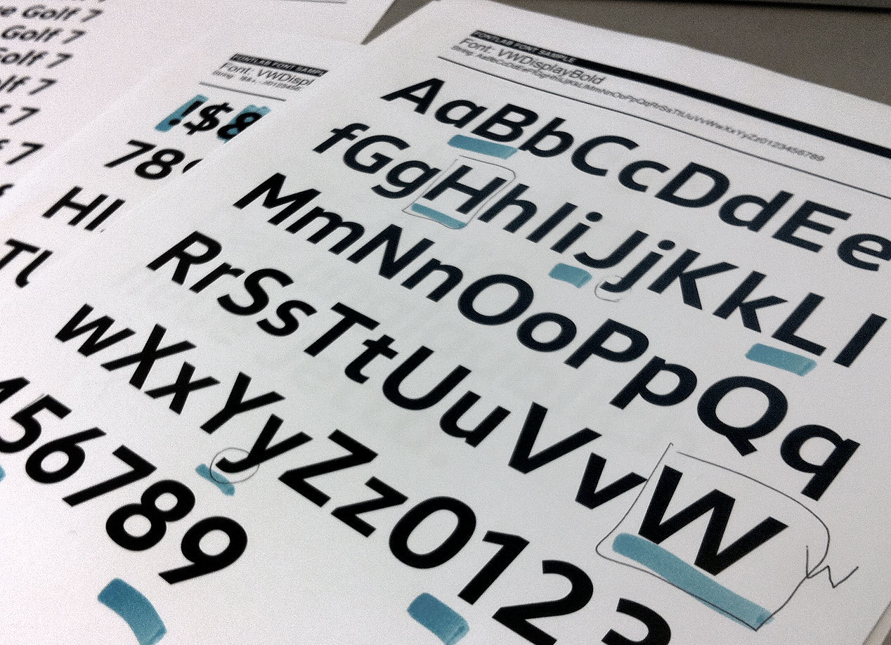
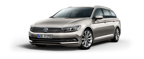
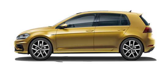
Since 1997, Volkswagen had been working with a customized version of the famous Futura typeface, developed by Erik Spiekermann and Luc de Groot. The visual appearance of the cars has evolved ever since and – not less important – the functional requirements in the different user fields have expanded. Eventually, Futura no longer performed sufficiently enough in several components such as digital, technical manuals or cockpit screens and Volkswagen began searching for alternative typefaces. Our research included communication design agencies working for the brand as well as UI developers, technicians and office users. In another approach we analized the visual language of the automobile design itself and studied its developments over the past 80 years. We came to the conclusion that a new typeface should be inspired by the design of the cars and that it ought to carry the idea of Volkswagen: cars you can rely on, outstanding engineering and a clean design driven by functionalism.
The anatomy of the letters are pushed to a rather square basic shape, integrating a technically well-versed character with an association to the visual language of the cars. Yes, it’s about cars – but as Volkswagen attaches great value to the human individual, soft curves, open forms and little details in the letters lend the typeface warmth and friendliness. People should experience a feeling of well-being when they read headlines, manuals and other infos of Volkswagen.
A typeface that needs to solve all the many typographic challenges within such a large company does not get away with just one weight. We decided to develop two related type families, each optimized for their specific environment and needs. VW Head is designed for applications that require large type sizes such as headlines: self-confident, strong in character and compact in appearance. VW Head is recommended for use above 16 point type size. VW Text is ideal for longer text in smaller sizes: optimized ‘color’ of the typeface in text blocks, reading rhythm and adjusted for small type sizes on screens. VW Text should be used in sizes below 16 point.
Advertising is an essential application. VW Head is there to catch attention, it lends the brand a face and represents the assets of Volkswagen. For small text that delivers information we created VW Text.
The Volkswagen fonts are all manually hinted and optimized for screens, to ensure a clean and sharp rendering in the digital world.
A wide range of weights and a clear distinction between headline and body text styles turn the VW type family into a strong workhorse for editorial design projects. A particular serif version was specially designed for body text in Volkswagen Magazine.
The fonts that are used for applications inside the cars were developed in close collaboration with the interior designers of Volkswagen. We created special numerals based on the type family to be used on the speedometer. What’s more, fonts are also implemented in the digital on-board and navigation systems.
Feel that tingling in your fingertips? That’s the magnetic urge to contact us: