Hyundai
Hyundai Sans Autos
Developing a typeface hand in hand with the complete redesign of the Hyundai brand.

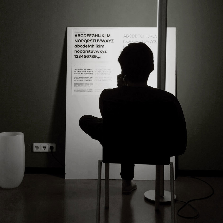
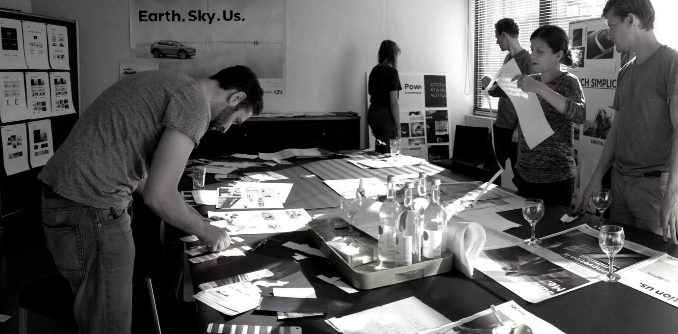
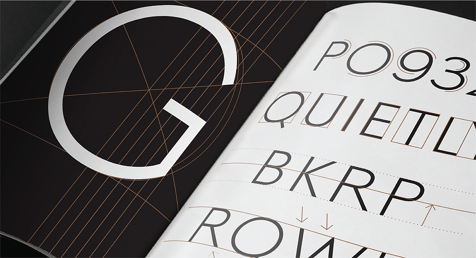
Hyundai Motors asked us to create a typeface hand in hand with the complete redesign of the brand. The big advantage was, that we could create it parallel with the new design works. So we could see directly how the typeface behaves in the environment like advertisements, website or other text uses. We where able to tweak things while already see them in the layouts. This made the work different to the normal type design process, because we could see directly what worked and what not.


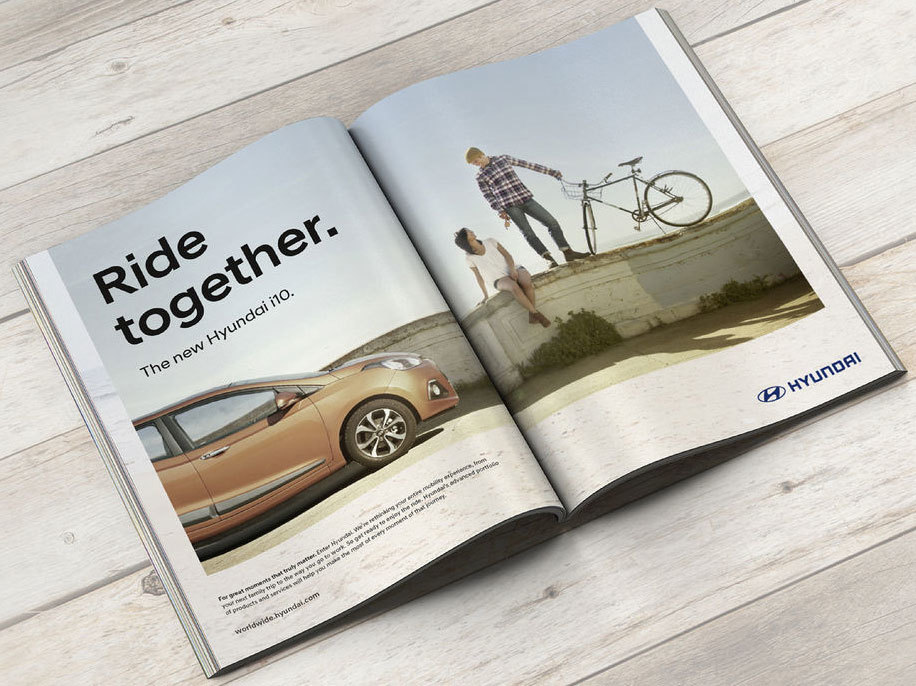
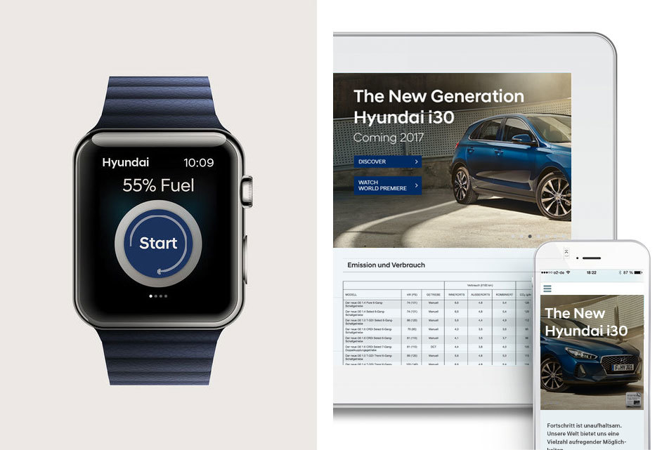
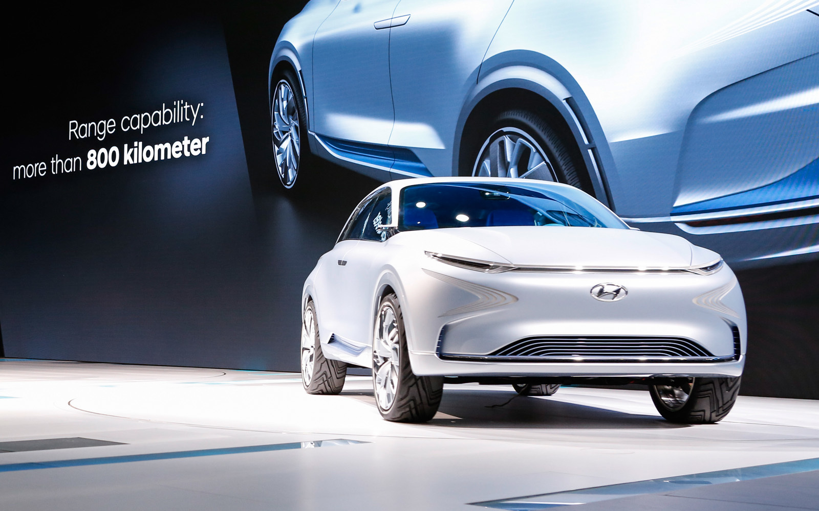
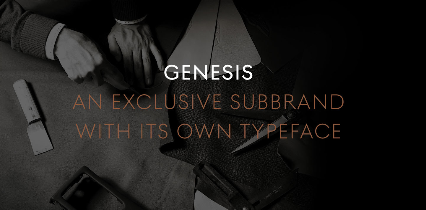
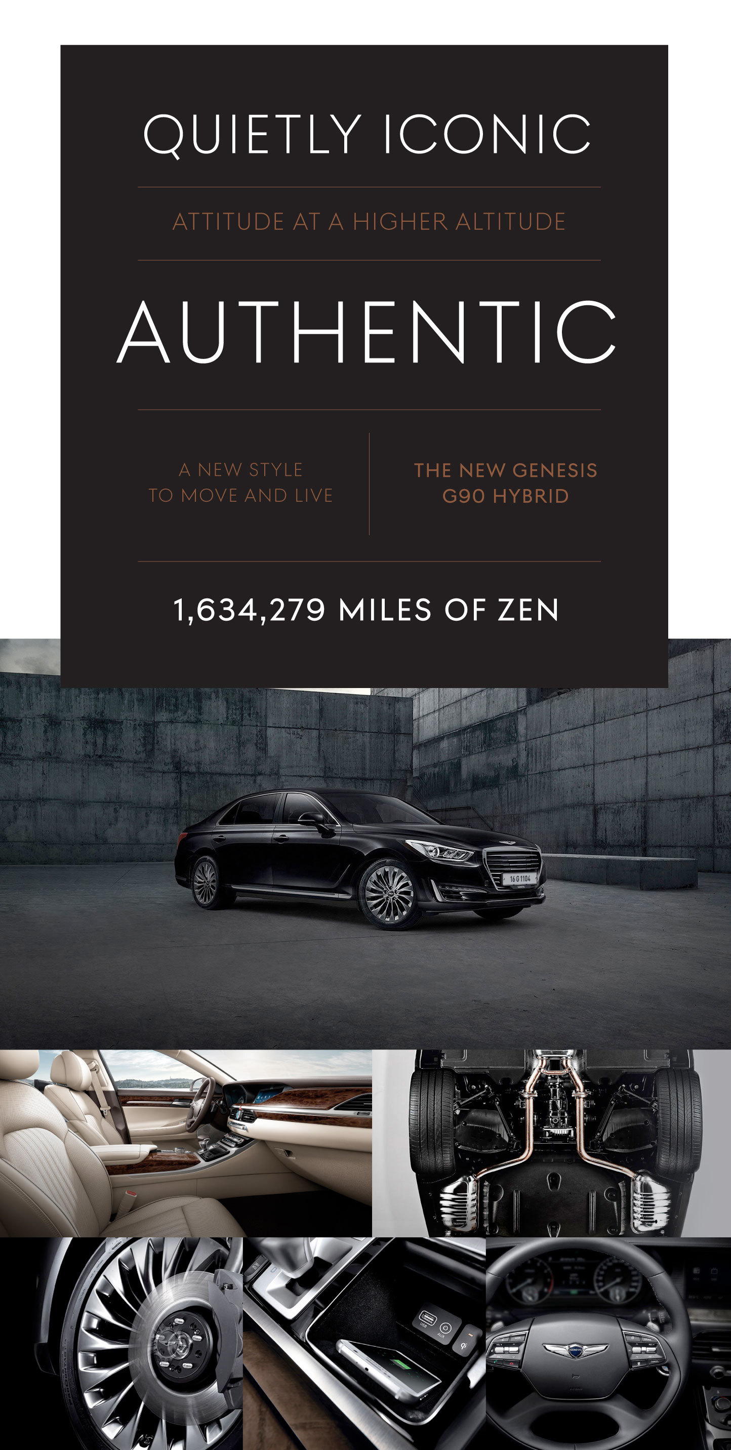
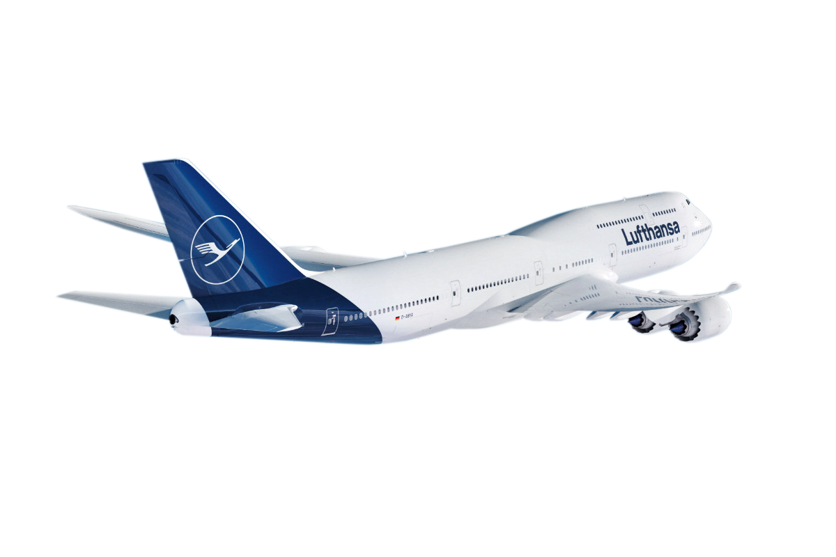
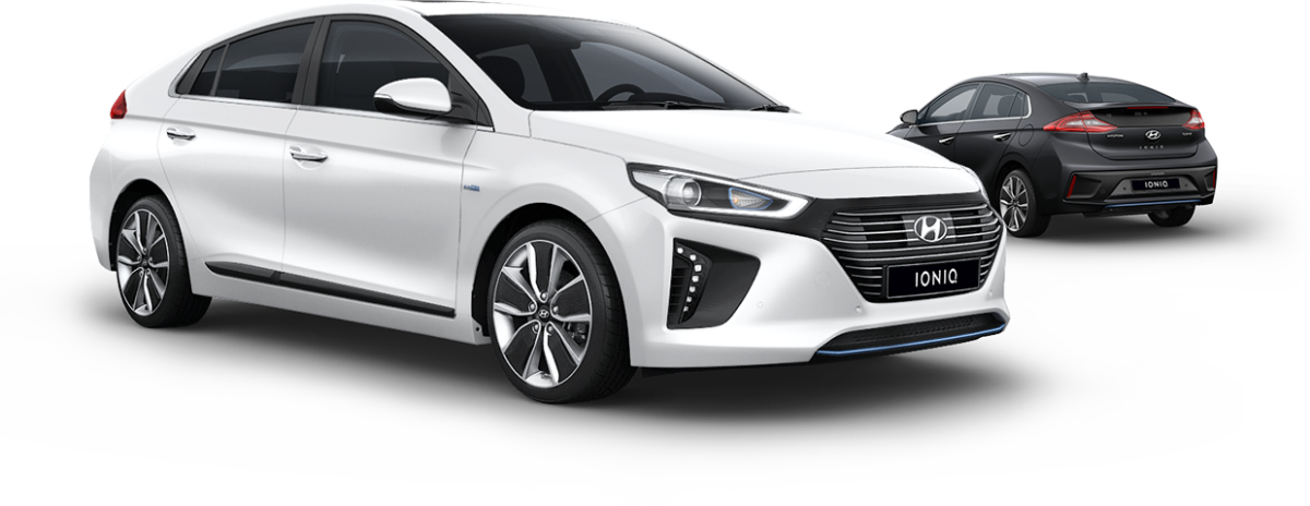
We evaluated all fields where the typeface will be used in the end. It had to work perfectly in all printed materials, in the web, their apps, in their office environment and it has also should visually cover all their different brandspectrum. Like the racing cars as well as the high class limousines or electric vehicles.

A custom type family should be thought through and accomplish all possible needs of a big company.


The project started with a vision of a new design language for the whole brand.
Hyundai Sans – Making Of
Developing a typeface

The first decision was to go with a geometric skeleton – we would like to have something timeless that can be used silently but that can also get loud if it is needed. The most important thing: The Hyundai brand core should be typified in every detail of its appearance: Rich simplicity – Our basic lead sentence of the whole project. To cover all needed tasks we decided to go with one headline version which is optimized for big texts and one text version which can be used for texts which are smaller than 12 pt. Several weights for both families to give the designers freedom for typographic variety.

We were a team of three type designers and around ten graphic and web designers who tested the font versions of the fonts in the different environments. To make sure that we create the best possible font family for Hyundai Motors.

1
2
3
4
5
1 — Terminals
One Basic principle of Hyundai Sans are the terminals of each character. The stems are cut off in a 90 degree angle to avoid sharp corners spikes or steep angles. This makes the appearance friendly and clear.
Developing a type system.

When a typeface should solve all typographic challenges in such a big company it needs more than one weight. We decided to go with two different related families – each optimized for their specific field.


With all these weights and styles the new type system is prepared for every possible use inside the Hyundai cosmos.
Hyundai Sans
Advertising & Print

Advertising is an essential application. Hyundai Sans Head is there to catch attention, it lends the brand a face and represents the assets of Volkswagen. For small text that delivers information we created Hyundai Sans Text.

Hyundai Sans
Digital Devices

The Hyundai fonts are all manually hinted and optimized for screens, to ensure a clean and sharp rendering in the digital world.

Hyundai Sans
Around and inside the cars.

Hyundai Sans is also designed to work everywhere else inside the company especially together with their cars. Here you can see one of the first official uses of Hyundai Sans on the Geneva International Motor Show 2017 beside their FE Fuel Cell Concept Car. We feel that the typeface and the cars represent some kind of unity.

Hyundai Sans Bild01
Hyundai Sans Txt01
Hyundai Sans Bild02
Hyundai Sans Txt02
Hyundai Sans Bild03
Hyundai Sans Txt03
Hyundai Sans Bild04
Hyundai Sans Txt04

Genesis is the high class subbrand of Hyundai Motors – so we created a second type family based on the same DNA.
Genesis Sans
An extravagant task.

Genesis is a premium subbrand of Hyundai so the typeface for Genesis has to fulfill some extravagant tasks. We decided to create a Caps only glyph set with special tweaks pushing the typeface into a clearly elegant direction.

As a base we took the Hyundai Sans Typeface. We made slight but character giving changes of the details and proportions to give a special feel to the Genesis Sans Typeface: Quietly Iconic. Premium, not luxury. Sophistated, refined and crafted. Just like the Genesis cars. Togther with a different color concept the Genesis brand world builds up its own language without loosing the DNA of the Hyundai mothership

Genesis Sans
Hyundai Sans vs. Genesis Sans

We sharpened all corners to give a more gemetric and absolute appearance to the letters – several details of the strong letters were designed more extreme. In general we decided to change the proportions of the alphabet from the homogenous consistent width of letters to the Romanis Capitalis concept where the straight characters are half of the width of the rounded ones. This quotation of the old roman stone carved typefaces in a sans serif typeface gives a new rhythm and a very exclusive apperance to the written headlines.


Genesis Sans is mostly used inverted to support the noble and sophistcated character.
We are happy to announce that the Hyundai type system received the RedDot Award and the iF Design Award 2017.

Feel that tingling in your fingertips? That’s the magnetic urge to contact us:

[email protected]