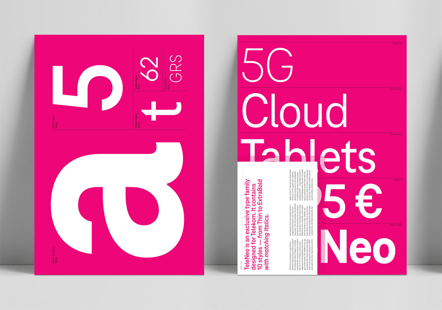
TeleNeo™ – a new type family for a new era. Life is for sharing.
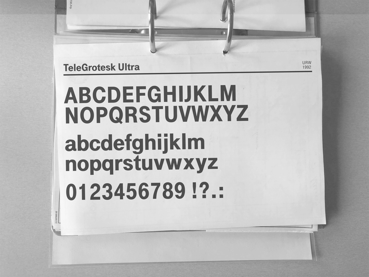
Deutsche Telekom is one of the world’s leading integrated telecommunications companies, with some 184 million mobile customers, 27,5 million fixed-network lines, and 21 million broadband lines. Since 1992 Telekom used its own custom font called TeleGrotesk. Visually based on Helvetica, the font was exclusively designed for Telekom by URW and Andrew Newton. Over the years the type family gradually grew into a five-weight font family.
Our world is becoming more digital in all areas of life. Telekom is a key driver of this change. At the same time, new technologies, business areas and user requirements are presenting the brand with new challenges. It was time to create a new homogenous type system, which works seamlessly in today’s typographic and technological demands in every field of the Telekom universe. Moreover, as a variable font, it opens up many possibilities for digital media and new environments such as Augmented and Virtual Reality experiences. This newly designed type system is called: TeleNeo™.
More consistent. More unique. More Telekom.
TeleNeo — Making Of
Briefing
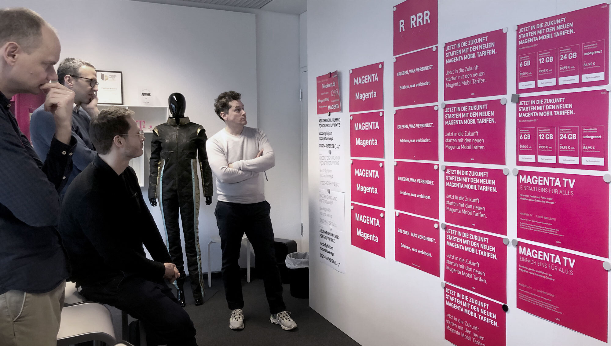
In close collaboration with Deutsche Telekom and MetaDesign we created a new type family: more consistent, more unique and more Telekom. We planned and designed a new functional typeface with a strong brand-character, by developing distinctive visual elements, which are associated with the Telekom brand. The last task was preparing the fonts for future technologies by developing a variable font that brings the whole font family together in small and compact files.
First steps…
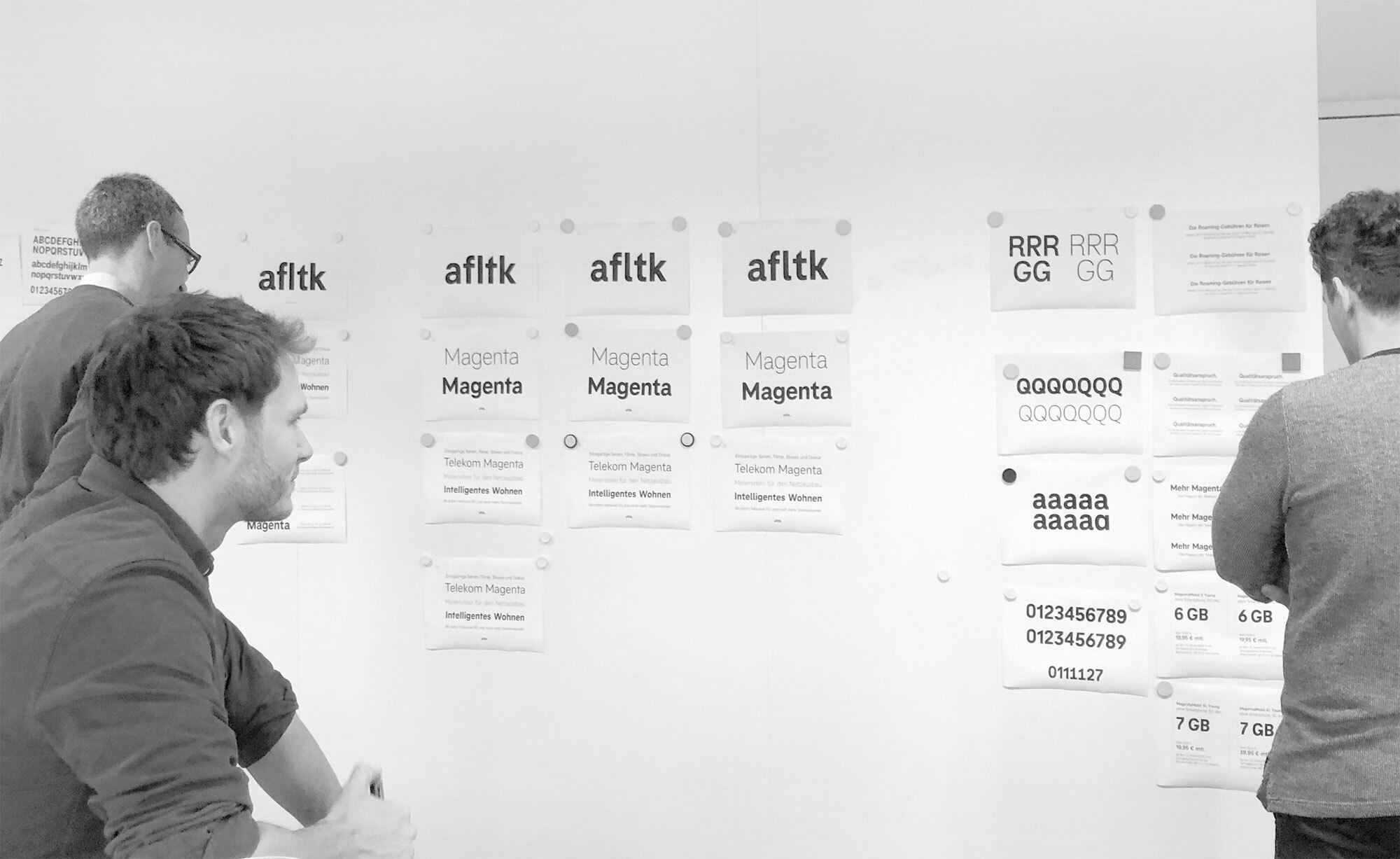
We first analysed the TeleGrotesk fonts and discussed what we like and what needs improvement. The Telekom brand and its typefaces are connected since 28 years, so we decided not to design something totally different and off-brand, but rather preserve some of the flavor of TeleGrotesk. The questions we had to ask ourselves were: Which details should be preserved? What do we associate with Telekom when we think about the TeleGrotesk Type used from 1992-2020?
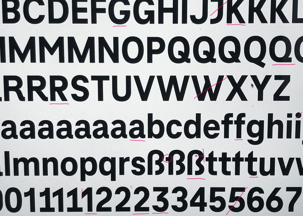
Defining visual rules and principles and their impact on the whole typeface.
Designing a linear typeface, it is all about creating rules for a system. As an example: If I design a square period, the exclamation mark should also have a square dot and the dot on top of the I will of course also be square. Defining these visual rules (which sometimes seem small) can have a huge impact on the whole typeface. It is important for a type designer to be aware of these rules and their impact. A typeface consists of hundreds of small decisions and the total sum of all these decisions result in functionality or uniqueness of the typeface. We as designers have to evaluate which decisions are good from the branding point of view, from the functional point of view, from the technical point of view and from the creative point of view.
Keep the grid!
One thing that was important from the beginning is the basic principle of horizontal and vertical stroke endings of all characters. This gives a clean and grid based appearance to the typeface supporting the core values of a digital, technology based company like Telekom.
The lonely alien.
The ”t” was one of the most unique characters of TeleGrotesk. This steep diagonal cut in the top makes it recognisable. On one hand it is a letter with a lot of character but on the other hand it feels like the lonely alien in the type system because there is no visual reference from any other character to it. But as character giving letters are the base to identify and associate with a brand, we discussed if it still fits to the brand values and decided to preserve it. We did some experiments with different “t“ versions and checked if we can establish a counterpart or other diagonals. We finally found the solution in tweaking the “M” referring to the pointy top of the in a natural way with its joining diagonal strokes. You can see one of their most important words “Magenta”. This example shows how all letters work together and end up in a good combination.
A touch of brush.
The “a” was an important chapter. The stroke terminal on the right can be seen as a soft, human element helping this constructed typeface not to be too cold. Yes, Telekom is a tech-company, but one of their core values is connecting and the people are most important – It’s all about participation and joint experiences and not about the “tech giant”. We decided to keep this stroke ending and develop it even further. The brush based stroke ending should be implemented more often and achieve a more friendly and human appearance based on a technical grid. Letter like “l”, “f” or “t” received softer curves.
Numerals — The pros and cons of round vs. straight.
In the process, we developed two different options for the numerals. A round set, which is more closed and soft and a straight set, which is reduced and comes with more diagonals. Numerals are very important in pricing and technical details. The round numerals gave a cosy feeling the straight numerals gave a more reduced and clean feeling. We did several test rounds and some research on form language and connected emotions: Round vs. angular. We discussed about the context where numerals are used in the Telekom universe and came to the conclusion that numerals are about facts and should be clean and honest.
Details make the difference.
1
2
3
4
Simplified forms
Simplified, reduced forms support a better readability, especially in small sizes.
The variable font technology.
TeleNeo is engineered to work in all environments. For new technologies we developed a two axis (Weight and width) variable font with uprights and italics. The styles on the weight axis are mapped to the CSS weight codes that are placed on 250 (Thin), 400 (Regular), 500 (Medium), 700 (Bold) and 800 (ExtraBold). The width axis uses the normal text width as default and ranges from 100 (normal width = 100%) to 140 (extended = 140%). For desktop and web, we developed separate fonts, optimized for the respective usage
In 2020 all modern browsers support the WOFF2 variable web fonts and the major Adobe apps like Indesign, Illustrator and Photoshop support the variable desktop TTF fonts. Compared to static desktop fonts, there are a 3 big differences: (1) All weights and widths are stored in one file. (2) Intermediate styles can be interpolated. (3) The file size of a whole font family with more than 10 possible styles is similar to 2 single font styles.
Some pictures from the design process
TeleNeo Posters
Choosing letters
TeleNeo – From the lab
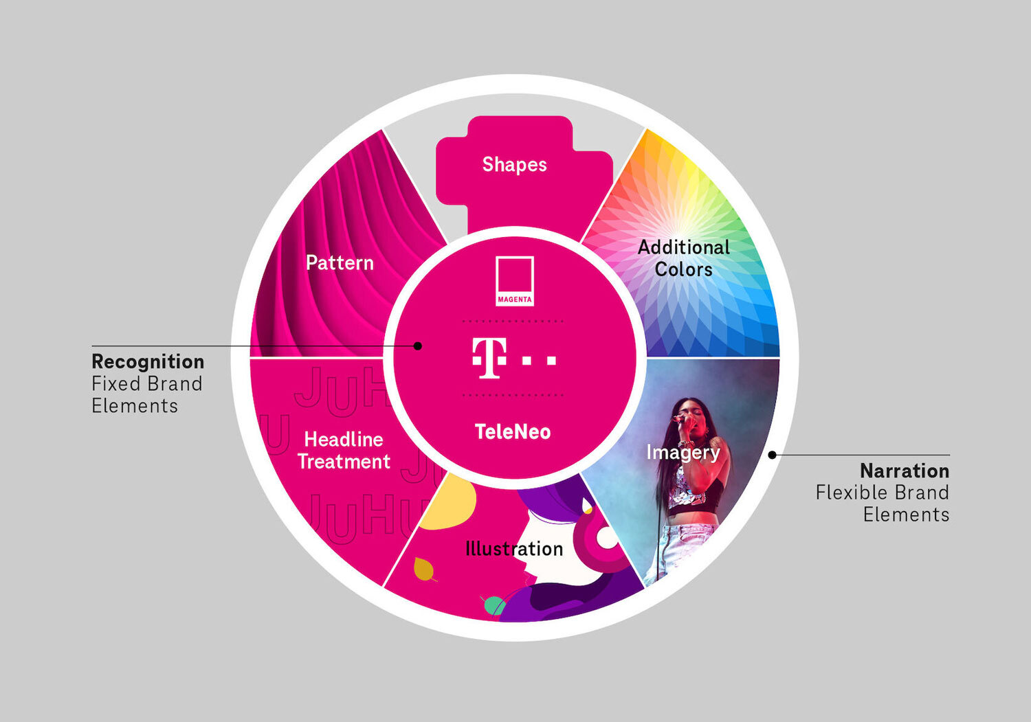
Liquid Brand Design System
Applying the fonts in every corner of the company
Telekom Corporate Type
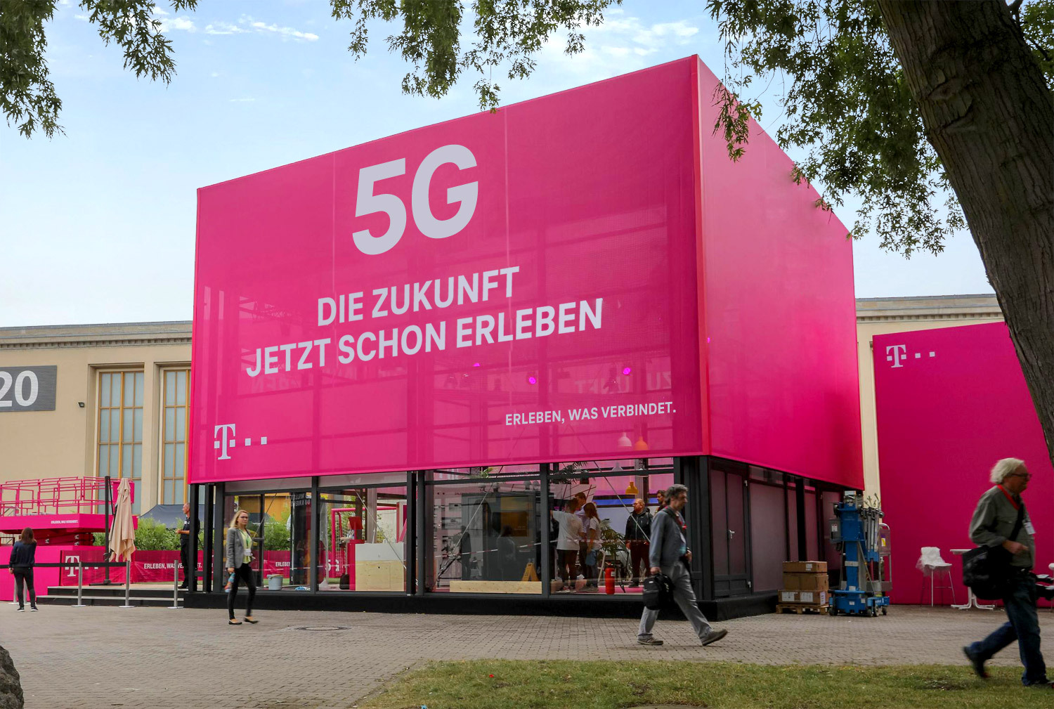
Advertising
Advertising is an essential application. TeleNeo catches attention, lends the brand a strong face and represents Telekom’s assets.
Telekom Corporate Type
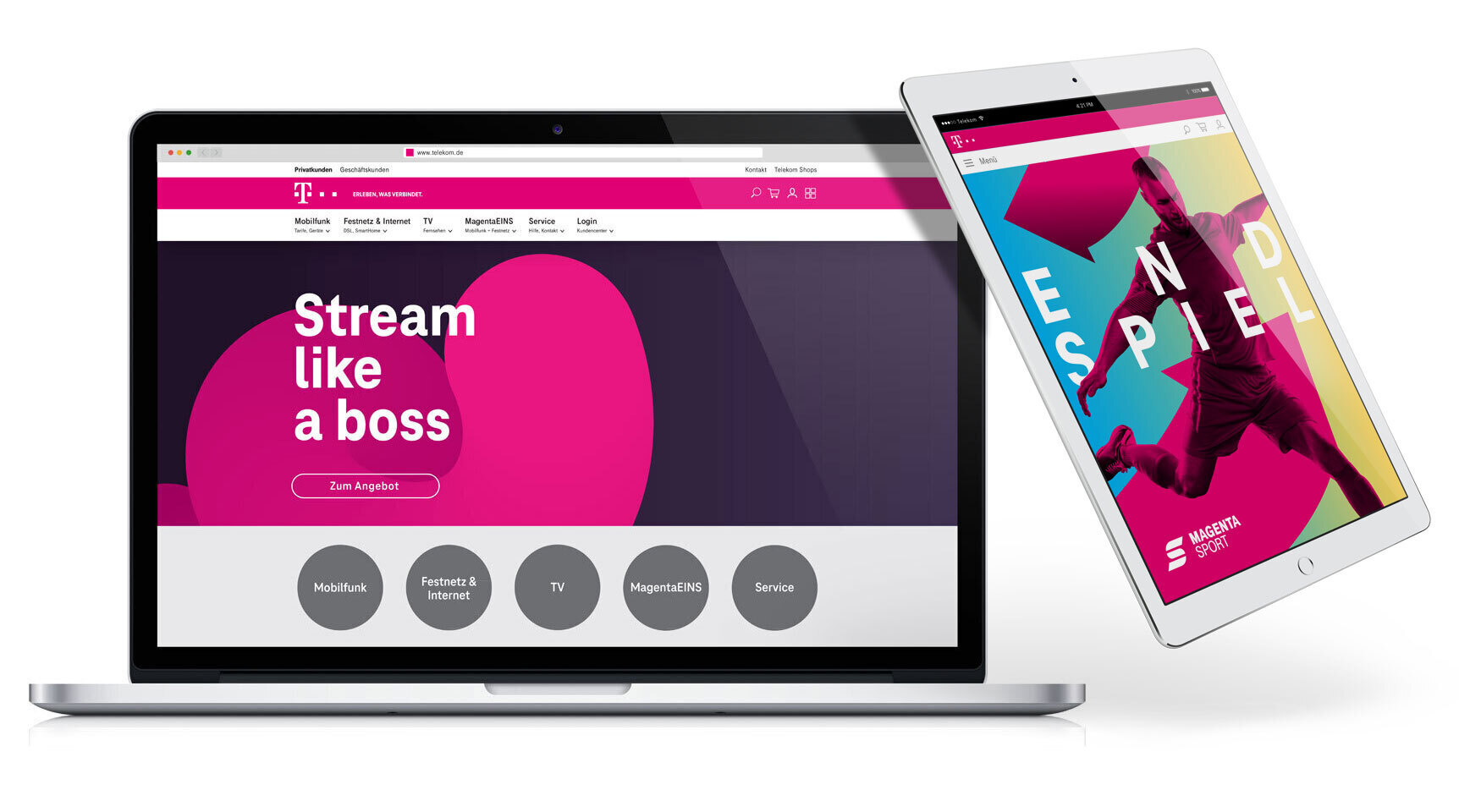
Digital Devices
The TeleNeo fonts are all manually hinted and optimized for screens, to ensure a clean and sharp rendering in the digital world all the way down to very small sizes.
Telekom Corporate Type
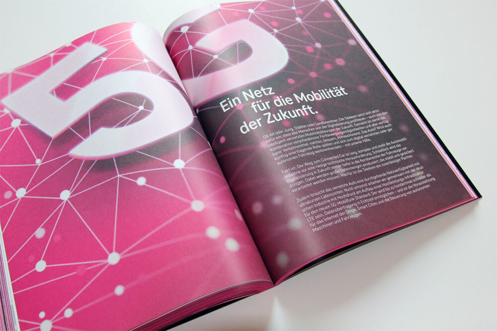
Editorial, Books & Magazines
A wide range of weights and a focus on reading rhythm and small sizes, turns TeleNeo into a strong workhorse for editorial design projects.
Telekom Corporate Type
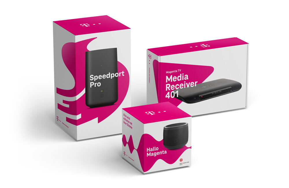
Packaging Design
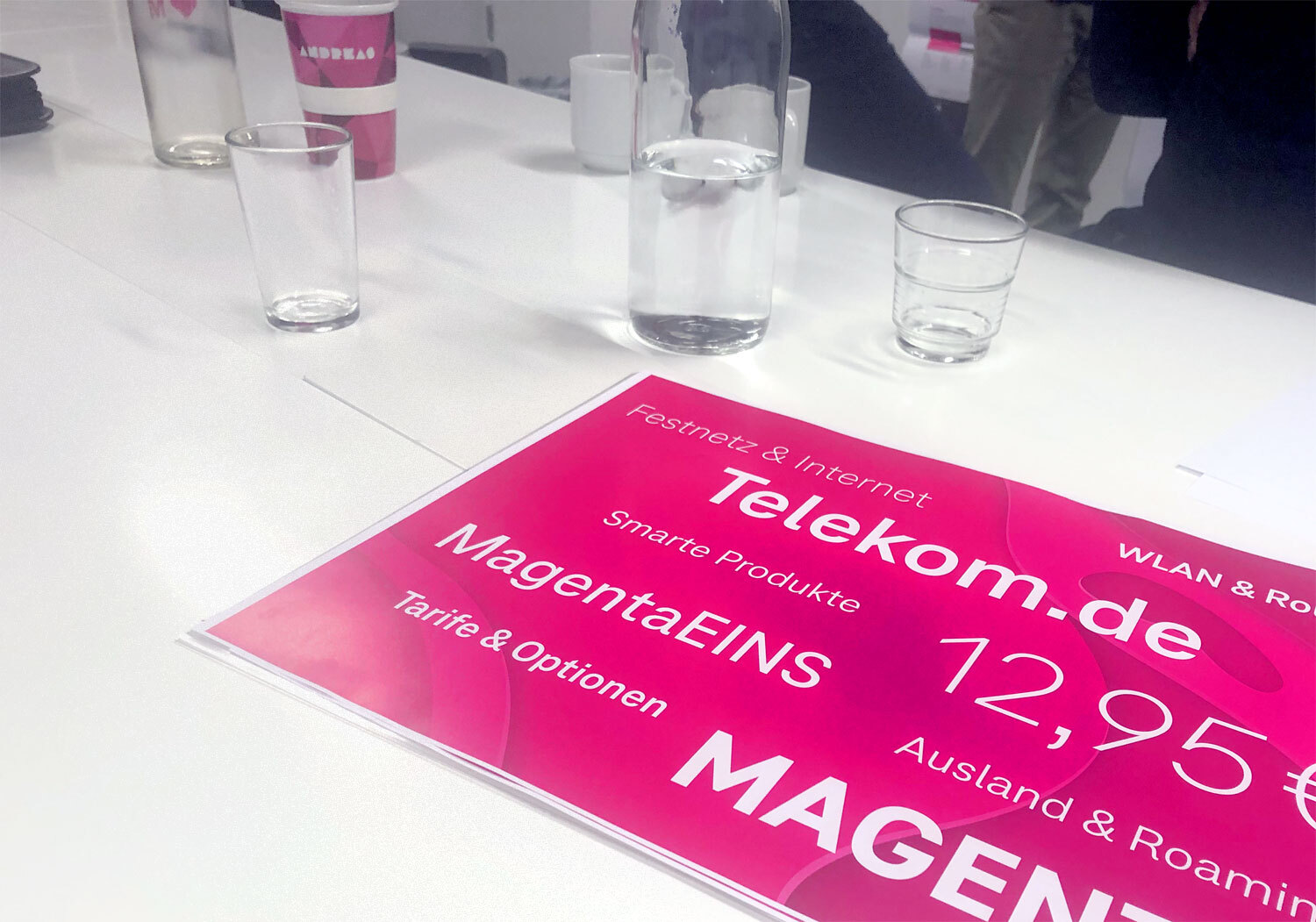
The packaging design makes extensive use of typography and the TeleNeo typeface ensures a brand related appearance in every aspect. The design of the numerals have been tested and optimised for pricing environment.
Telekom Corporate Type
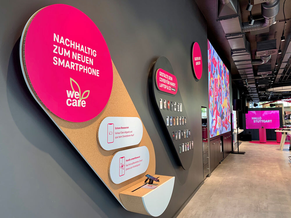
Telekom Stores
The typefaces can be found in the interior design of all Telekom’s retail stores. This implementation makes for an invaluable holistic approach for the brand and corporate design.
A video about the Telekom Liquid Brand Design developed by MetaDesign
If you want to learn more about the Telekom liquid design concept, visit the MetaDesign Website.
We are happy to announce that the Telekom typeface and the brand design received several awards.
Feel that tingling in your fingertips? That’s the magnetic urge to contact us: