The new Lufthansa typeface was part of a comprehensive relaunch of the entire corporate design. The original design was developed by Otl Aicher and his team in 1963. Helvetica was selected as one of the basic elements of the corporate design at the time and remained the brand’s face for more than 50 years. New times call for new designs, thus new requirements in a digital world made a new typeface necessary. Our goal was to create a typeface that is exclusive to Lufthansa, without disregarding where it came from. It was crucial to create a typeface that covered all of the requirements and met today’s standards. The brief demanded the development of an all-round type system that served the needs of the company, while preserving the brand’s visual references.
The corporate identity of Lufthansa was and is a part of German design history.
Changing a legend.
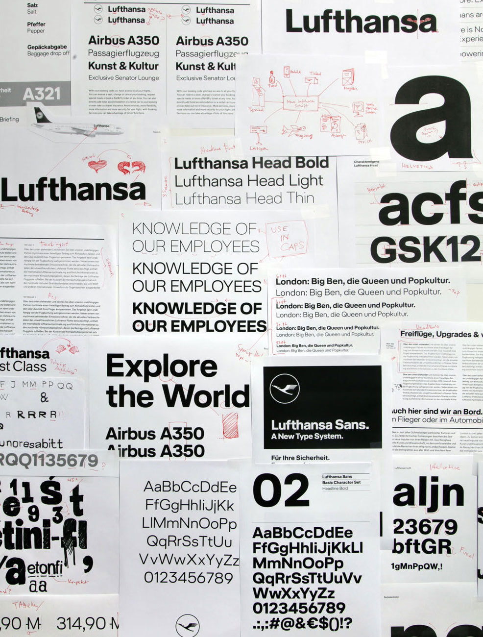
Perhaps not an unusual approach, the design process began with the word “Lufthansa” as we know it: Helvetica Bold (slightly modified), tight spacing, and the characteristic skyline of ascenders. For many this is more than just a sequence of nine letters. It has become the face that captures the brand’s values: strong, bold and confident.
To me, Helvetica resembles a Beatles song, with all its history and attitude as well as its visual peculiarities. In my opinion it cannot actually be improved. It remains a classic and one of the most famous typefaces in history. Thus, it was never our idea to create a better Helvetica. Instead our goal was to take over today’s standpoint and develop something that is new, something that features advantages for contemporary needs – and yet with Helvetica “in the air”.
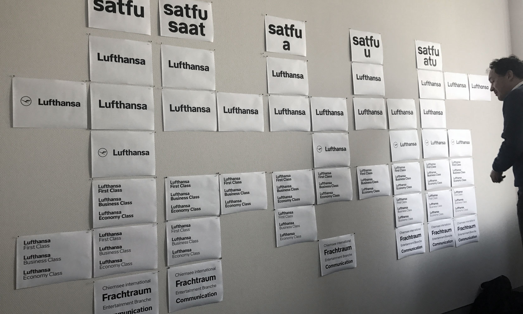
We began to draw alternate versions of the word “Lufthansa” to observe how these characteristics can be preserved in a new typeface. We also analysed the existing logotype and wondered whether it could be improved.
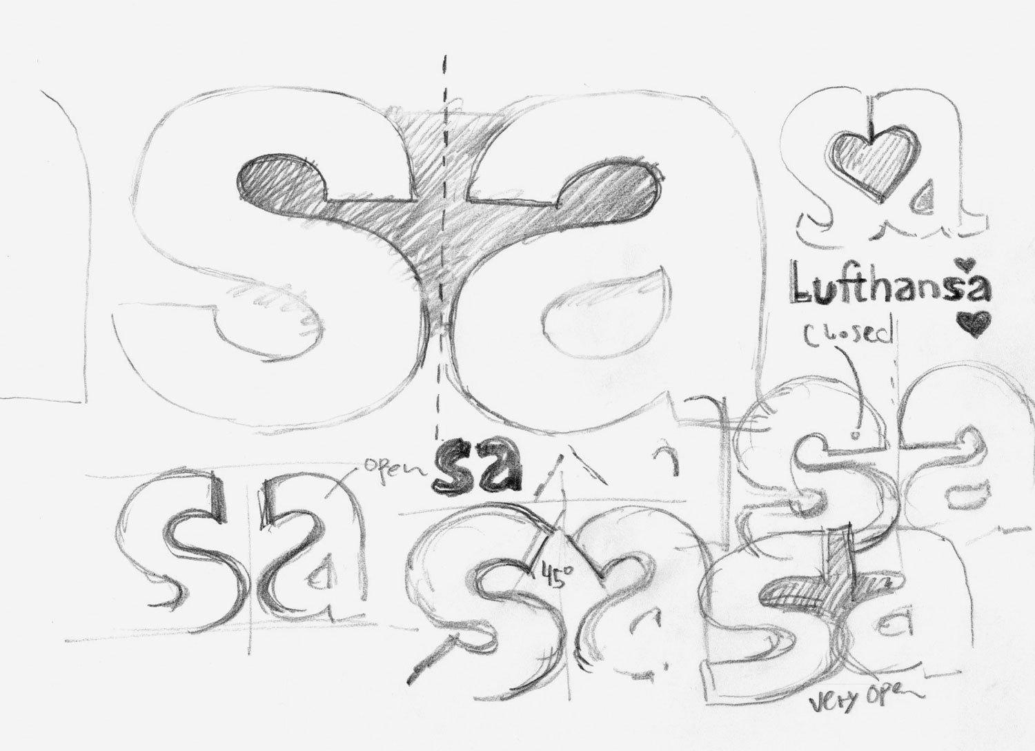
Exploring the relationship of ‘s’ and ‘a’
In this process we defined details that lend specific character to the existing logotype, e.g. the very unique combination of ‘s’ and ‘a’. When you explore the two letters side-by-side, typeset in Helvetica, the diagonal swing in the ‘s’ becomes quite apparent as it is almost mirrored in the ‘a’ – a result of the counter form that is created between them. We found this relationship fundamental in the logotype and therefore explored different solutions to keep this symmetrical white space. While doing so, we also defined other parameters of the new Lufthansa typeface.
Lufthansa Corporate Type
Finalising the logo
While we were searching for the right formula, we discussed forms and ideas with the designers of Lufthansa and with the design studio Martin et Karczinski. Our goal was to shape a precise, well-constructed, grid-based appearance – in keeping with other Lufthansa values. As a result, we considered designing either vertical or horizontal stroke endings. Given the long and horizontal nature of air planes and the fact that a logo had to be placed rather prominently on them, it was clear that the type should also feature horizontal emphasis. The characteristic look of compact letterforms and tight spacing became another fundamental ingredient for the final design of the typeface.
“Fine, the new logo looks nice but the new fonts also have to work everywhere inside the company.”
A company of Lufthansa’s scale has many design application areas, just to mention the main fields: air planes, website, apps, several magazines, advertising, wayfinding systems, office supplies or simply give-away materials. We decided to create a type system of two optical sizes for different application purposes: First a self-confident headline type, that lends the brand a strong and recognisable brand and second a text face that can perform as a workhorse, optimised for long text, small sizes and for screens. Each type family is a specialist in its field, and yet both share the same DNA. Few differences lie in proportions: the text face has larger spacing, while the letterforms are slightly narrower. The characters are also a bit more open as we paid special attention to small sizes in larger text amounts.
It is not just about drawing some letters — it is about creating a system which works everywhere.
Lufthansa Corporate Type
Considering constructions
The Lufthansa brand combines high-tech precision and premium service paired with friendliness. Therefore we tried to find the ideal balance between constructed forms and optical corrections. We developed a grid-based design that features “functional” proportions, keeping an eye on reading rhythm and usability. As a result, a human touch shows underneath curves and details.
In order to achieve the most possible compact look that lets every word appear like a logo, we designed curves with more tension than one would usually do in the design of a conventional geometric typeface. This trick leads to the appearance of smaller white spaces and more compact words. To take this step even further, we analysed different letterforms of the alphabet architecture and explored how far we could go in minimising white space between characters – without losing their overall elegance and definition. A key to the new appearance is the balance between black and white shapes.
1
2
3
4
5
1 — Basic shapes
The curves have more tension than a geometric circle. Overall this leads to a more compact perception.
Lufthansa Corporate Type
Balancing everything
A typeface ought to be observed as a system. Every character has to get along with all the other characters. While there there are letters that make more noise than others, some provide the base and keep the system running – just the way it should be in a well-balanced community. Designers decide where to turn up the volume and where silence is needed to achieve a working composition. It is also crucial to maintain balance within the range of weights, in order to provide a coherent system that other designers can rely on in their layouts.
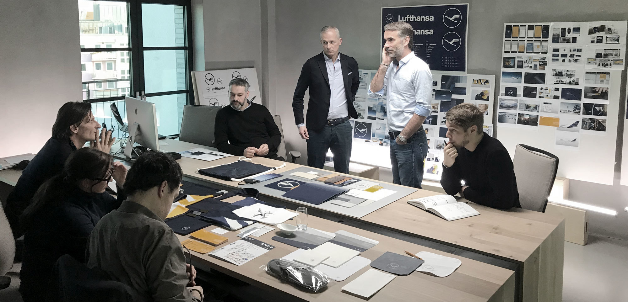
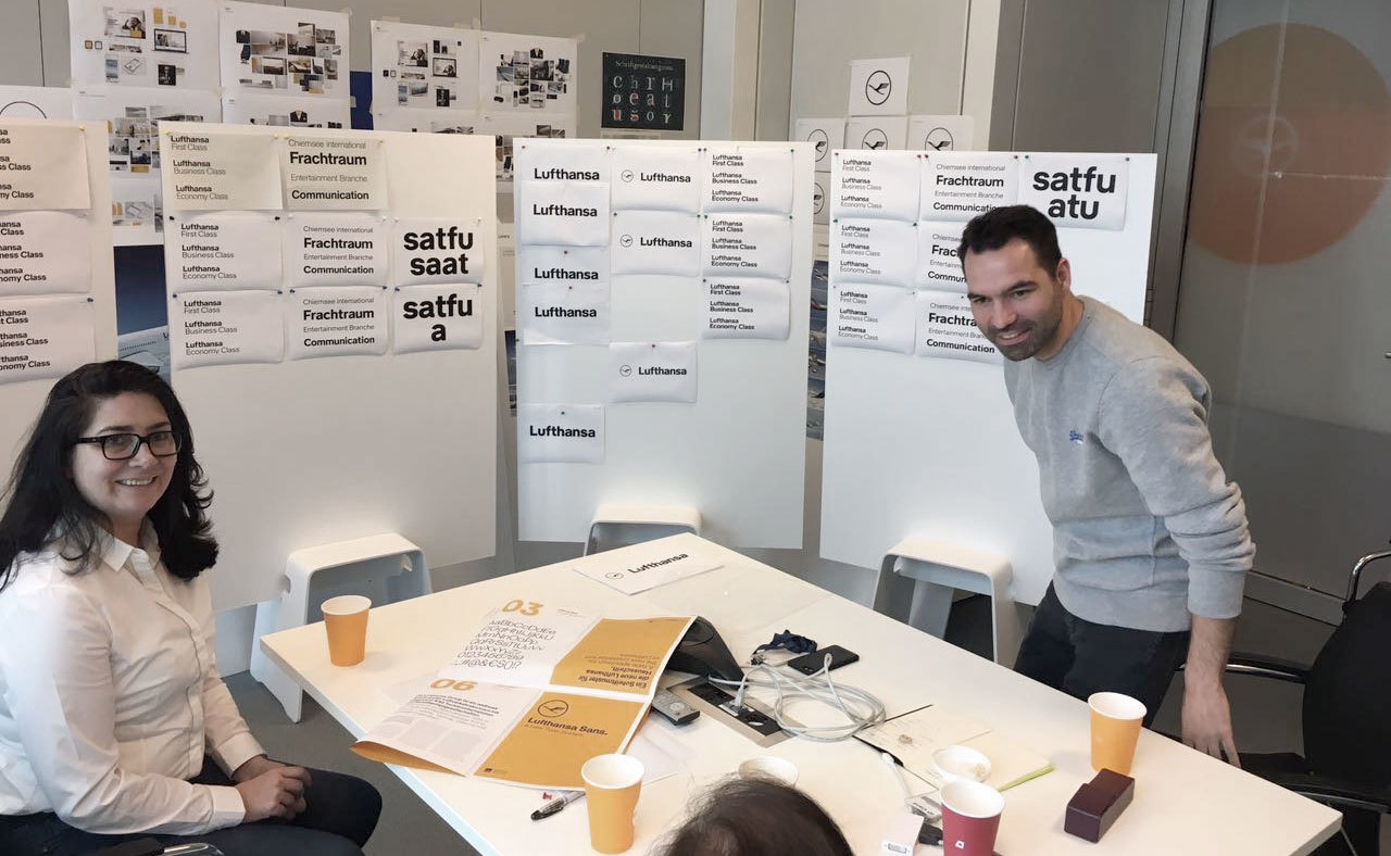
More photos from the process
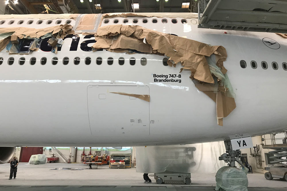
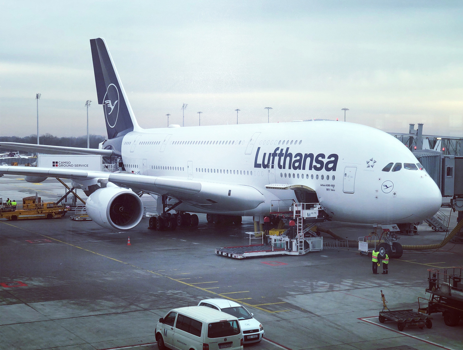
New livery in progress
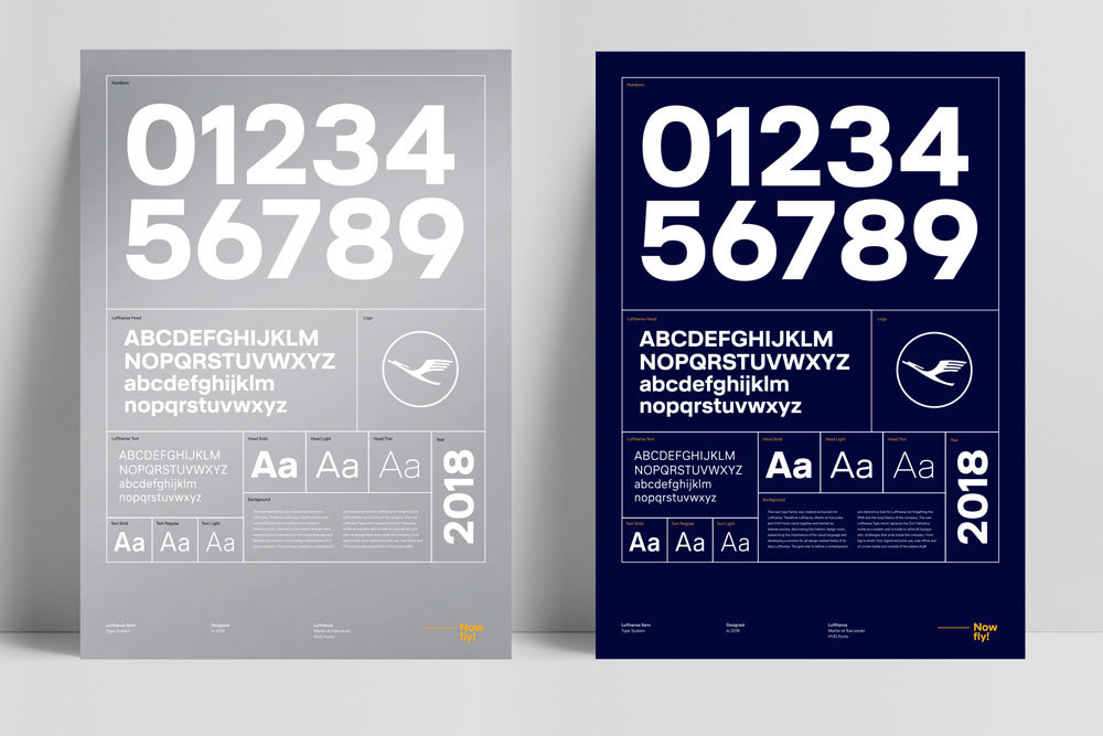
Type specimen posters
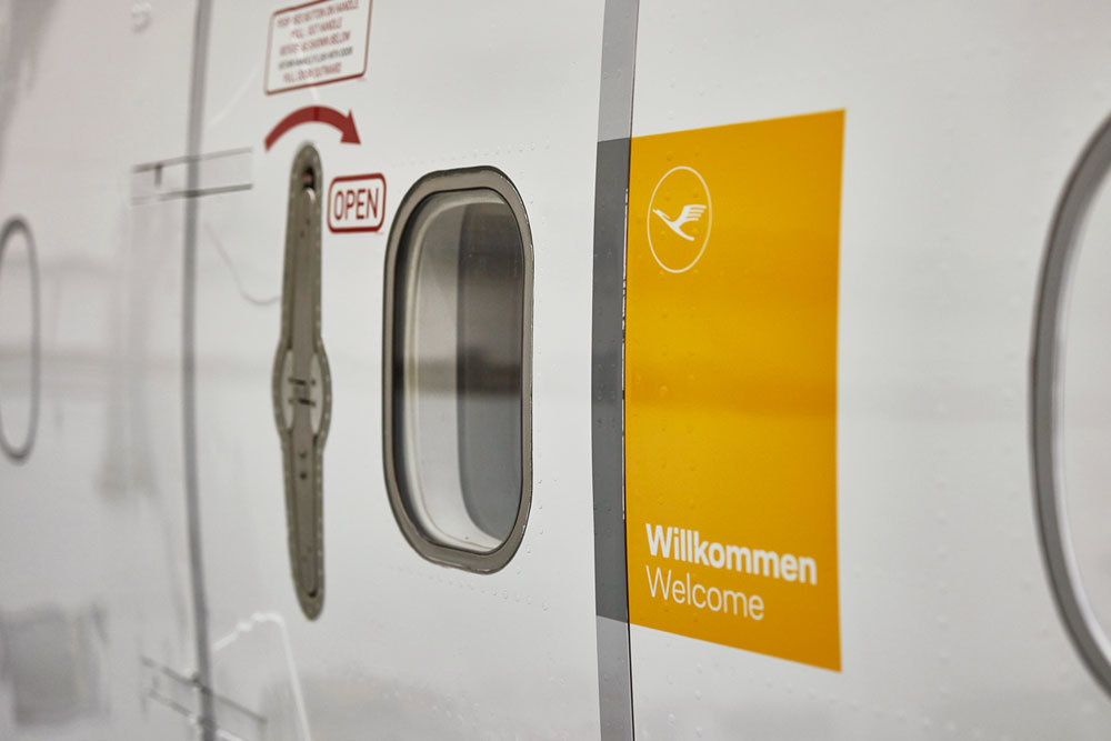
The yellow welcome panel
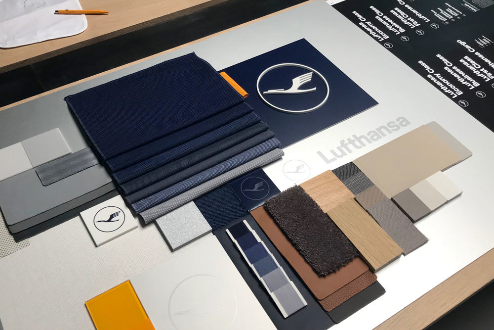
Lufthansa material mood board
Applying the fonts in every corner of the Lufthansa company
Lufthansa Corporate Type
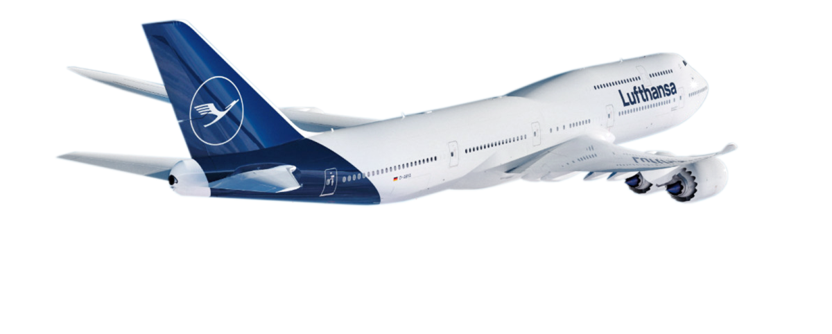
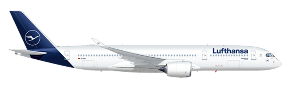
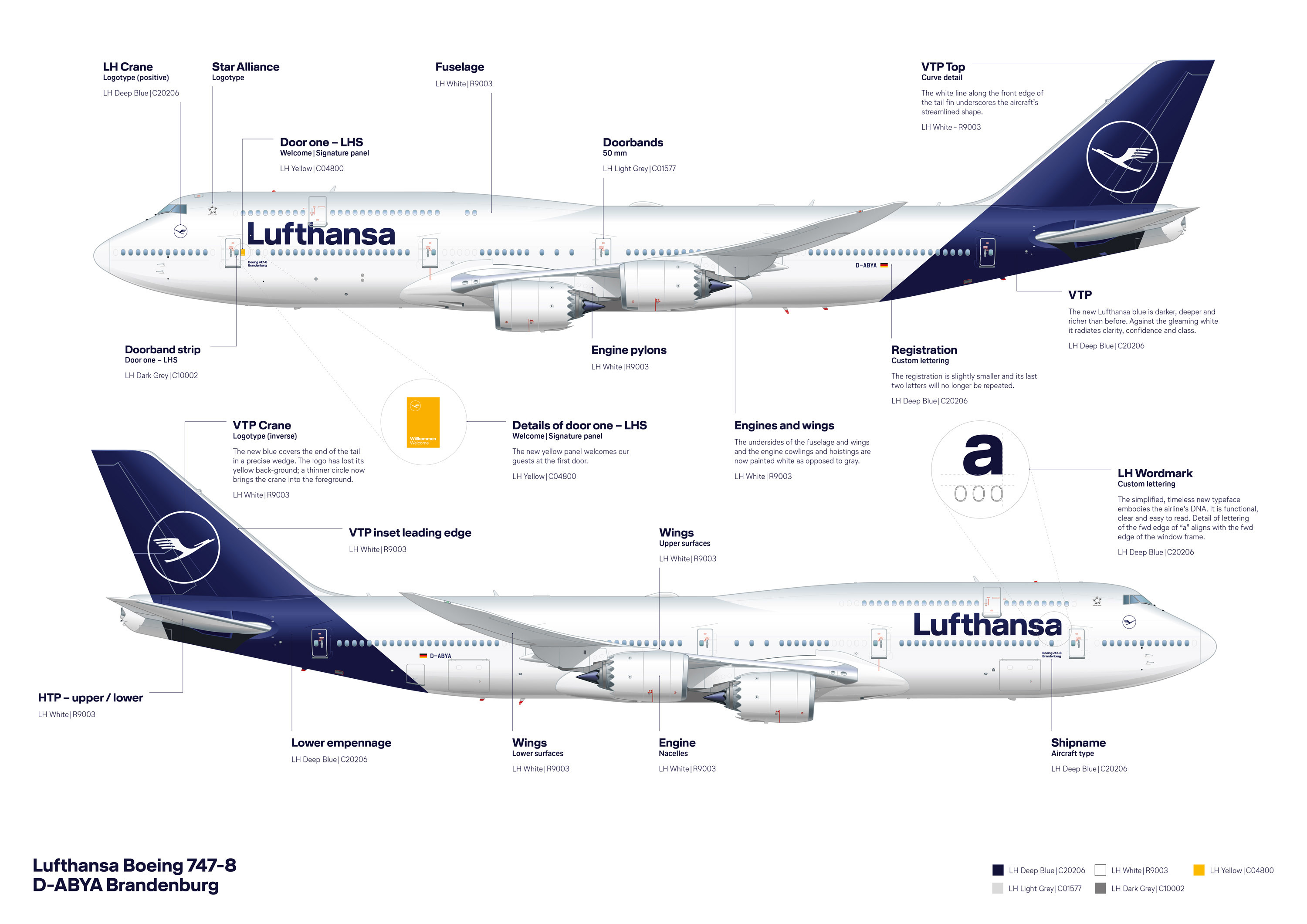
The Livery
The Lufthansa logotype, as it appears on the livery, is slightly heavier (than the Lufthansa Head Bold weight) and tightly spaced. Of course the registration code on the rear is set in the monospaced Lufthansa Registration Type, which also follows the characteristics of the type family.
Lufthansa Corporate Type
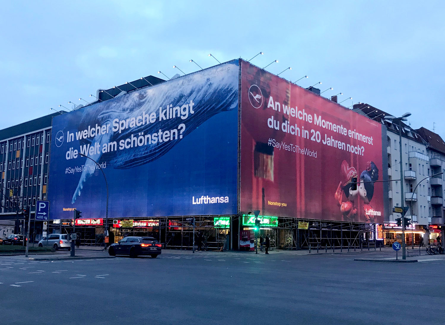
Advertising
Advertising is an essential application. Lufthansa Head catches attention, lends the brand a strong face and represents Lufthansa’s assets. Lufthansa Text represents small sizes.
Lufthansa Corporate Type
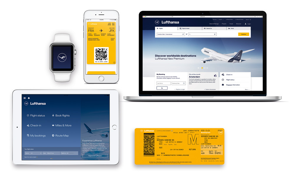
Digital Devices
The Lufthansa fonts are all manually hinted and optimized for screens, to ensure a clean and sharp rendering in the digital world all the way down to very small sizes.
Lufthansa Corporate Type
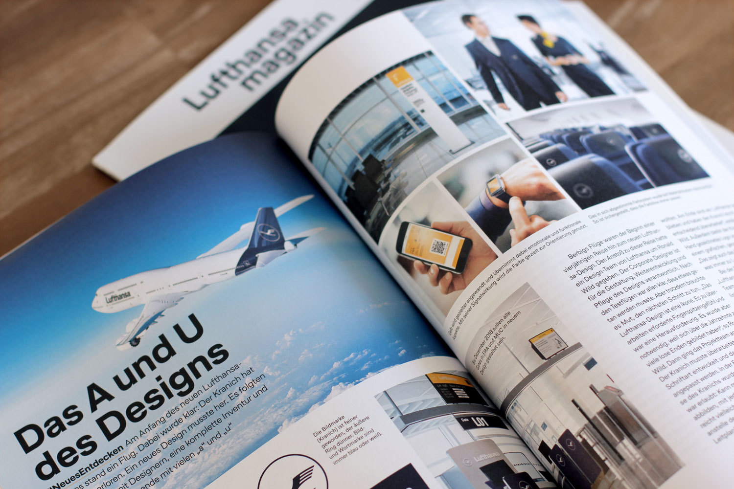
Editorial & Magazines
A wide range of weights and a clear distinction between headline and body text styles turn the Lufthansa type system into a strong workhorse for editorial design projects.
Lufthansa Corporate Type
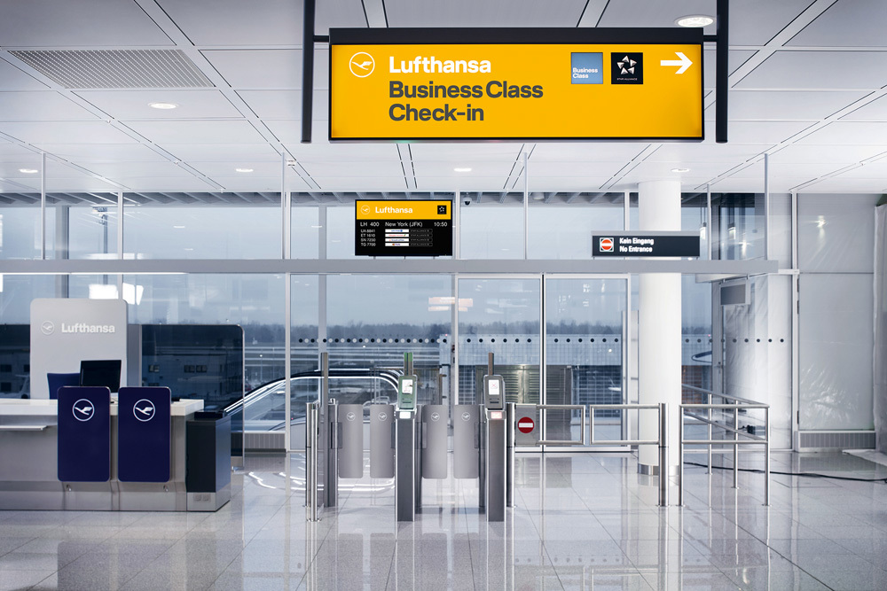
Orientation
The bold styles of the new Lufthansa typeface will lead the way in airport signage systems. Combined with the appropriate colors, the new face will unmistakably represent Lufthansa.
Lufthansa Corporate Type
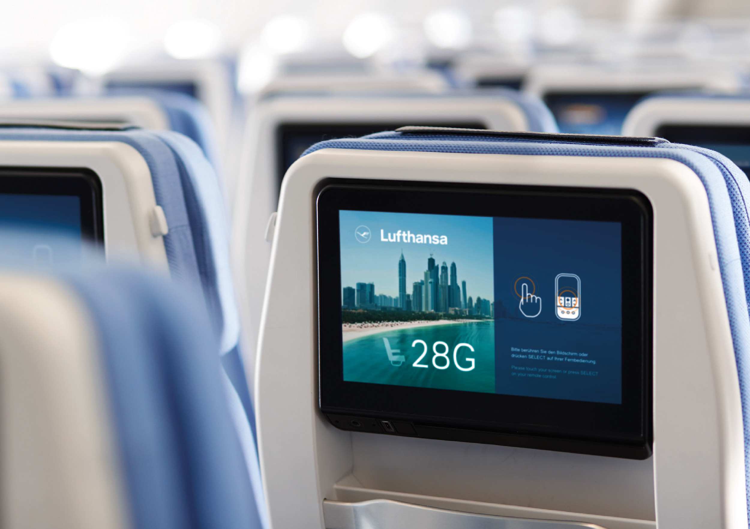
On-board systems
Additional applications areas for the new fonts are found inside the plane: for seat numbers, toilet signs and for the digital on-board system of course.
Here is a short documentary about the design process.
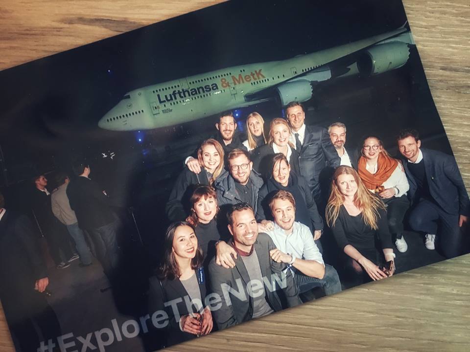
Good team, good time.
This was a project where a lot of people were involved.
Thank you all for the good teamwork, the endless discussions, the different opinions, the ups and downs, the positive vibes, the great time and the outstanding result! #Lufthansa #MetK #HvD
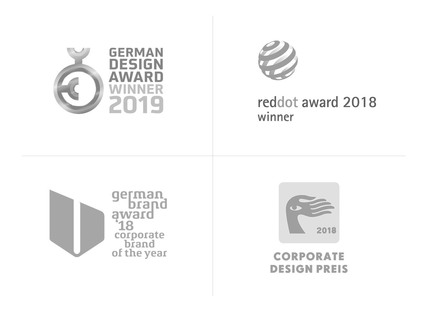
We are happy to announce that the Lufthansa brand relaunch received several awards.
Feel that tingling in your fingertips? That’s the magnetic urge to contact us: