Liebherr
Liebherr Freisteller
A custom type system for applications from technical tables to mining trucks.

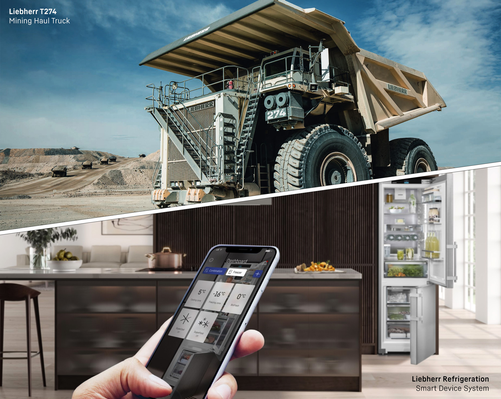
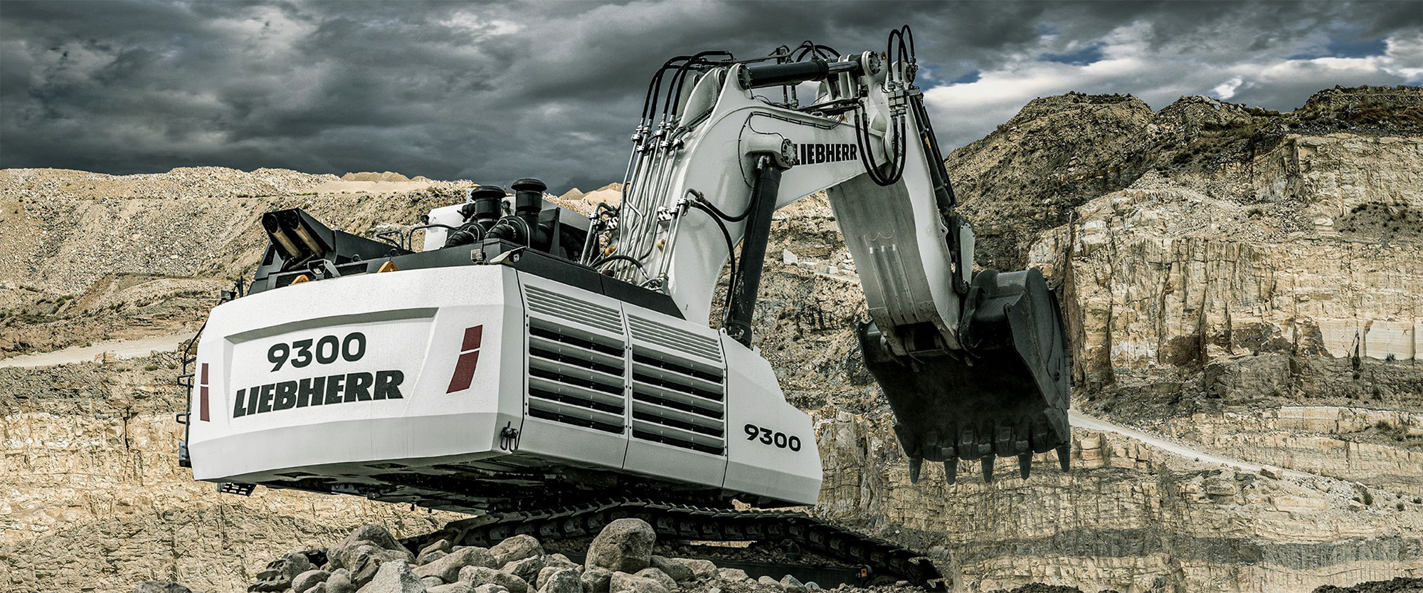
The Liebherr Group is a technology company with a broad and diversified product portfolio that includes 13 different segments, ranging from eco-refrigerator technologies to precise aerospace engines and huge mining trucks. With all of these solutions, Liebherr aims to inspire their customers. In doing so, the limits of what has previously been appropriate and feasible are constantly reconsidered, allowing Liebherr to contribute to the overall progress of technology.
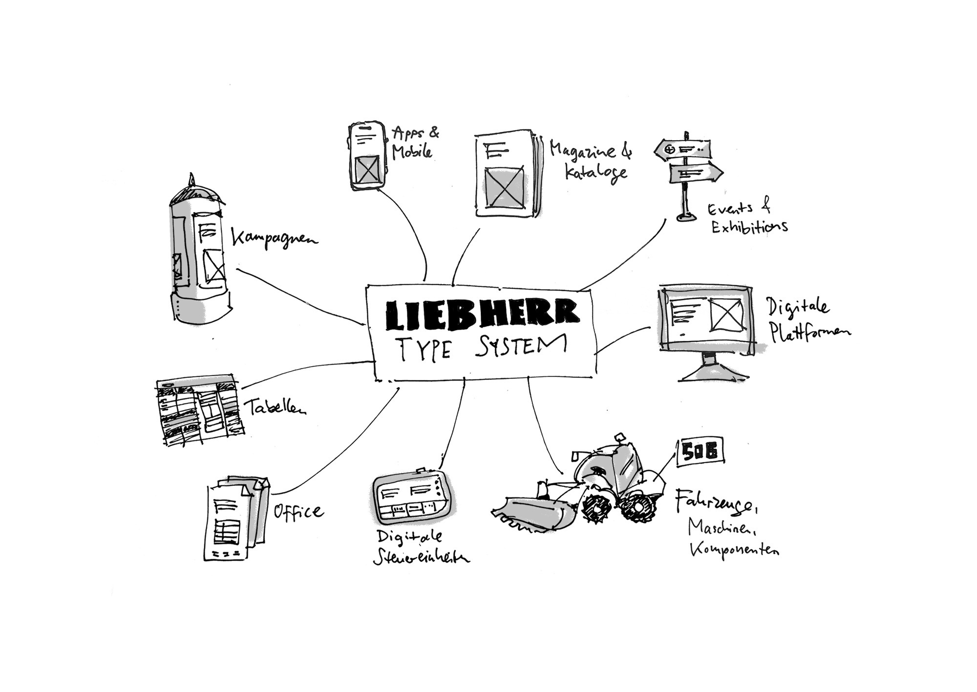
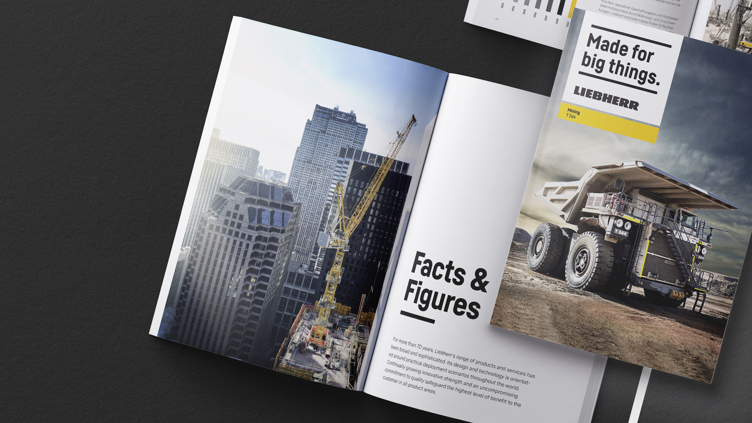

A versatile typeface for different tasks.

The new Liebherr typeface is part of a comprehensive relaunch of its entire corporate design created by MetaDesign and Liebherr. Our task was to deliver a homogenous type system that is seamlessly integrated into Liebherr’s new visual identity, while also meeting today’s typographic and technological demands. Based on our own Fabrikat type family we created a custom version tailored for the complex challenges of the Liebherr universe.

Corporate designs grow organically over years. From time to time workarounds become necessary, especially when technology changes: if an existing typeface no longer works for emerging digital applications an entirely different typeface may be added to the system. This results in a patchwork that somehow handles day-to-day tasks, but consists of many different variables. When a new type system is put into place, it allows us as type designers to find solutions for those issues from scratch.

Liebherr has a very broad scope of different products and areas of application. Therefore the new typeface has to deal with a lot of challenges. We analysed which fonts are used in which field and worked out how one font system should be built up, that works for every requirement and looks homogenous.

Finding the right type for the job.

As it turned out, the basic principles of our existing type family Fabrikat nearly matched the approach and the attitude of the Liebherr company: technology and precision. We then analysed Fabrikat in detail and explored every single character to consider possible adjustments that would make a perfect fit for a customized Liebherr typeface.

Some things need to be considered in the construction of a typeface that is based on geometric principles. In addition to its geometric appearance, we needed to make sure that it was legible and easy to handle. A mathematically constructed set of characters does not make a very legible typeface, therefore optical corrections are necessary. Specific adjustments need to be made to specific characters to find the path between pure geometry and functionality. However, we made sure that optical corrections remain as invisible as possible to maintain the illusion of pure geometry.


Digging deep: uncovering the anatomy.
The anatomy of a typeface.

Precision and geometry are the foundation of this type family — a reflection of the core values of the client. A look at the character anatomy in detail reveals a grid. After this first step we applied optical corrections. Rounded shapes that are found in the upper and lower parts of the O need a slightly larger tension than a perfectly mathematical circle, while all horizontal strokes are slightly thinner than the vertical ones. What’s more, rounded strokes are slightly heavier than vertical stems. We defined this formula in the beginning and utilised it throughout the whole design process. One significant characteristic of the Liebherr typeface are round letters like C, G or O: their round sides are made of straight vertical stems representing a more condensed and technical appearance.

Cutting a fine line.

The construction of the Liebherr typeface is based on narrow shapes with vertical emphasis. This results in an alphabet that is space-saving and well-suited for headlines.

Striking figures.

The reduced appearance of the figures make a clear statement in tables, invoices, price overviews and any business document.

As tight as readable.

In addition to the text weights that is optimised for small sizes, we created a condensed version that is appropriate for technical instructions and tables where a lot of information is jammed in limited space at small sizes. We did several test rounds to find the perfect weight for this condensed version: strong enough to not break away in bad conditions, but also thin enough not to blurr in very small sizes.

Characters with character.

Unique characters are a must in a custom typeface. Characters that breath the air of the client and can be associated with the visual identity by simply seeing the typeface without any additions. When thinking about these rather unique characters we always keep functionality as the basic requirement — based on this precondition we can turn up the volume.


Extra wide for the big ones.

The heavy machines like construction machines, mining vehicles and cranes are captured in a specific code lettered on its metal body. The big engines call for a strong and self confident typeface!

At first we created an ultra black version based on the proportions of Liebherr Head, the headline style. While testing on the vehicles, it was clear that we need to go one step further: even more prominent with a wider and more self-confident appearance. The final solution was to use the principle of the Liebherr typeface anatomy and flip the horizontal and vertical strokes. This leads to a clearly horizontal emphasis, lending the big ones enough power.

Testing in the habitat.

Of course the new face has to be tested in each respective size in the real environment. As it is also applied to cranes it has to work from a distance and in heights. The result is an additional style which is used exclusively for the product codes. These codes describe the model, while also providing a strong visual connection to the formal language of the Liebherr company.


Applying the fonts in every corner of the Liebherr company.
In editorial design

A wide range of weights and a clear distinction between headline and body text styles turn the Liebherr type system into a fitting solution for editorial design projects.

On the web

The Liebherr fonts are all manually hinted and optimised for screens, to ensure a clean and sharp rendering in the digital world, all the way down to the smallest size.

For digital devices

Additional application areas for the new fonts are found inside the control devices.

On all kinds of products

The heavy and wide Liebherr Product Type appears on heavy machines like construction machines, mining vehicles and cranes.

In orientation systems

The different styles of the Liebherr Type will be used for signage systems and info signs to navigate through the Liebherr world.


We are happy to announce that the Liebherr brand relaunch received several awards.

Feel that tingling in your fingertips? That’s the magnetic urge to contact us:

[email protected]