Love at first Flight. Discover the type of Eurowings.
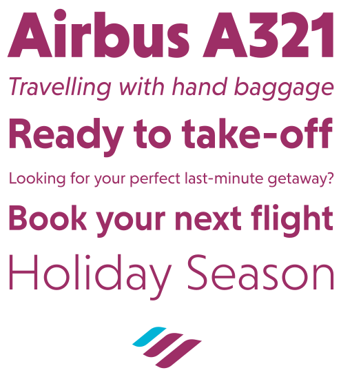
Clarity on the ground and in the air: Eurowings’ refreshed look and new typeface reflect an ongoing commitment to a seamless brand experience. Forward-looking brands require clarity: That is why the new typeface blends character with functionality—serving as a unifying element to elevate passenger communication.
Typography at 30,000 Feet.
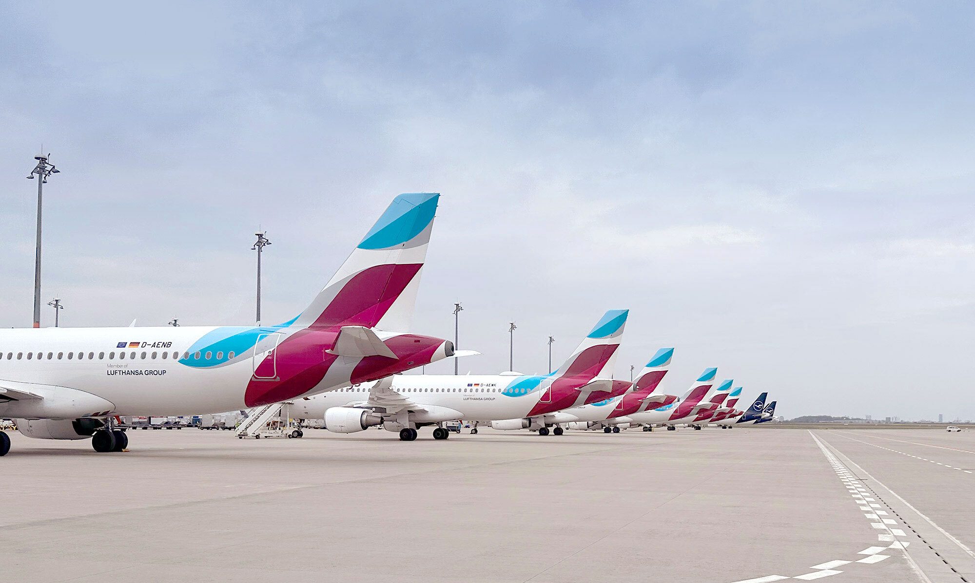
Eurowings specializes in direct flights within Europe and neighboring countries – offering a compelling price-performance ratio. Eurowings is the value airline of the Lufthansa Group and thus part of Europe's largest airline group. With a clear positioning as Europe's value airline for leisure and business travelers, it clearly distinguishes itself from the ultra-low-cost carrier segment.
Ready for Departure: Defining the Logo.
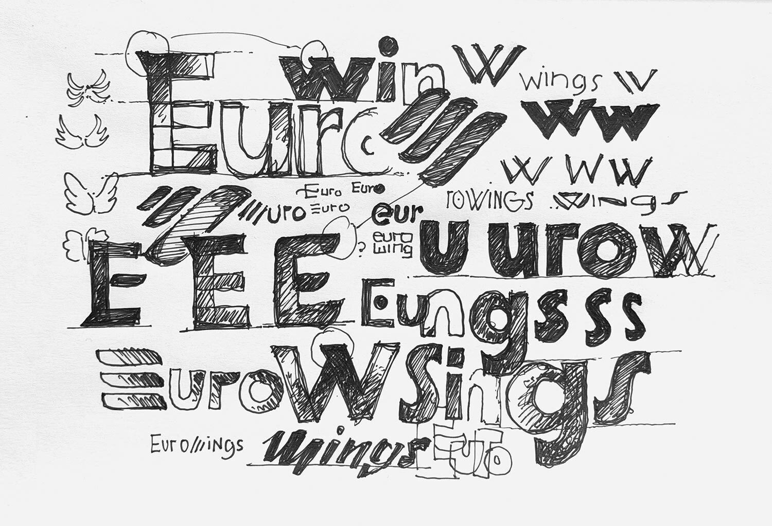
We started with the Eurowings logo, since the lettering of the new wordmark is to be set in the new typeface. How should the new Eurowings logo appear? What is the flow of the wordmark? How do the letters relate to each other, and are there any particular letters that can function as recognizable elements?
Eurowings Type
The balance between functionality and personality.
During the design process, we evaluated various aesthetic approaches. Our goal was to create a functional wordmark with a distinctive, unique identity that complements the well known three-stroke element without competing for attention. In typography, it is often the small details and subtle touches that work best. These fine nuances inject personality into the letterforms, giving the brand a unique and memorable voice.
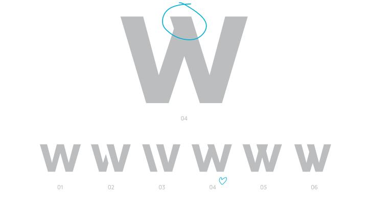
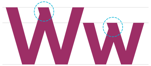
An analysis of the structural anatomy of each individual character—and the word as a whole—revealed that the letter “w”, in particular, offered an interesting opportunity for a distinctive solution. The “w” sits at the center and can be designed in various ways. We added the overlapping tip as a reference to wings, which fits perfectly with the context of an airline.
Precision engineered in every detail
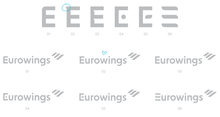
We also focused intensively on the “E” since it leads the wordmark and carries a particular emphasis. We chose to reference the overlapping “w” in its design—this gives the “E” an individual character while keeping it in line with the overall aesthetic.
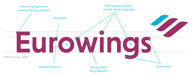
While clear and highly legible, the final logo possesses unique details that give the brand a distinct, memorable personality. The refined nuances in the “E” and the “w” transform simple letterforms into a distinctive brand mark. To achieve a more compact appearance, we shortened the stroke of the “r”, thereby reducing the gap between the “r” and the “o”. We also opted for circles in both the counters and the dot of the “i” to ensure a consistent design language across all letters.
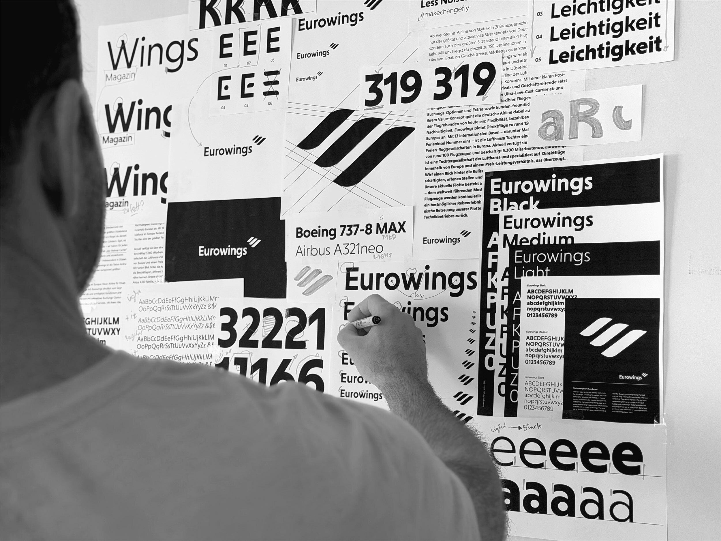
The Logbook of Type: Decoding the Design Approach.
Eurowings Type
Structure & Character
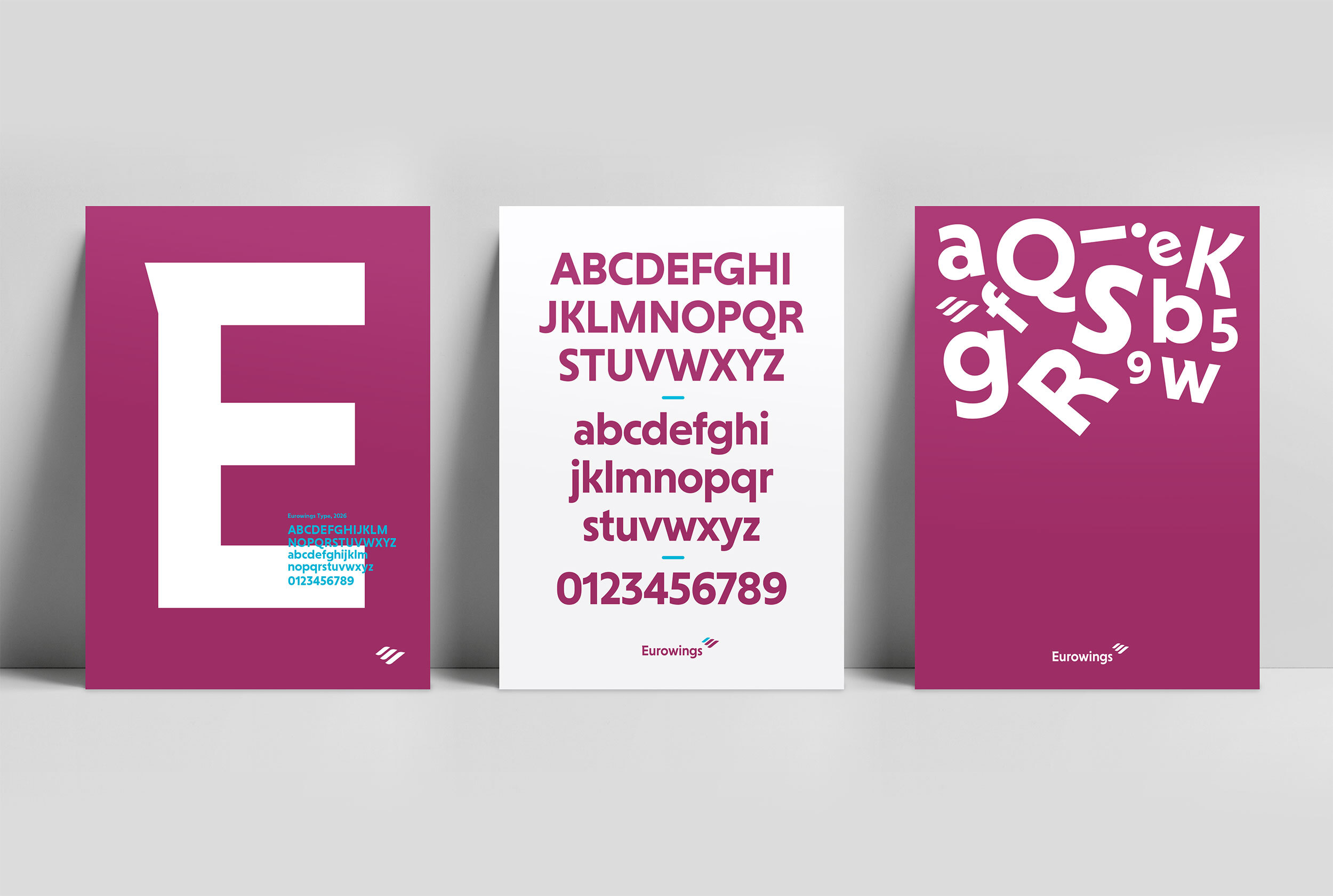
The shapes of the typeface are based on a geometric grid to establish functional proportions optimized for reading rhythm. The core exploration focused on the tension between structure and character: by systematically applying dynamic elements to the strict geometry, a subtle human element was integrated into the details.
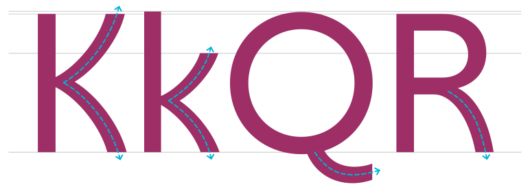
Enjoy the flow!
Flying with Eurowings should be uncomplicated and feel effortless. Letters like “K“, “Q“, or “R“ feature curved legs, giving an easy and approachable feeling.
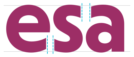
Vertical Stroke-Endings.
Vertical end caps lend a typeface a high degree of static stability and create a particularly clear, geometric aesthetic. Their right-angled alignment with the line flow also makes glyphs appear more compact and enables a very precise, cohesive text layout.
The Geometry of Wings.
The overlapping “W” letters form a subtle brand element that connects with the brand identity and is frequently used across various contexts.
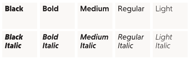
The final Eurowings type family includes weights from Black to Light with matching Italics, offering a wide spectrum for diverse design requirements.
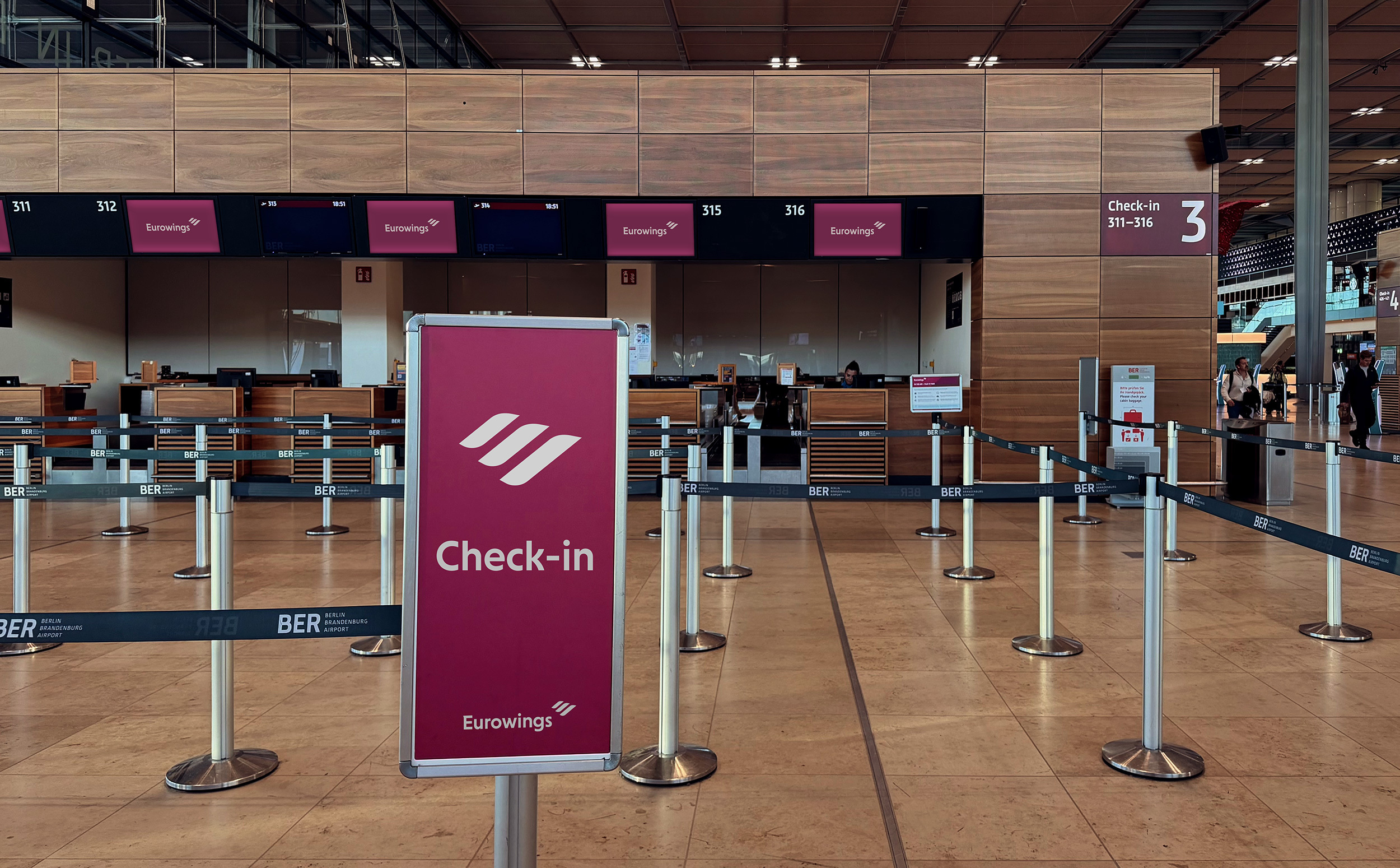
Applying the fonts in every corner of the Eurowings company.
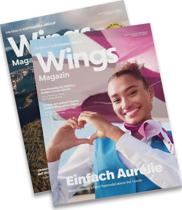
In editorial design
With a wide range of styles the Eurowings type family is perfectly prepared for editorial design and adversing flyers.
Digital
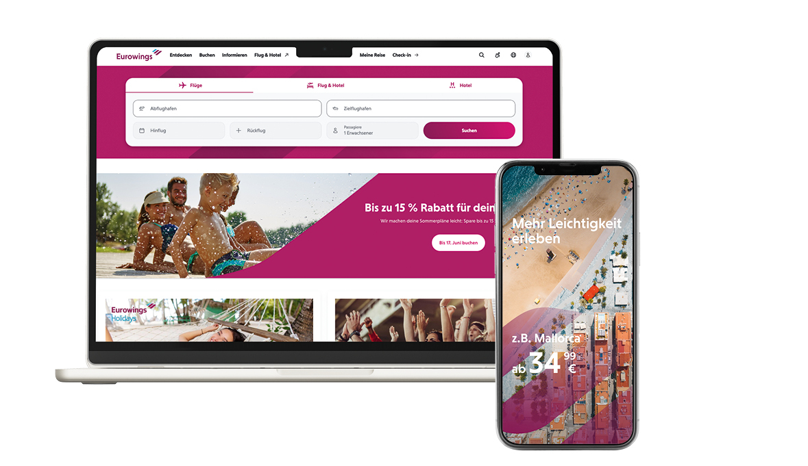
The Eurowings fonts are all manually hinted and optimised for screens, to ensure a clean and sharp rendering in the digital world, all the way down to the smallest size.
Advertising
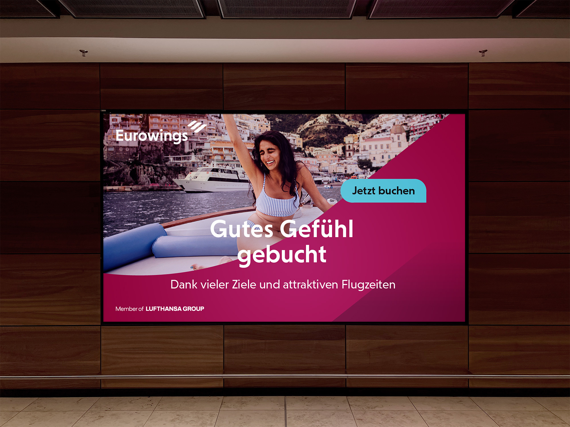
Advertising is an essential application. The Eurowings font family catches attention, lends the brand a strong face and represents the Airlines’s assets.
Feel that tingling in your fingertips? That’s the magnetic urge to contact us: