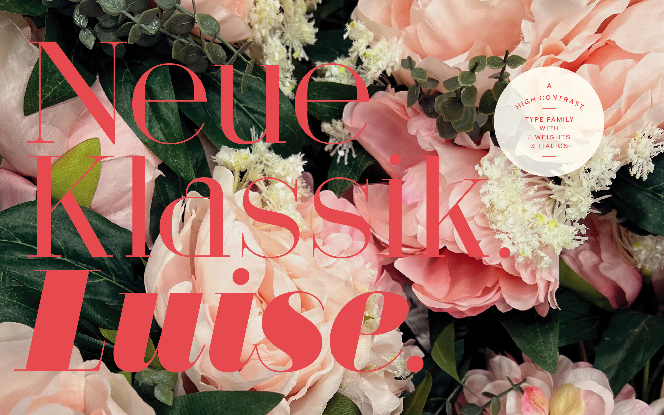
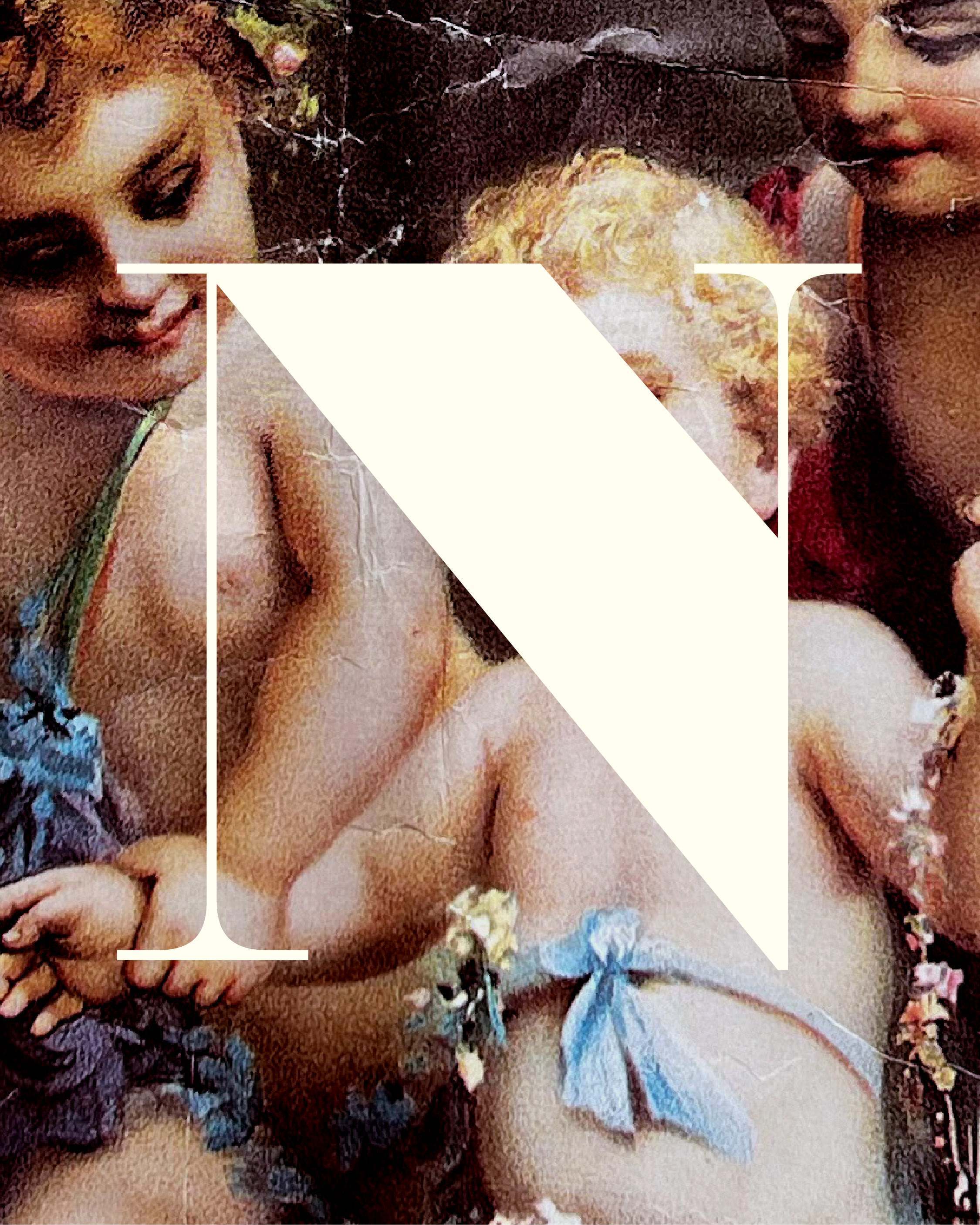
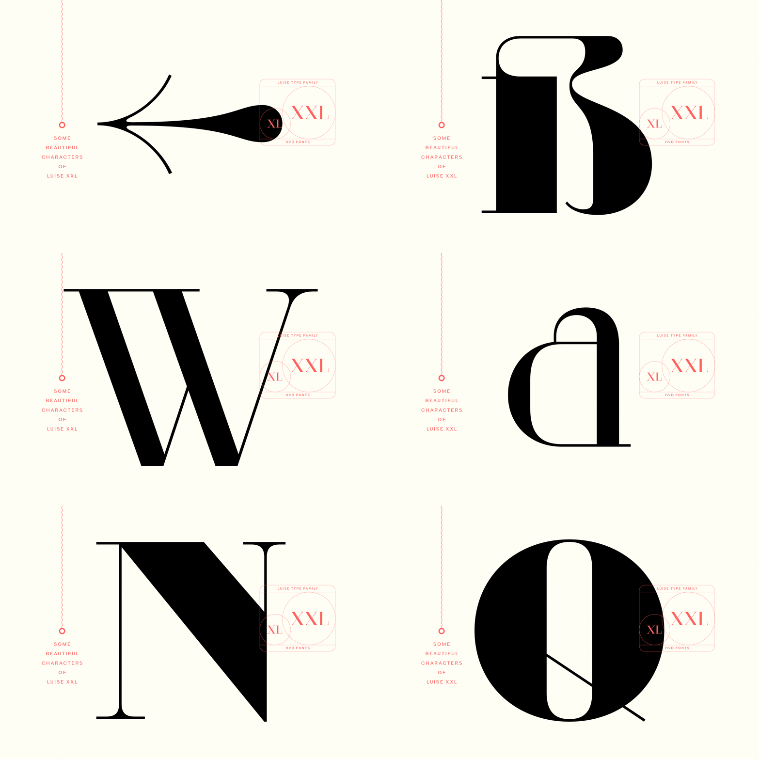
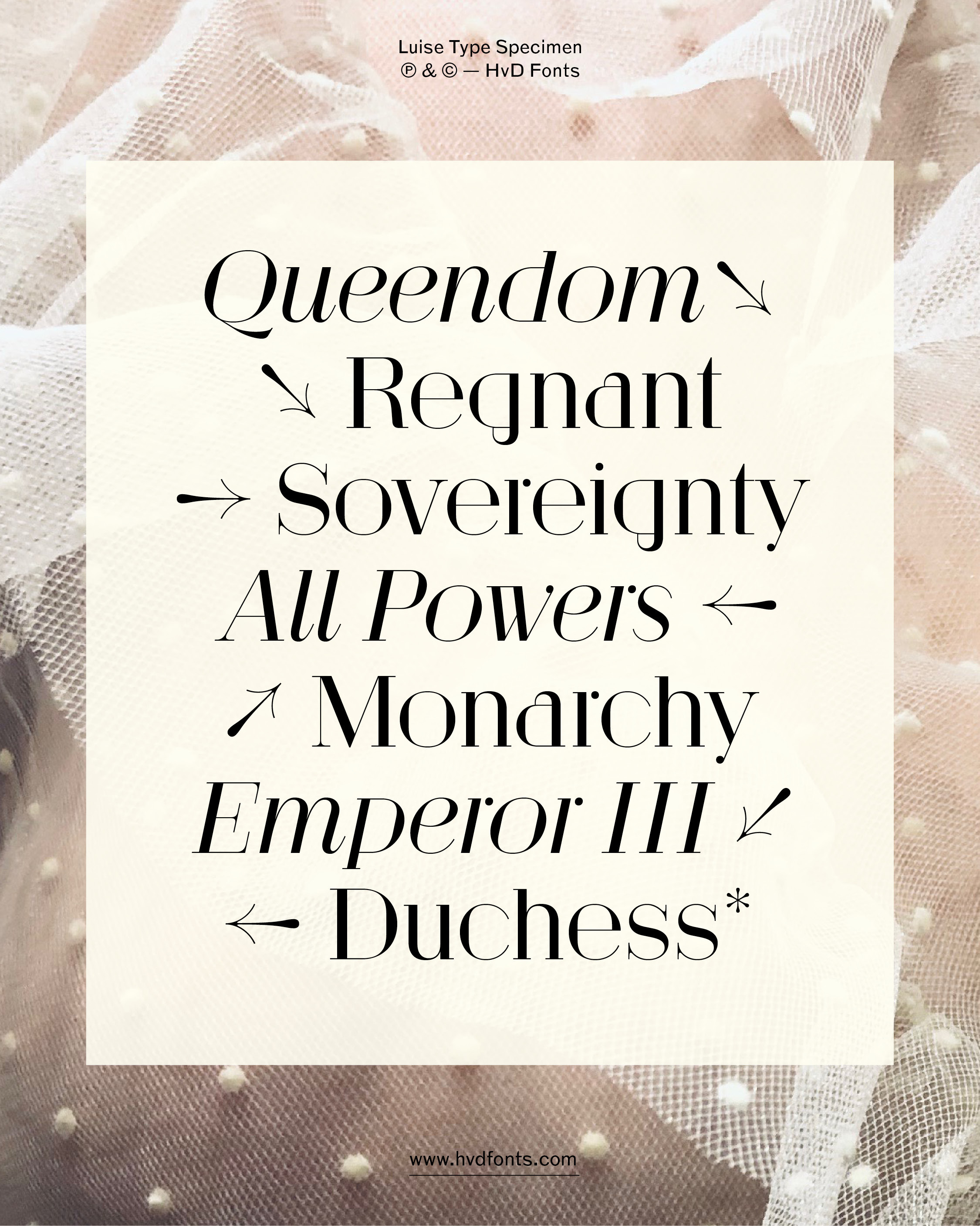
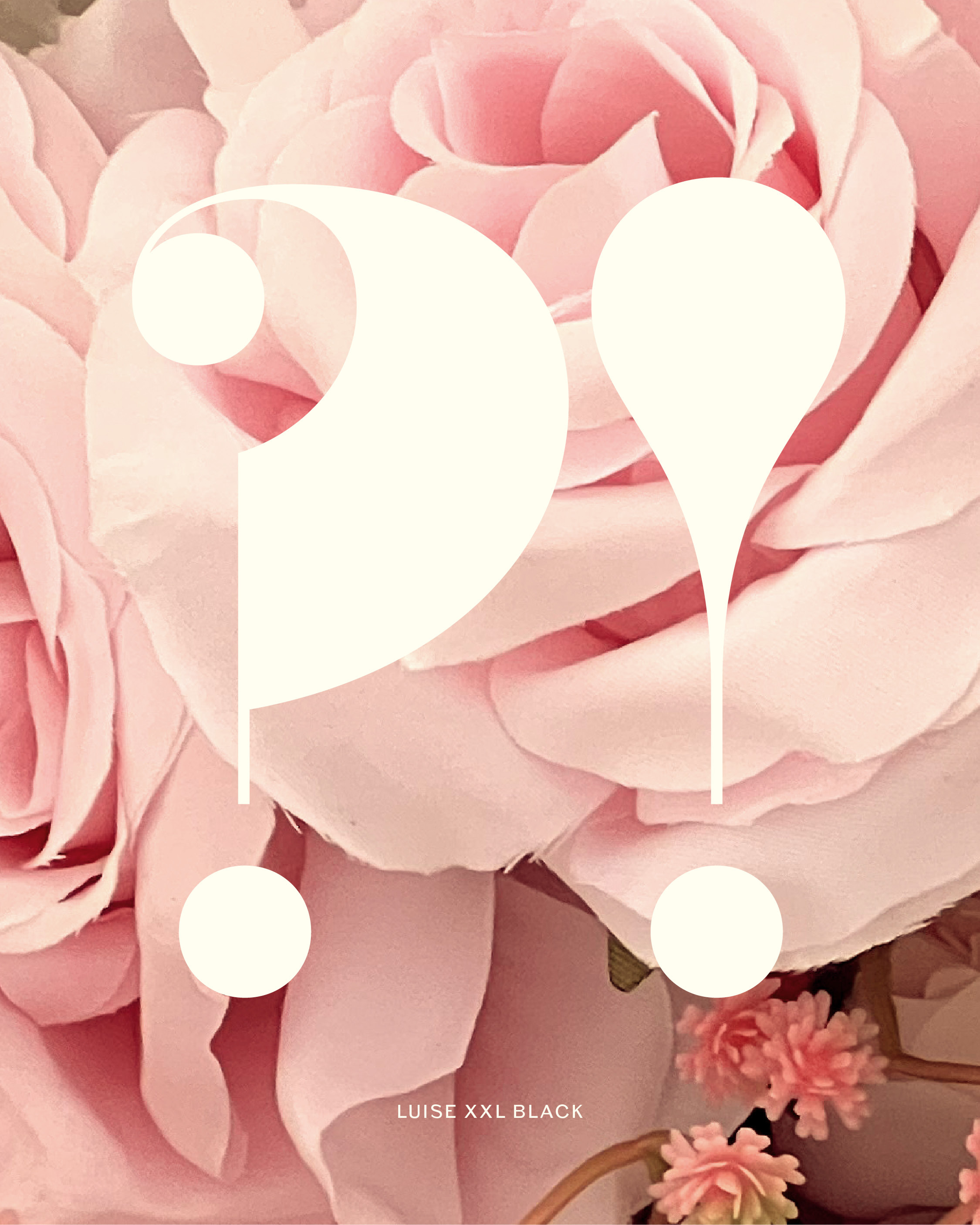
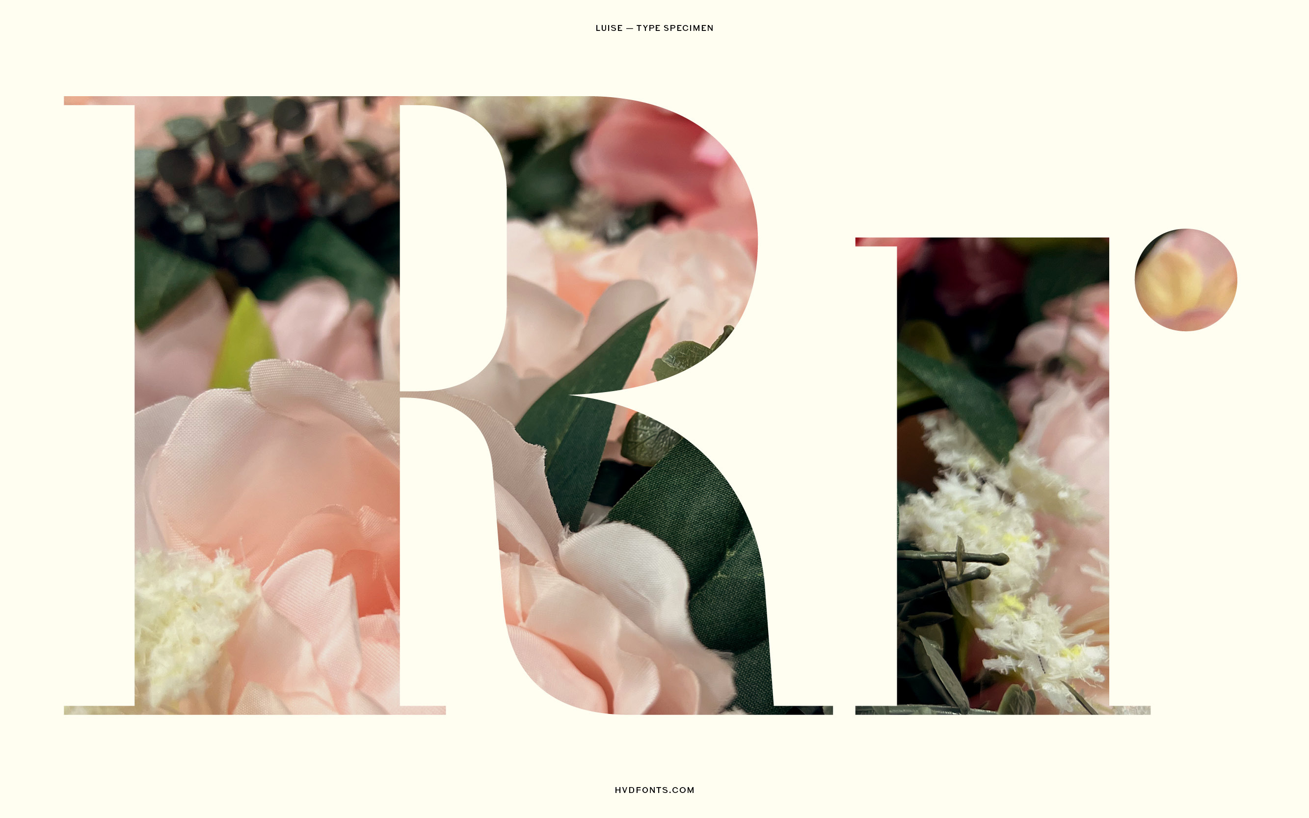
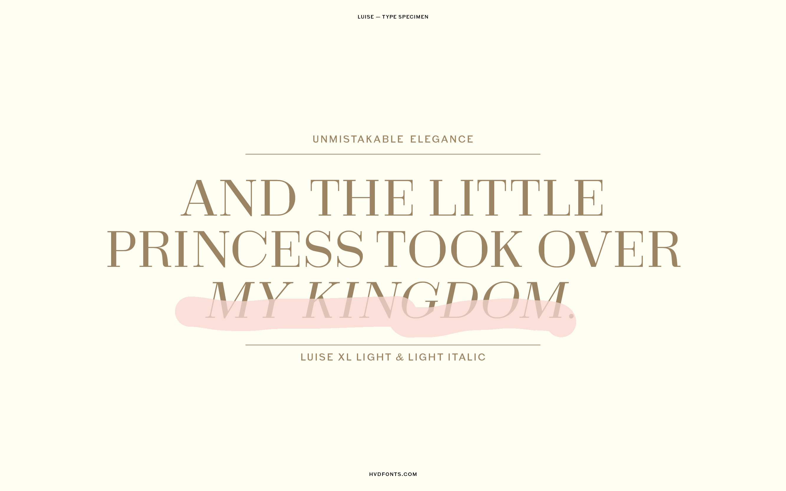
There’s always an initial thought behind every typeface. With Luise we experimented with new letterforms and a high contrast construction. The result is a typeface that exudes puristic elegance and finesse, which differs from its neoclassical relatives. Whether Luise invites you to dinner or takes you to the theatre – Luise is something extraordinary.
Saxophone
SYMPHONY
Ensemble
ELECTRICS
Orchestra
ORIGINALS
Classical
CLARINET
Mozart 7
MASTERS
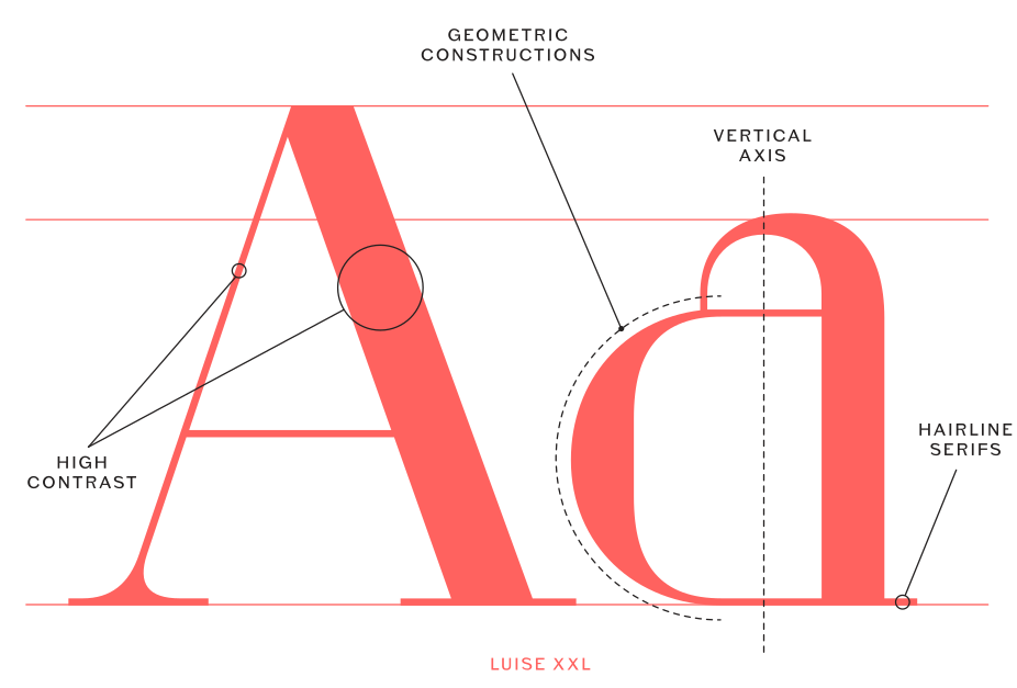
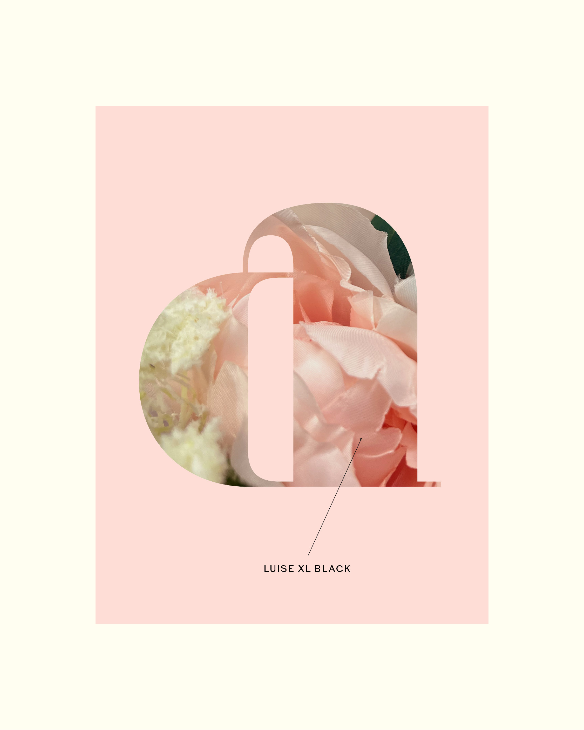
Luise can be classified as a Didone typeface, characterized by high contrast, vertical axis, hairline serifs and geometric constructions. Influenced by neoclassical typefaces of the late 18th and early 19th centuries such as Didot, Bodoni and Walbaum, Luise finds her own niche with her extravagant letter constructions. A combination of fine and delicate vs. strong and robust forms creates the basis for the letter design. Simple yet distinctive letterforms, such as the “a” or the “r”, lend it a unique character and that ”exquisiteness“.
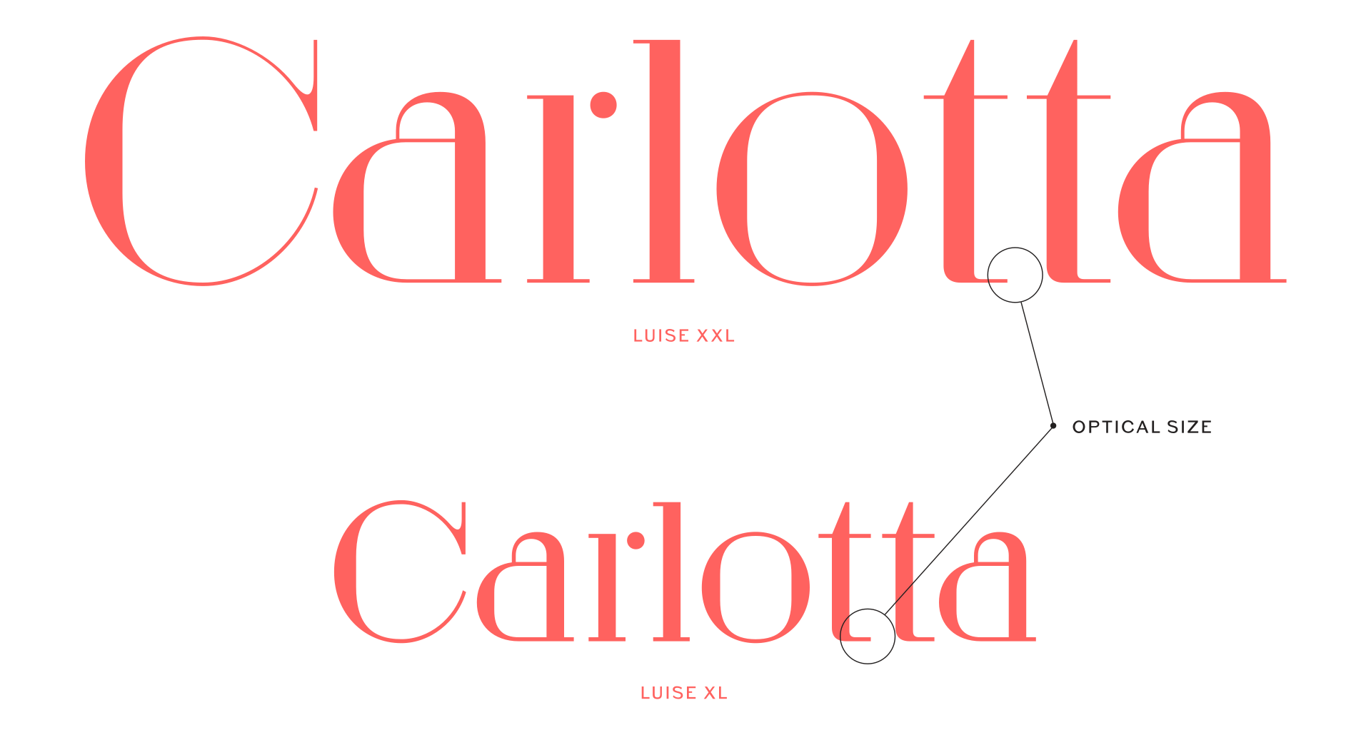
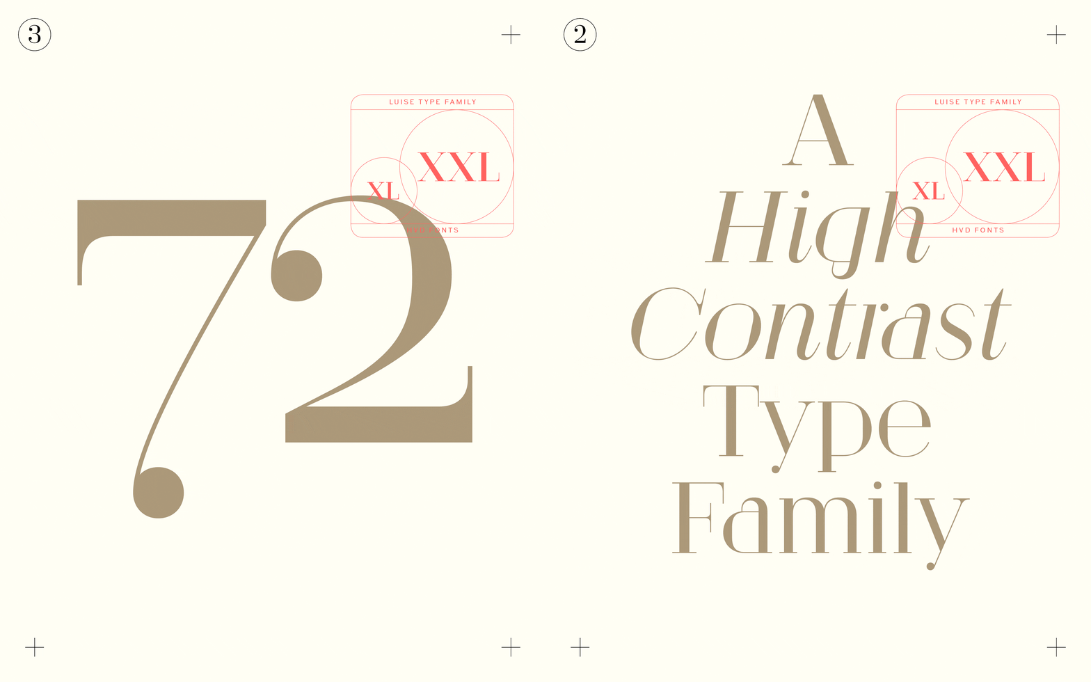
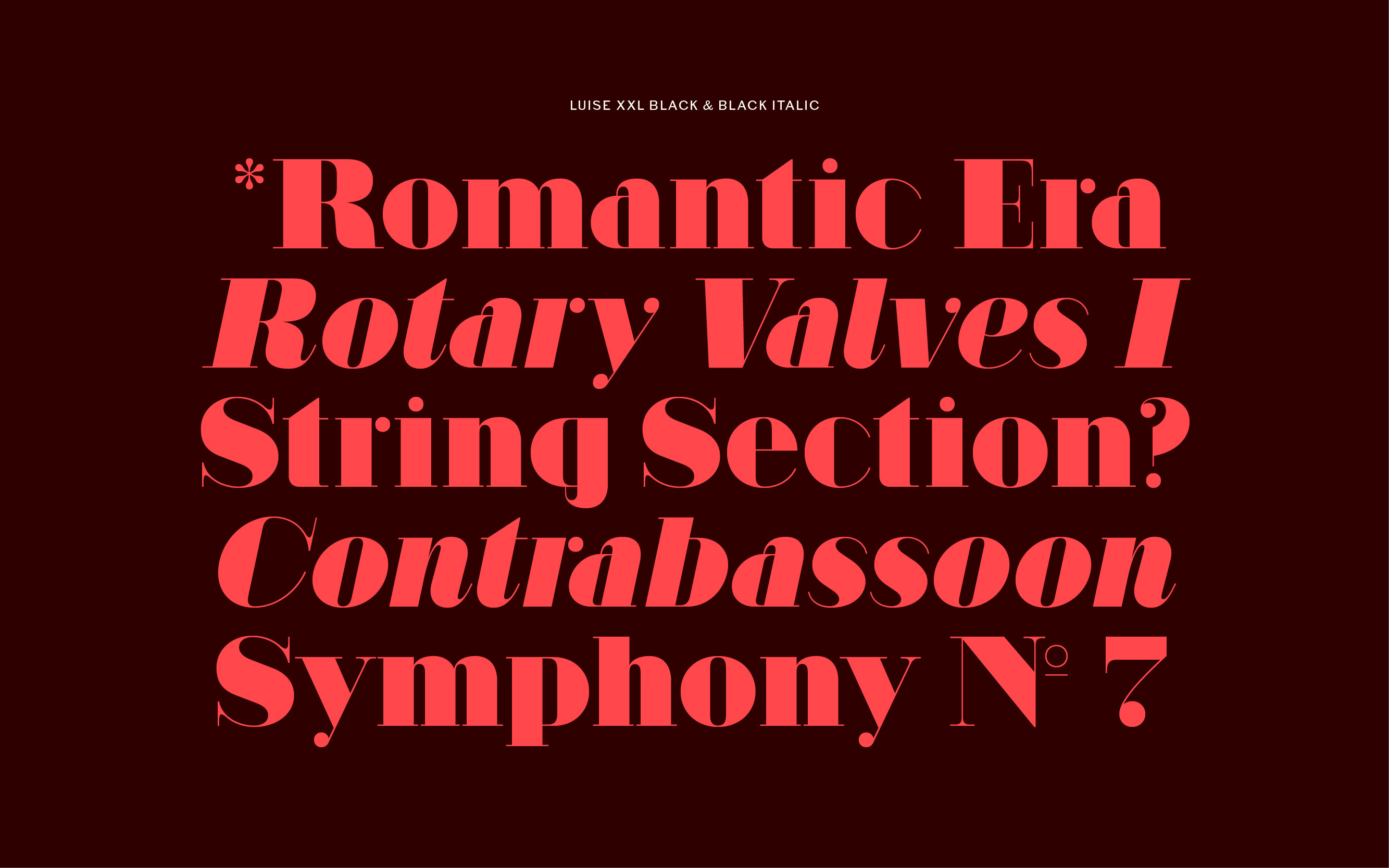
Five weights from Light to Black with matching italics and two different optical families offer plenty of opportunities for experimentation: Luise XXL with thin hairline strokes and Luise XL with slightly thicker strokes. As a font that stands for elegance and luxury, Luise is perfect for use in advertising, magazine cover design, headlines, and logo design.
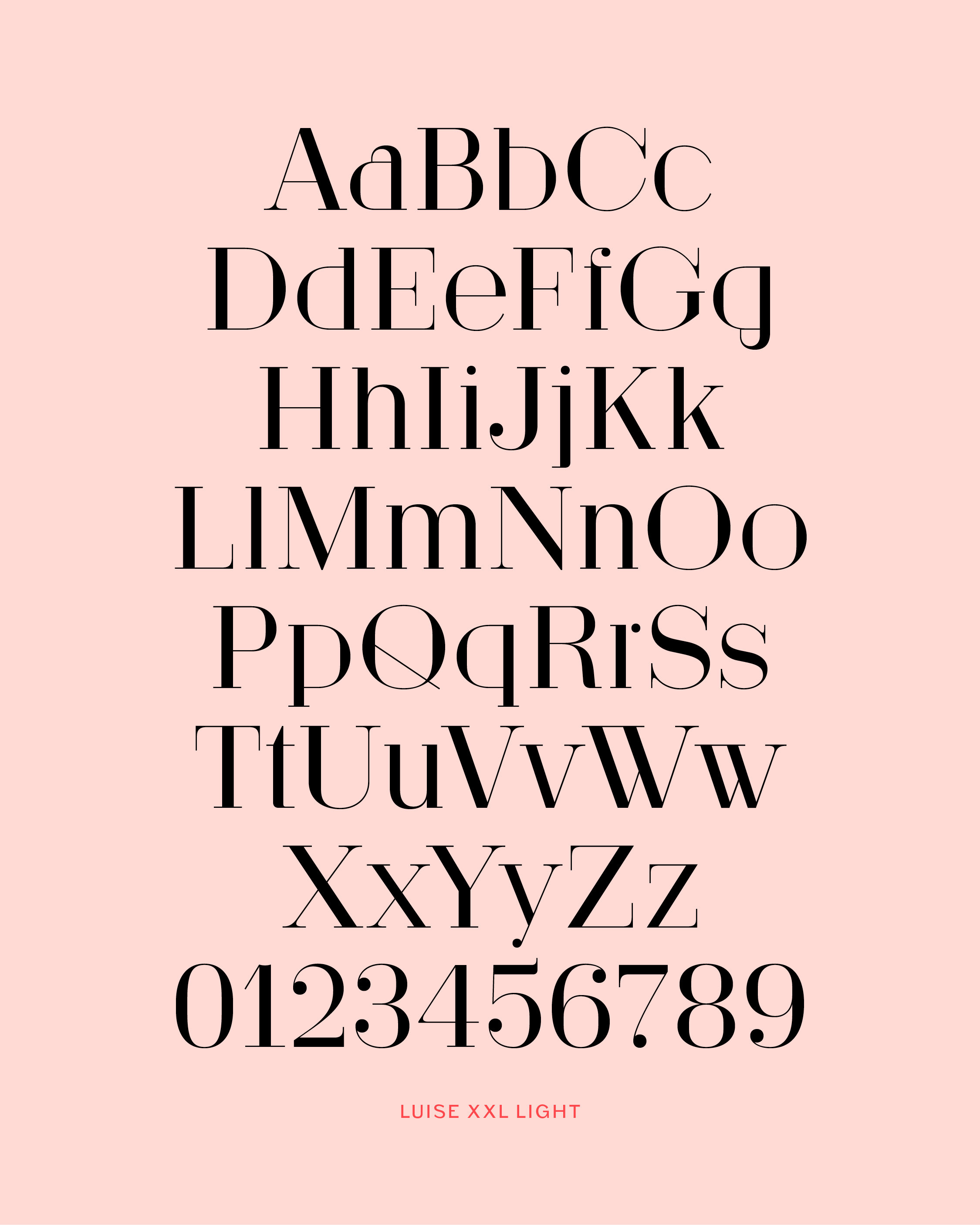
Luise not only has an extended character set to support the most common latin based languages, but also a rich OpenType feature support. The OpenType features enable excellent typography for the users in all modern layout applications.
I still have 2/8 of Didot’s type specimen.
If fractions are needed anywhere an OpenType code makes sure that if you type any numbers combined with a slash between a fraction will automatically be substituted.
Give me 256 letters.
When lining figures are used in a reading text they often produce a visual stretch in the text and disturb the grey value. It has the same effect if you use ALL CAPS in a text. One solution could be to make the numbers slightly smaller and give them some more space in-between. The other, more elegant way is to use the old style figures, they have ascenders and descenders like the lower case letters and will fit seamlessly in the text.
012753
111396
In addition to the normal lining figures, the fonts contain a set of tabular figures. This means that all numbers have the same width, which is useful for setting up invoices, tables or every other task where the figures should have a structured appearance among themselves.
H2O7N8
A subscript is a character that is set slightly below the normal line of type. They are used in formulas, mathematical expressions, and specifications of chemical compounds and isotopes, but can have many other uses as well. These characters are not simply ordinary characters reduced in size – to keep them visually consistent with the rest of the font, they are slightly heavier than a reduced-size character would be.
REGIO2
A superscript is a character that is set slightly above the line of type. It has the same weight and size like a subscript character. They are also used in formulas, mathematical expressions and text references, but can have many other uses as well.
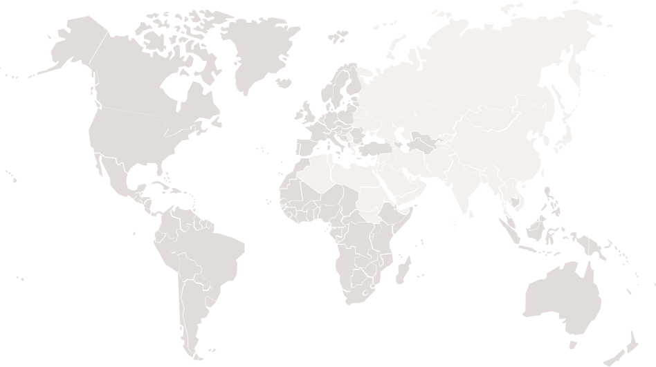
Latin: Afar, Afrikaans, Albanian, Basque, Belarusian, Bislama, Bosnian, Breton, Catalan, Chamorro, Chichewa, Comorian, Croatian, Czech, Danish, Dutch, Esperanto, Estonian, Faroese, Fijian, Filipino/Tagalog, Finnish, Flemish, French, Gaelic, Gagauz, German, Gikuyu, Gilbertese/Kiribati, Haitian-Creole, Hawaiian, Hungarian, Icelandic, Indonesian, Irish, Italian, Javanese, Kashubian, Kinyarwanda, Kirundi, Latin, Latvian, Lithuanian, Luba/Ciluba/Kasai, Luxembourgish, Malagasy, Malay, Maltese, Maori, Marquesan, Moldovan/Romanian, Montenegrin, Nauruan, Ndebele, Norwegian, Oromo, Palauan/Belauan, Polish, Portuguese, Quechua, Romanian, Romansh, Sami, Samoan, Sango, Serbian, Sesotho, Setswana, Seychellois-Creole, Swazi, Silesian, Slovak, Slovenian, Somali, Sorbian, Sotho, Spanish, Swahili, Swedish, Tahitian, Tetum, Tok-Pisin, Tongan, Tsonga, Tswana, Turkish, Turkmen, Tuvaluan, Uzbek, Wallisian, Walloon, Welsh, Xhosa, Zulu.
Enjoy this typeface?