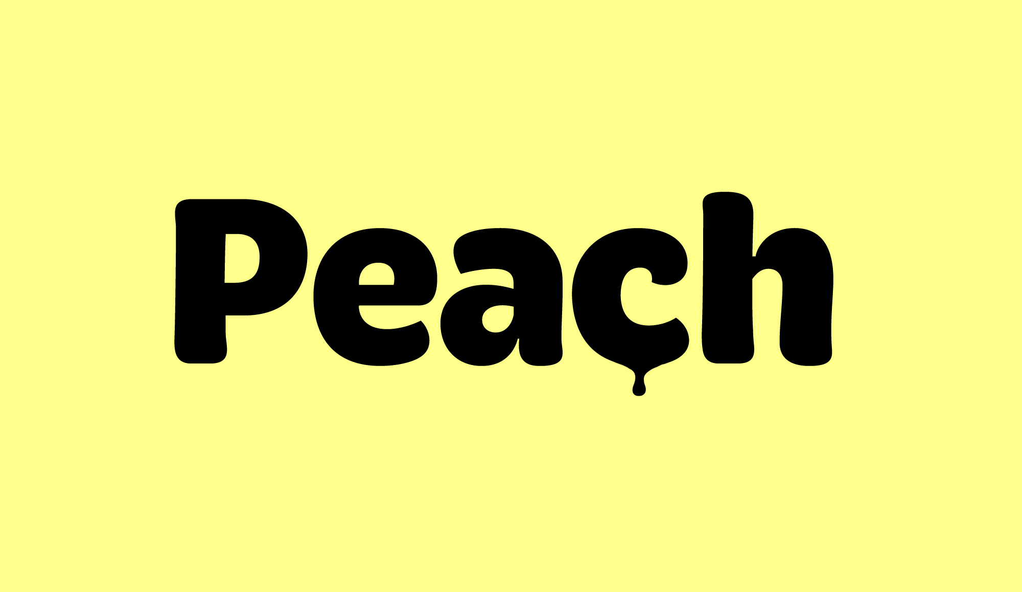
Brevia feels casual and friendly it has a straight architecture, making it perfect for longer texts. Because of its large x-height, it also performs nicely in very small sizes. Brevia’s heavier weights are slightly more curved and have an eye-catching appearance. They unfold their strength especially in bigger sizes. This contemporary type family is intended to be used in applications like: Cosmetics, Service, Food and Advertising – basically everywhere where a pleasant feeling should be conveyed.
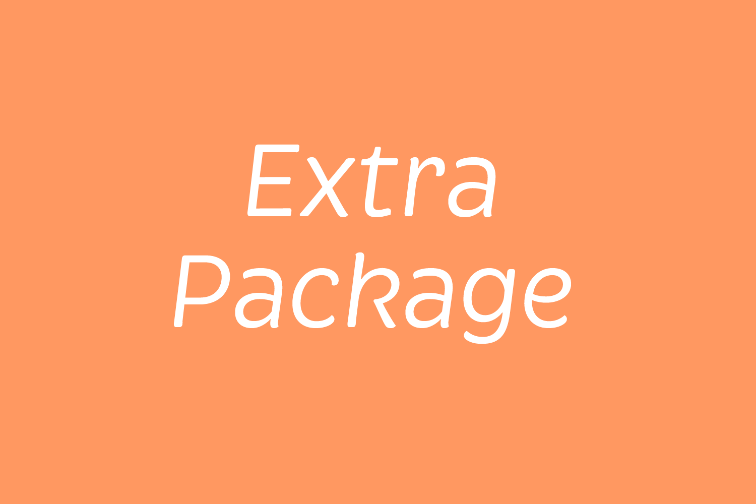
DAIRY PRODUCTS
A lower fat content
BUFFALO MILK 4
Grain-based pellets
PASTEURISATION
Delicious dumpling
AWESOME PARTY
Health of pet dogs
APPROXIMATION
Vanilla milkshakes
WHIPPED CREAM
Health of pet dogs
MACRONUTRIENT
Glossy red colour 3
Lorem ipsum dolor sit amet, consetetur sadipscing elitr, sed diam nonumy eirmod tempor invidunt ut labore et dolore magna aliquyam erat, sed diam voluptua. At vero eos et accusam et justo duo dolores et ea rebum. Stet clita kasd gubergren, no sea takimata sanctus est Lorem ipsum dolor sit amet. Lorem ipsum dolor sit amet, consetetur sadipscing elitr, sed diam nonumy eirmod tempor invidunt ut labore et dolore magna aliquyam erat, sed diam voluptua. At vero eos et accusam et justo duo dolores et ea rebum.
A font of todays needs has to include more than just the alphabet and some punctuation. Besides a big number of accented letters, making sure that the typeface has a good language support, a font should include several features for excellent typographic work joining forces with the layout applications of the time and of course the user. Here is a selection of what this font family has to offer under the hood.
The New Bristles
Small Saps are uppercase characters set at the same height and weight as the lowercase characters or text figures. They are used in text emphasize or typographically differentiate passages beside the italics. Professional designed Small Caps are not simply scaled-down versions of the capital letters – they are designed to work with the lowercase letters and have the same stroke weight.
Lucky & Language
Besides the standard letters a font sometimes contains several versions of a letter called alternates. You can exchange the alternate with the standard letter by selecting it through the Opentype feature panel and every letter of the stylistic set will be exchanged. Often this results in a totally different optical appearance of the typeface.
Explore the 1645 ways of luck
When lining figures are used in a reading text they often produce a visual stretch in the text and disturb the grey value. It has the same effect if you use ALL CAPS in a text. One solution could be to make the numbers slightly smaller and give them some more space in-between. The other, more elegant way is to use the old style figures, they have ascenders and descenders like the lower case letters and will fit seamlessly in the text. In Brix Sans there are also tabular oldstyle figures available.
13.025,16
25.896,97
In addition to the normal lining figures, the fonts contain a set of tabular figures. This means that all numbers have the same width, which is useful for setting up invoices, tables or every other task where the figures should have a structured appearance among themselves.
1/4 is paint, 3/4 are imagination
If fractions are needed anywhere an OpenType code makes sure that if you type any numbers combined with a slash between a fraction will automatically be substituted.
C6H12O6
A subscript is a character that is set slightly below the normal line of type. They are used in formulas, mathematical expressions, and specifications of chemical compounds and isotopes, but can have many other uses as well. These characters are not simply ordinary characters reduced in size – to keep them visually consistent with the rest of the font, they are slightly heavier than a reduced-size character would be.
Still not for free2
A superscript is a character that is set slightly above the line of type. It has the same weight and size like a subscript character. They are also used in formulas, mathematical expressions and text references, but can have many other uses as well.
Afar, Afrikaans, Albanian, Basque, Belarusian, Bislama, Bosnian, Breton, Catalan, Chamorro, Chichewa, Comorian, Croatian, Czech, Danish, Dutch, English, Esperanto, Estonian, Faroese, Fijian, Filipino/Tagalog, Finnish, Flemish, French, Gaelic, Gagauz, German, Gikuyu, Gilbertese/Kiribati, Haitian-Creole, Hawaiian, Hungarian, Icelandic, Indonesian, Irish, Italian, Javanese, Kashubian, Kinyarwanda, Kirundi, Latin, Latvian, Lithuanian, Luba/Ciluba/Kasai, Luxembourgish, Malagasy, Malay, Maltese, Maori, Marquesan, Moldovan/Romanian, Montenegrin, Nauruan, Ndebele, Norwegian, Oromo, Palauan/Belauan, Polish, Portuguese, Quechua, Romanian, Romansh, Sami, Samoan, Sango, Serbian, Sesotho, Setswana, Seychellois-Creole, Swazi, Silesian, Slovak, Slovenian, Somali, Sorbian, Sotho, Spanish, Swahili, Swedish, Tahitian, Tetum, Tok-Pisin, Tongan, Tsonga, Tswana, Turkish, Turkmen, Tuvaluan, Uzbek, Wallisian, Walloon, Welsh, Xhosa, Zulu
Enjoy this typeface?
Other buying Options: MyFonts.com, FontShop.com